


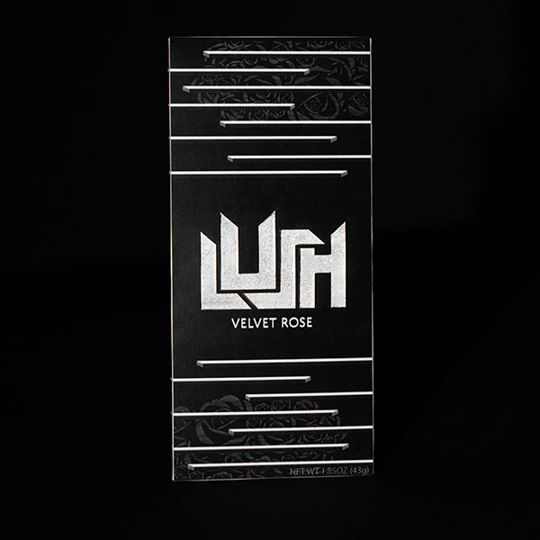
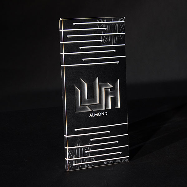
Lush is a modern and healthy chocolate bar brand that I made for a school project. In this project we had to make a chocolate bar brand and make four packages based on four different flavors we came up with. I designed, cut, and assembled the packaging.


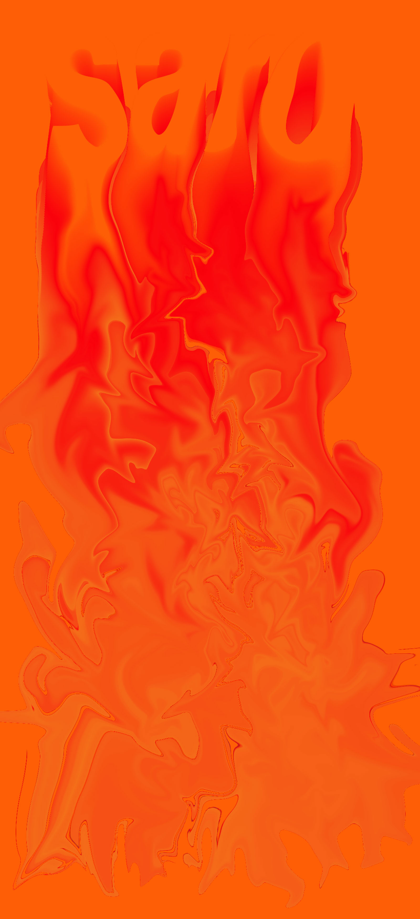
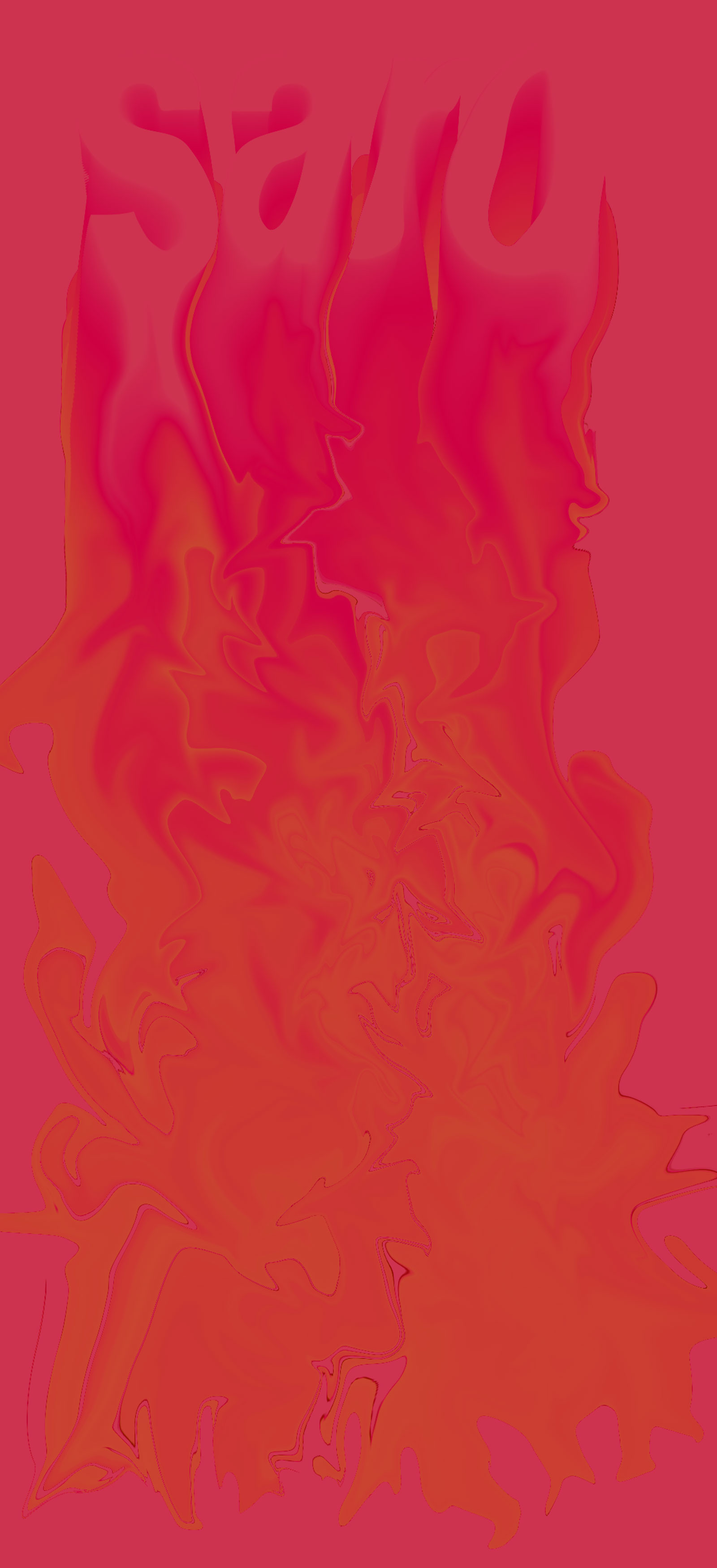
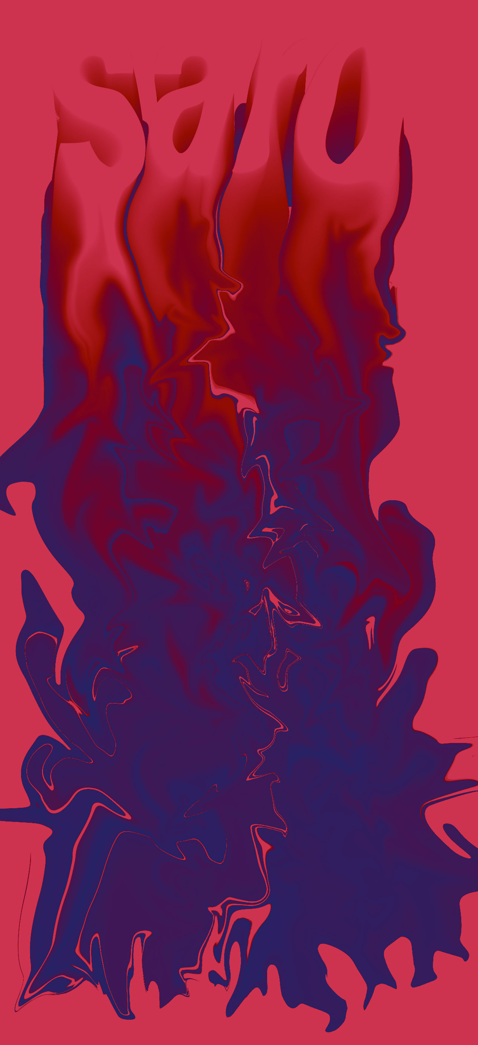
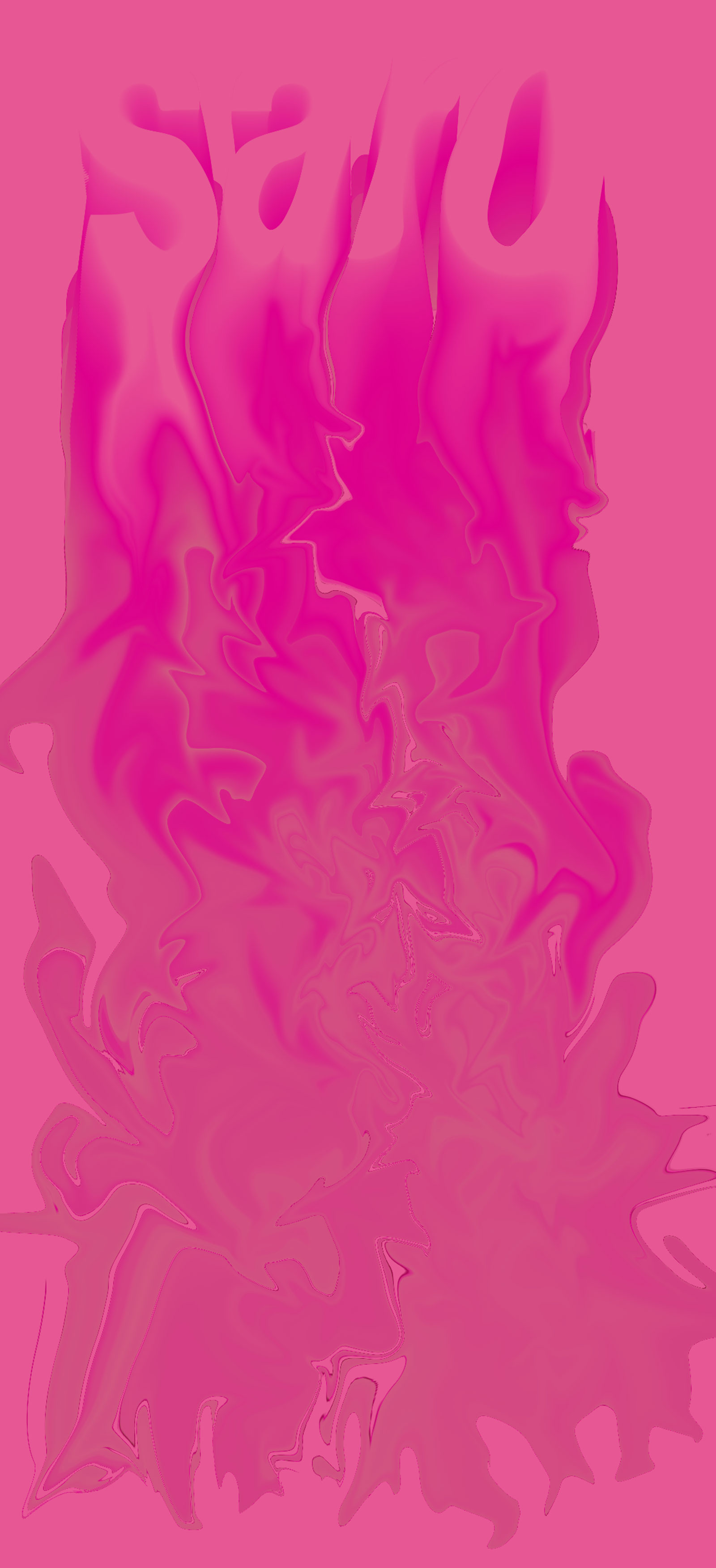
In this project I demonstrate various forms of liquidation and color palette. With this project I wanted to create a sense of relaxation and tranquility with the liquidation.
.jpg)
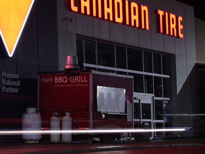
This shot was for my digital imaging class where we had to capture light using a DSLR camera in fully manual. While in Canada I really liked the glowing red of the canadian tire sign at night and my cousin had a red honda civic where he drove past the shot to capture the movement of light from his red car causing a moving line of red light.
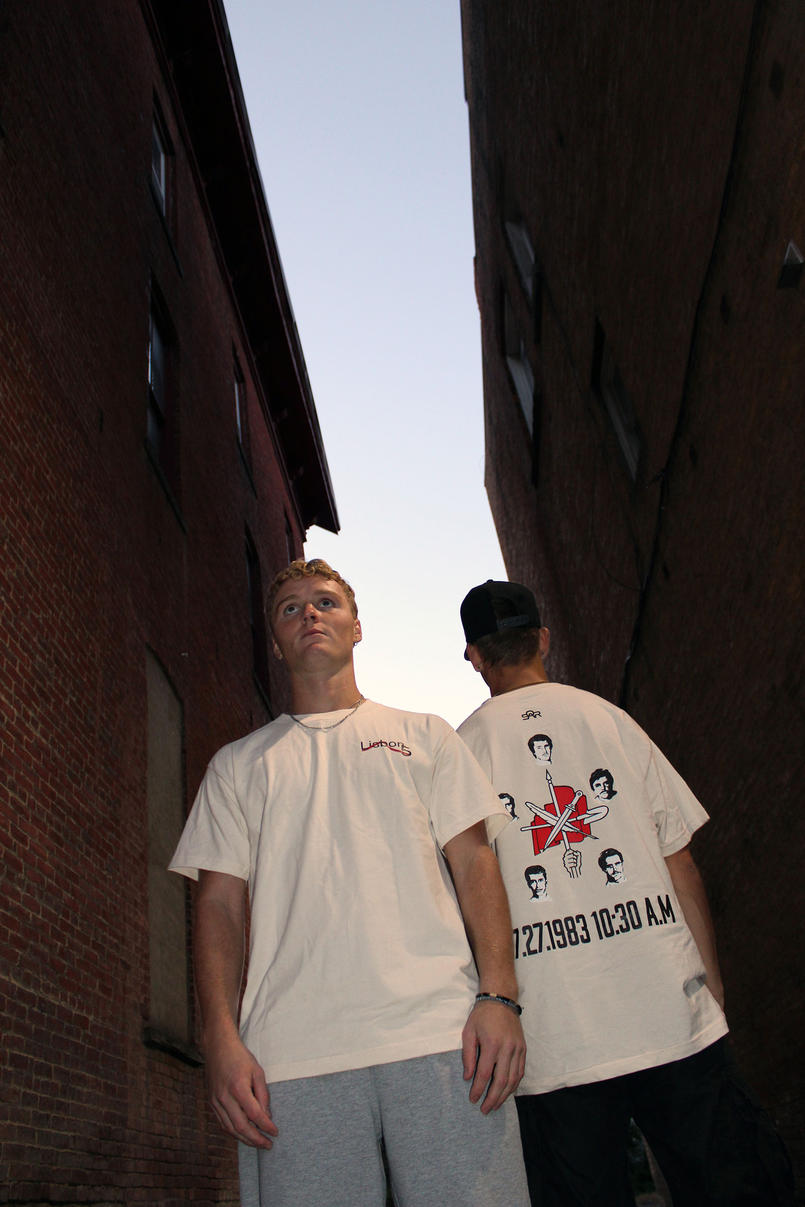
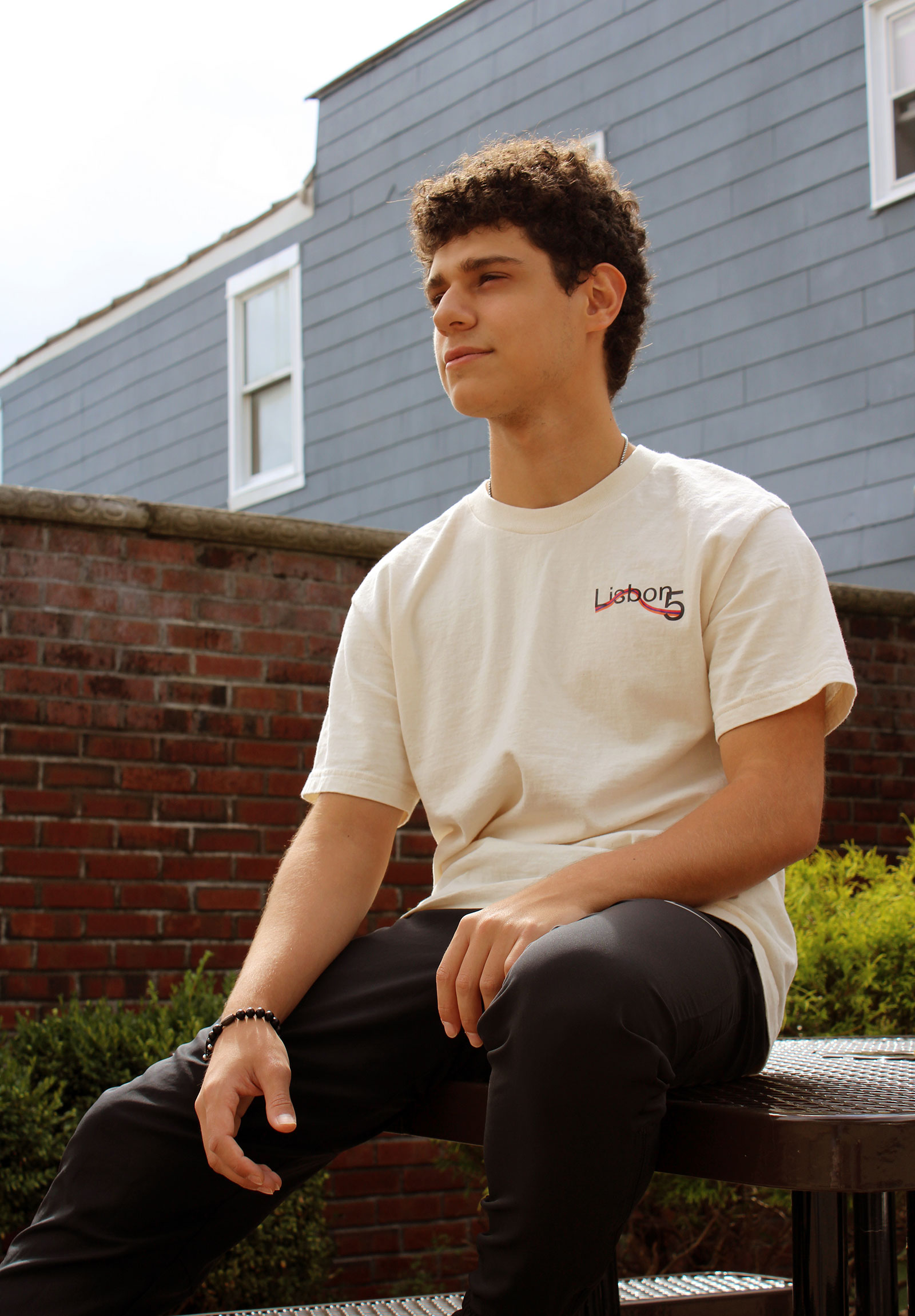
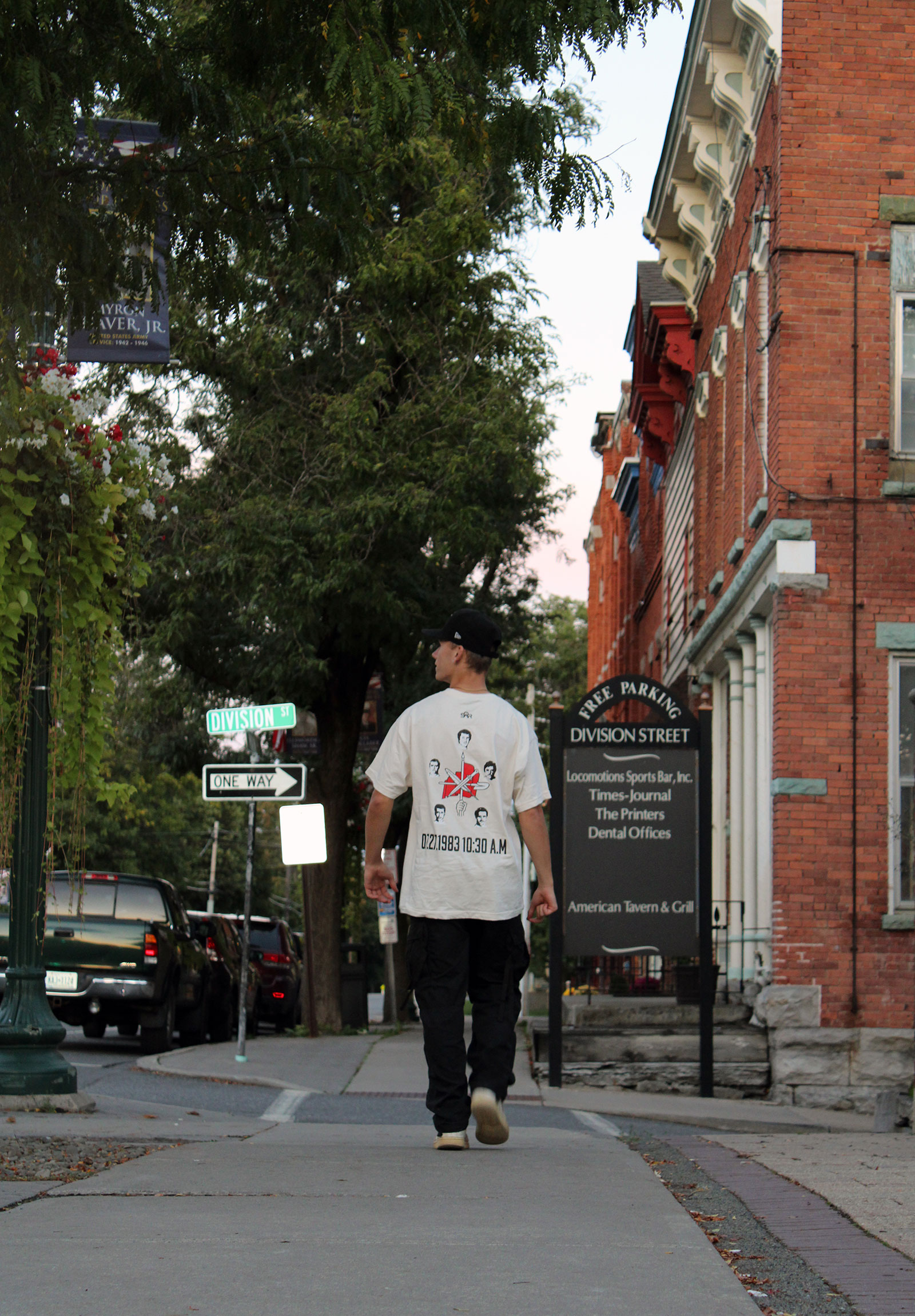
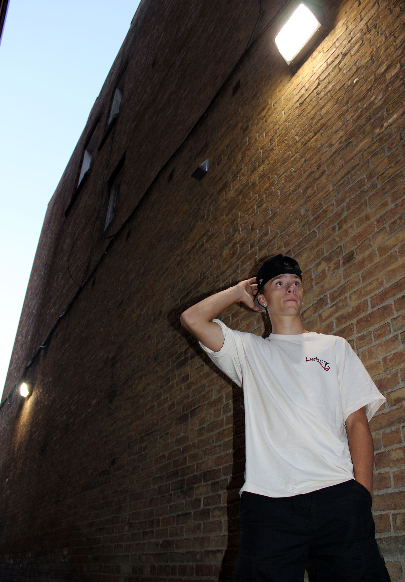
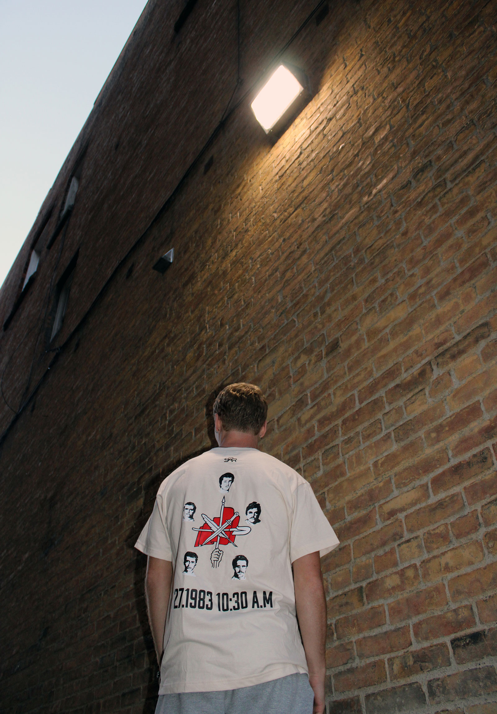
For my first drop for my clothing brand I decided to commemorate it to the Lisbon 5. I designed all the necessary graphics for the T-Shirt, orchestrated and shot all the photos in the photo shoot.


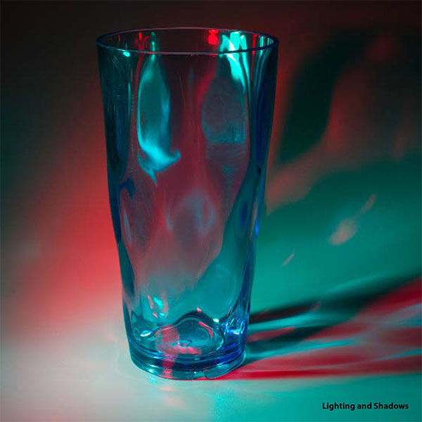
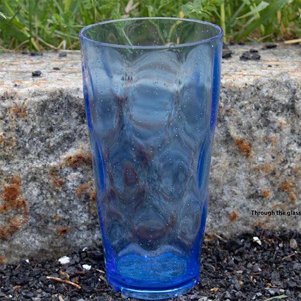
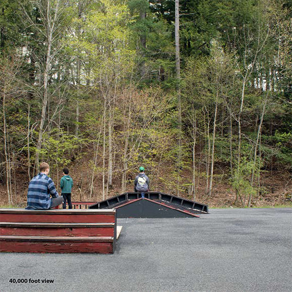
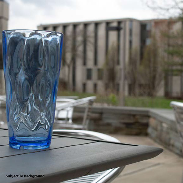
This was a project for digital imaging in which we had to compose all these different shots based on different rules of composition in photography. We made these photos into a book using Indesign to layout and print the book.


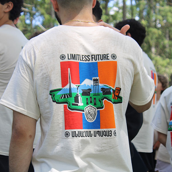
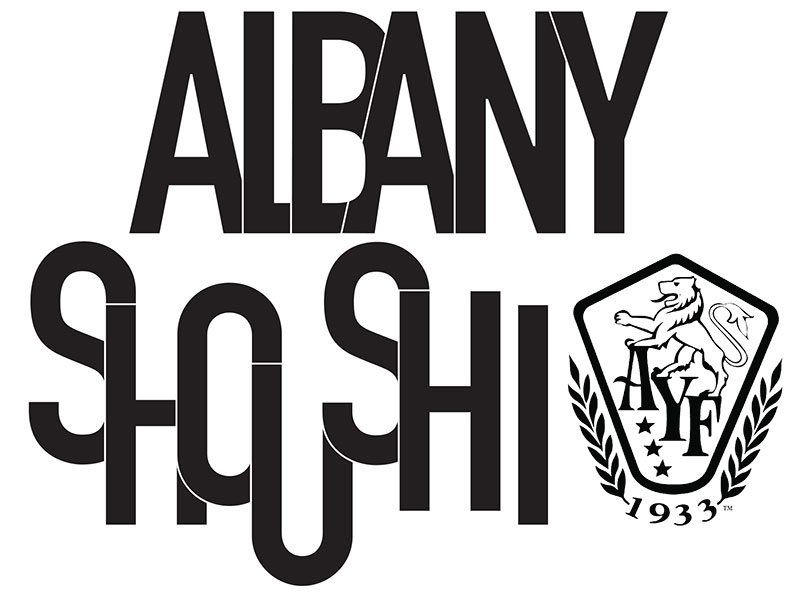
This was a logo that was used for the Armenian Youth Federation annual junior seminar camp. The logo symbolizes the limitless possibilities and future of the young and prospering Armenian community. This logo comprises various Armenian monuments encased inside the map of Armenia Woodrow Wilson drew up after the world war but was never implemented. The Wilsonian map of Armenia symbolizes what area of land really should have been like post world war. This logo was used for T-Shirts, stickers, and used on various promotional graphics for the event itself. The T-Shirts were handed out to every camper and there were around 400 campers.


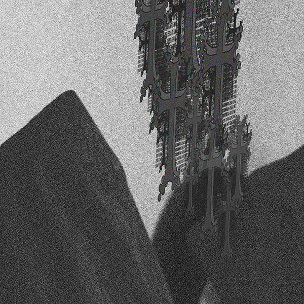
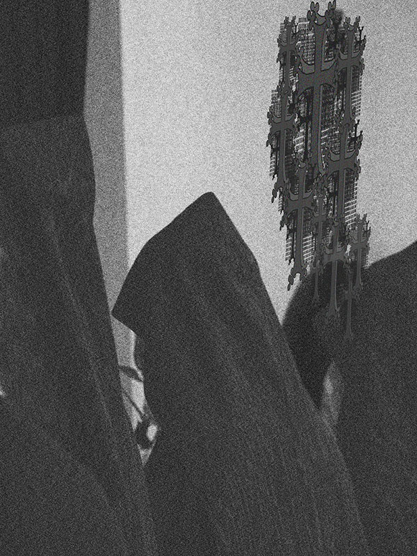
With this poster I capture the pope of the Armenian Apostolic Church with my graphic warped on the wall in the background. I took this photo and edited it by adding grain and making the image black and white on Photoshop. Then added multiple layers of my cross design using various sizes to create a typographic effect. I wanted to create a sense of religious despair.
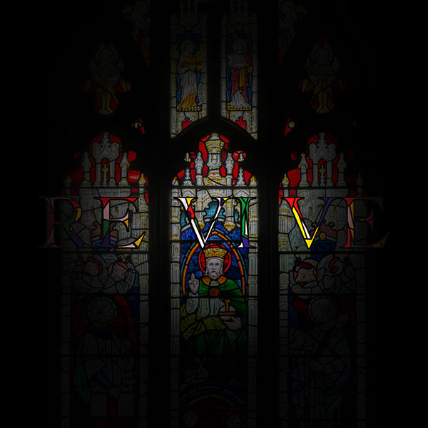
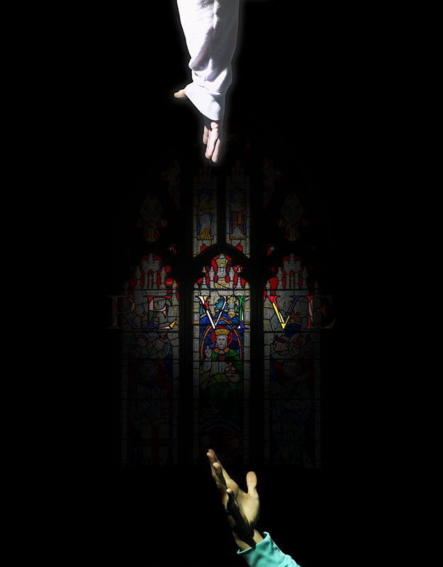
This was a project where we had to create a visual representation of the word revive without a clear view. Using the word revive as a religious form of revival by utilizing the symbolism from the reaching of the hands and stained glass background.
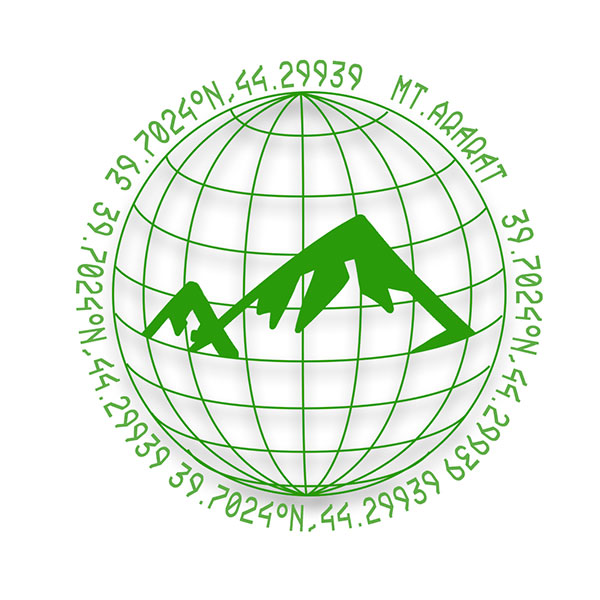
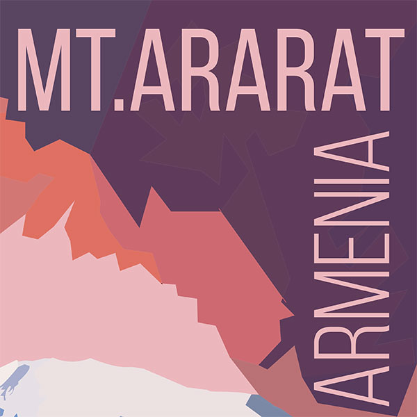
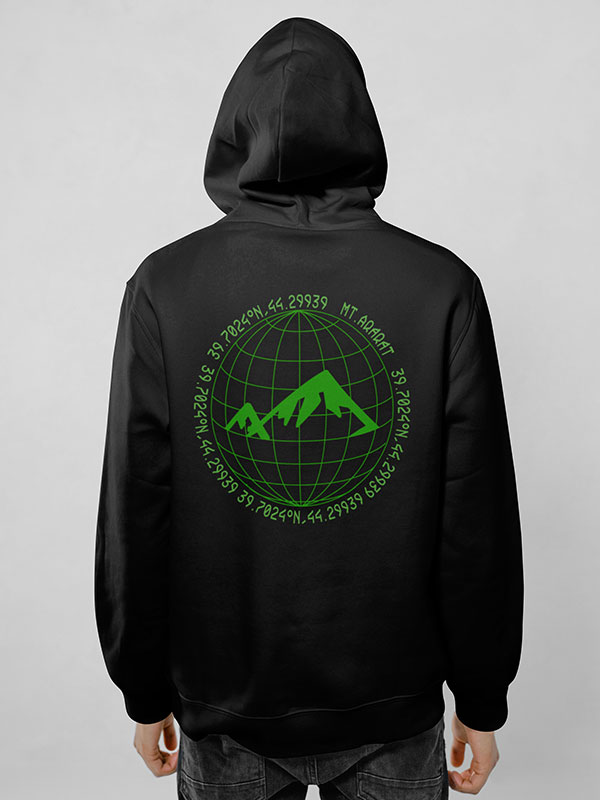
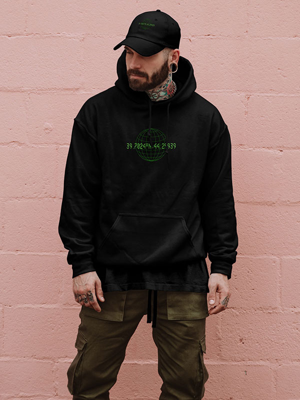
This is a hoodie mock up for my clothing brand. This design is based on Mt. Ararat which is a holy mountain for the Armenians. The coordinates around the design is the exact location of the mountain.
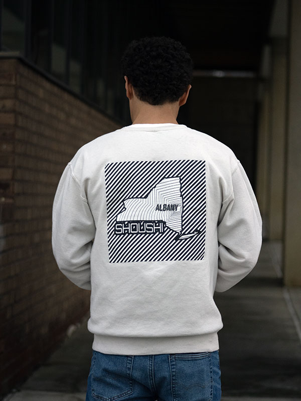
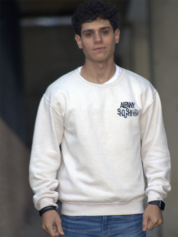
I made this graphic for my local Armenian Youth Federation Chapter in the Eastern USA called the Albany “shoushi” chapter. This graphic was used for crewnecks and shirts that the chapter members would wear to represent themselves as the Albany chapter at regional events across the nation.
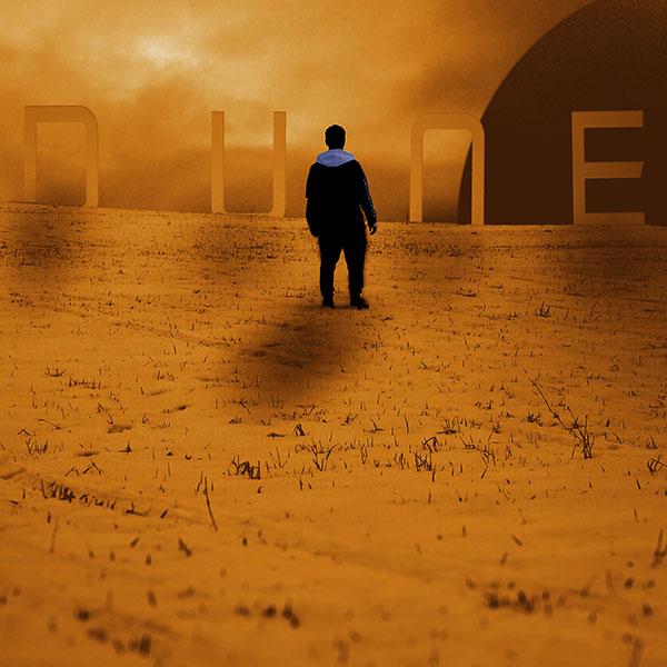
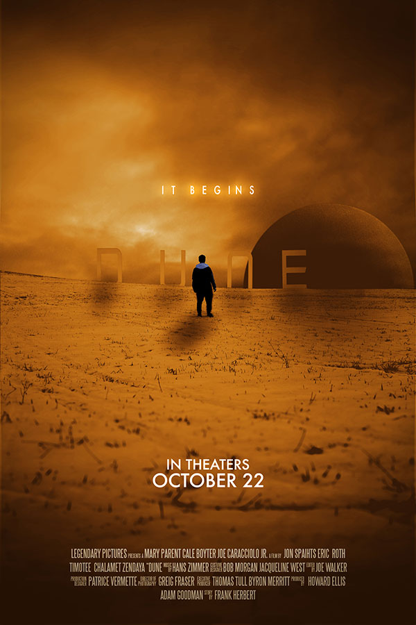
In this project I redesigned the original movie poster for the movie DUNE using original photography and all the text that is used in the original poster.
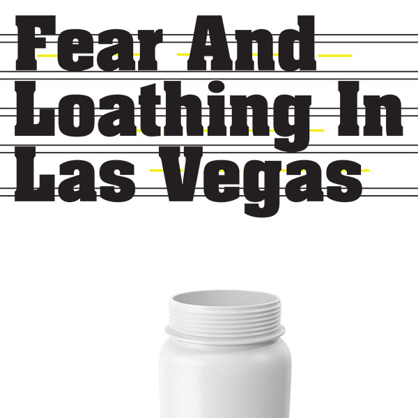
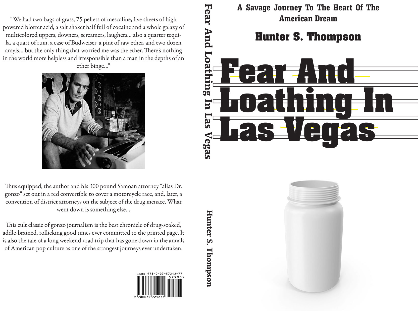
This book cover was made for a class project. We had to redesign the book cover of Fear And Loathing In Las Vegas. Using typographic skills and layout I created this modern looking book cover.
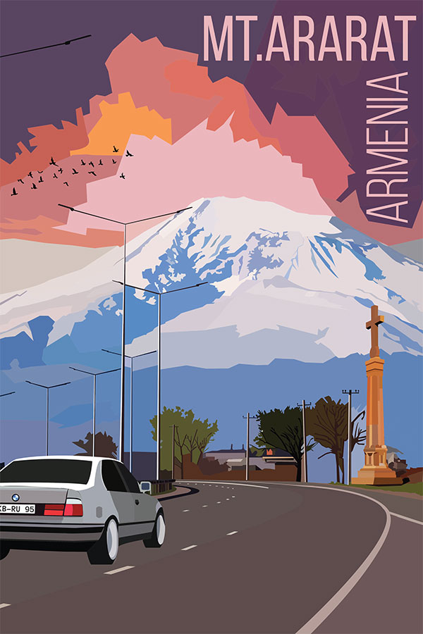
This travel poster was made for my class project where we had to pick a place in the world and illustrate it using the pen tool in Adobe illustrator. We first used Photoshop to add the country’s famous monuments and symbols into the base photo.
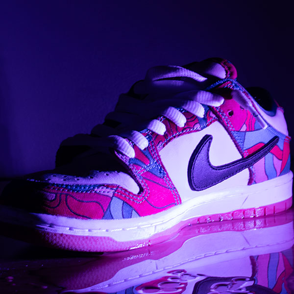
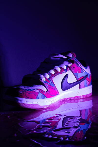
This photo was part of a project for my digital imaging class. In this project we had to take night photography photos. In this photo I really wanted to capture the reflection of the shoe with the water.
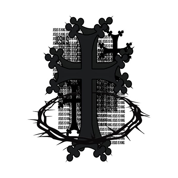
This graphic is a design that will be eventually used for my clothing brand. This design emphasizes Jesus’s presence and importance for us. With this design I focused on my use of typography in the background of the crosses adding

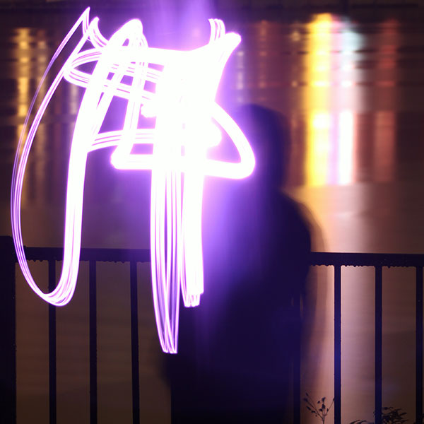
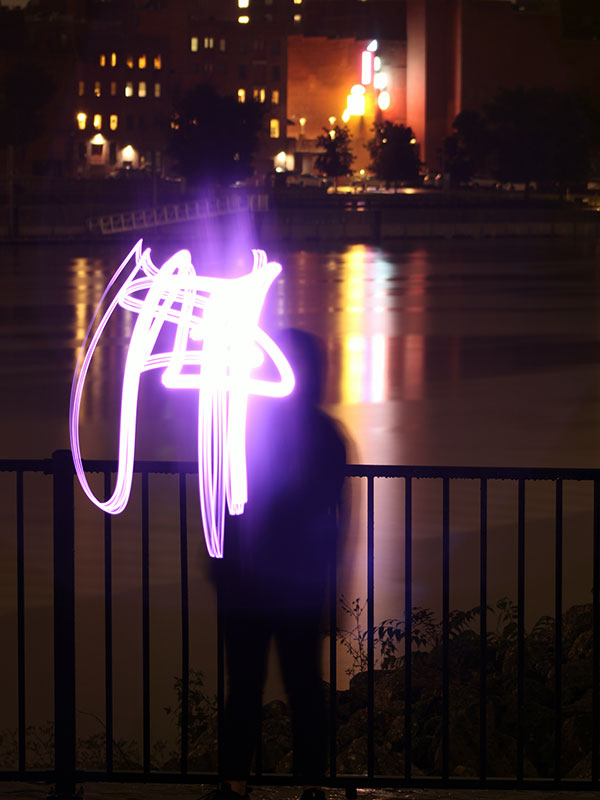
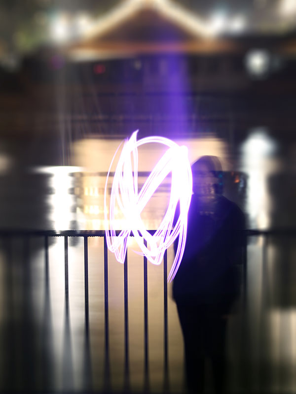
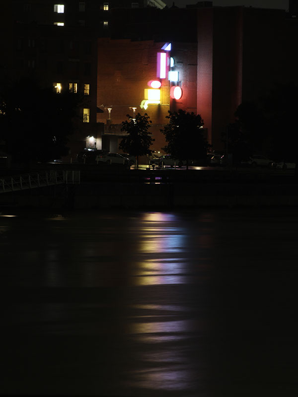
I took these shots right next to the Green Island Bridge across from downtown troy. I had to take these shots because of how the light reflected off the hudson river. I really wanted to capture those bright colorful and vivid lights in the background.
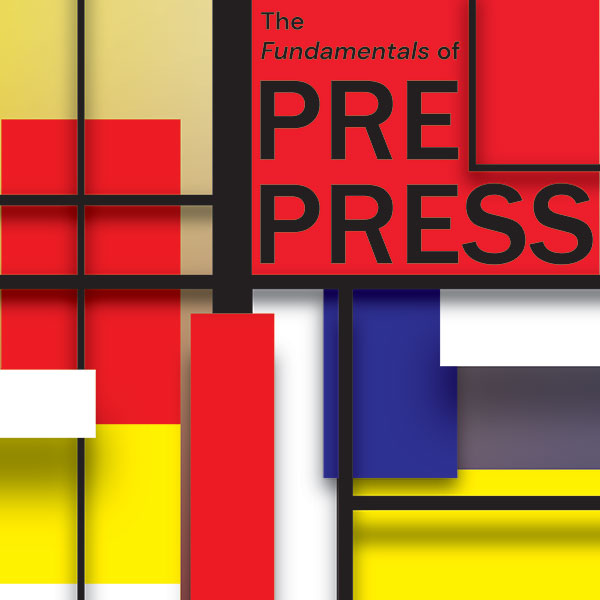
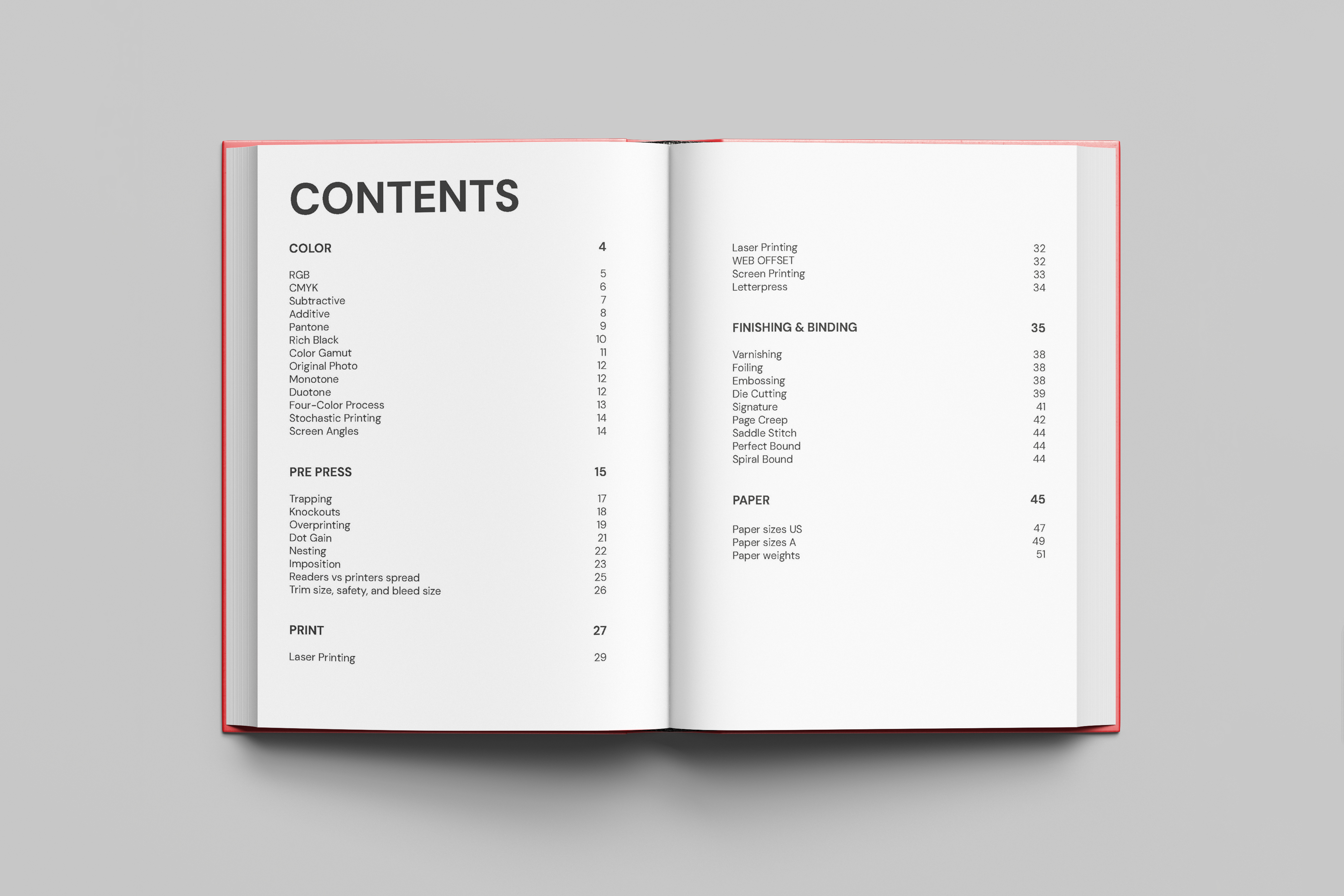
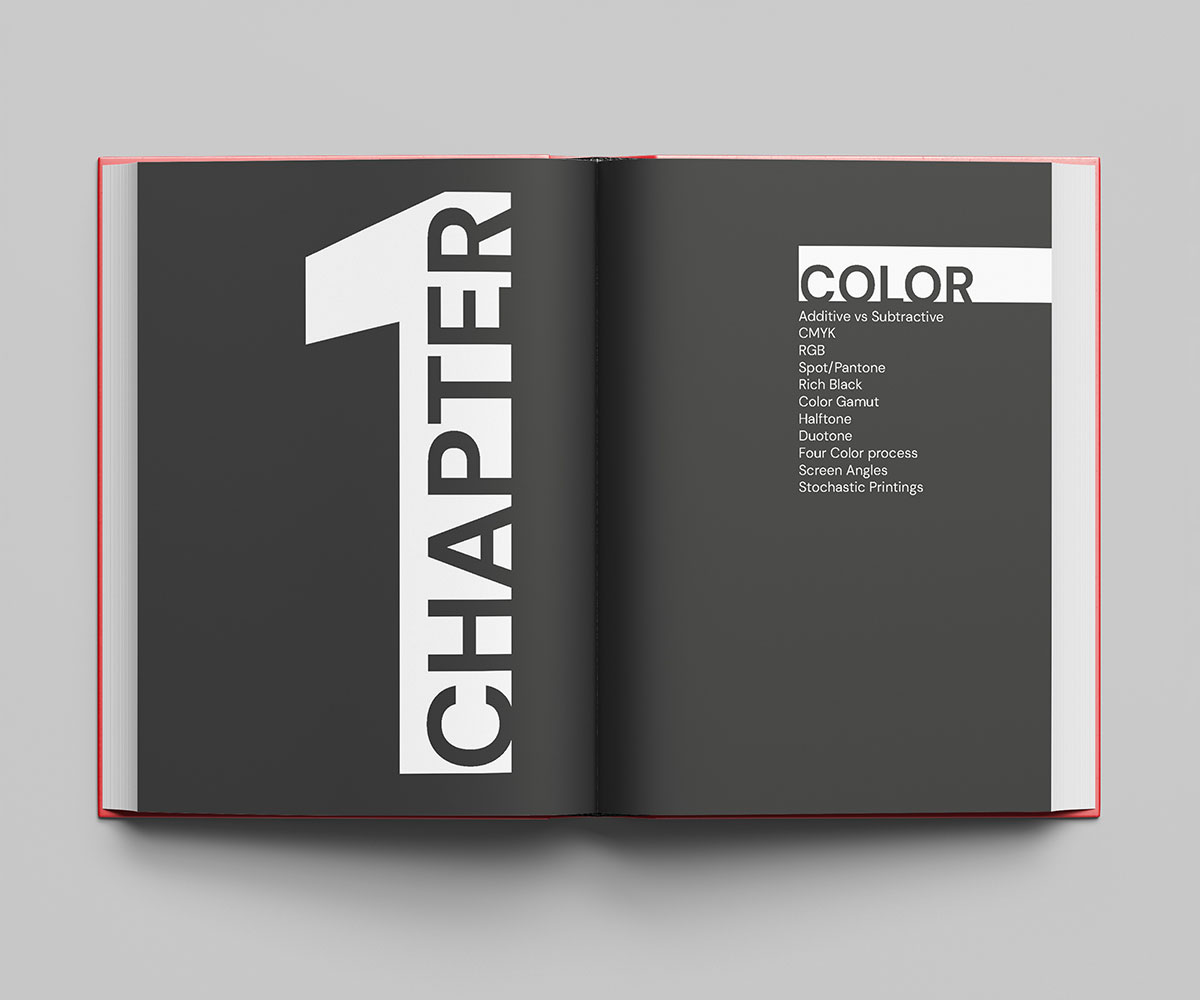
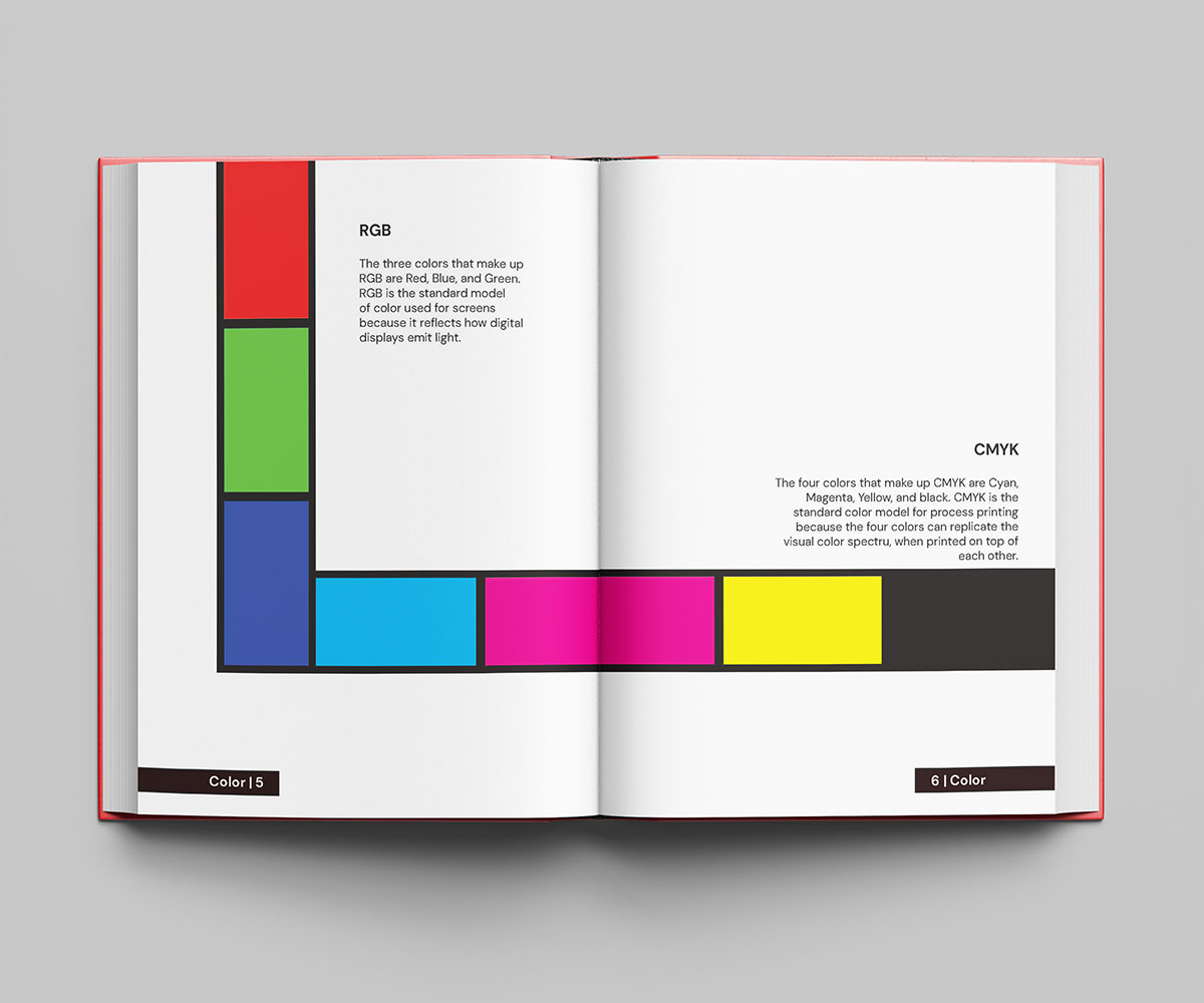
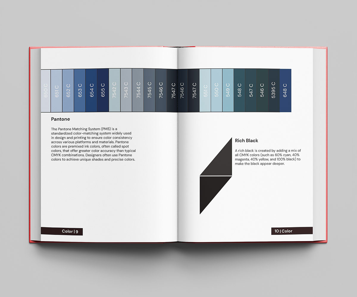
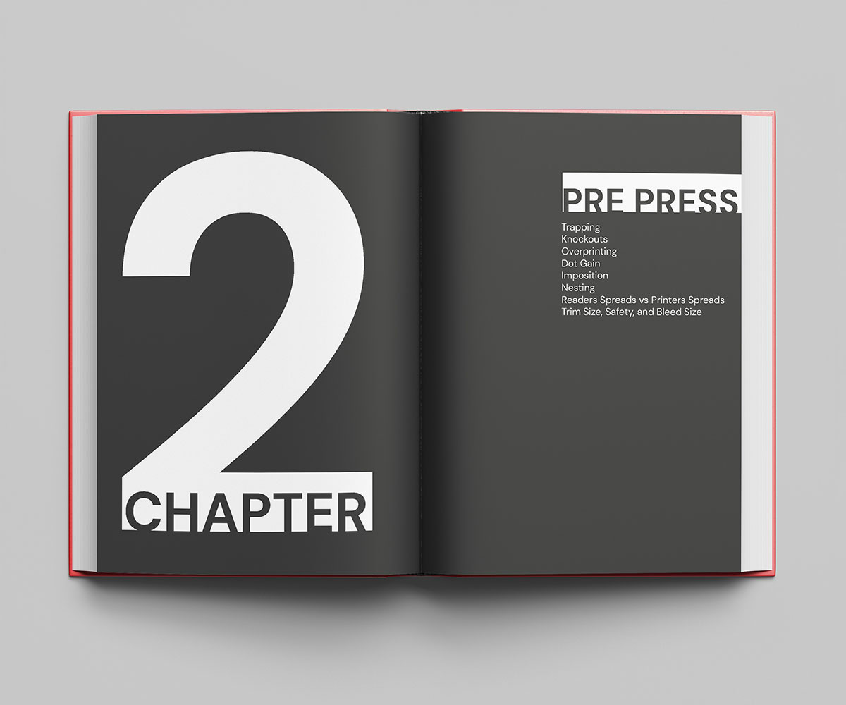
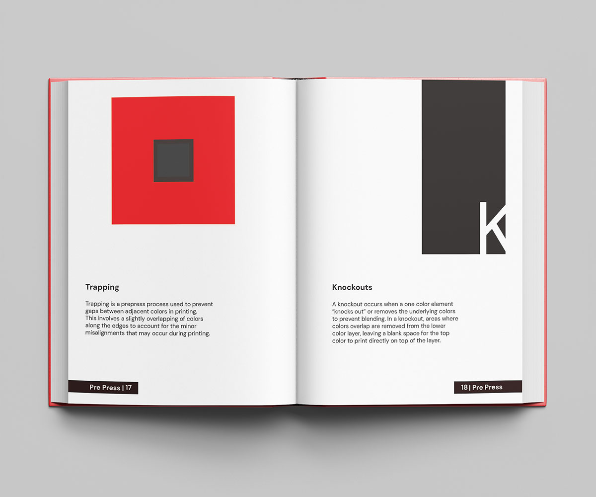
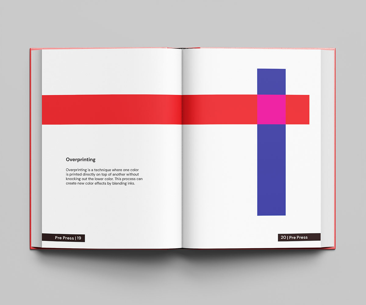
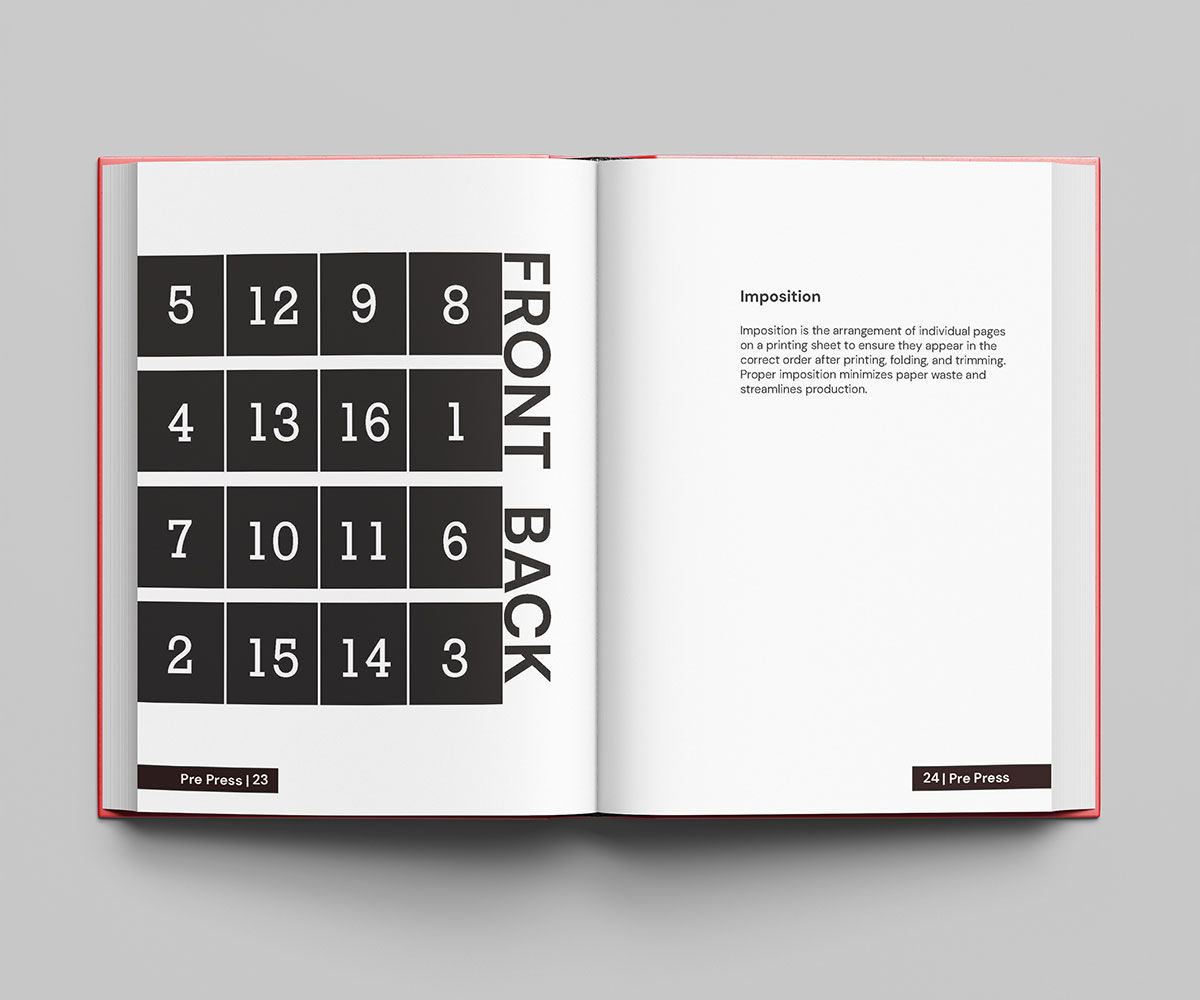
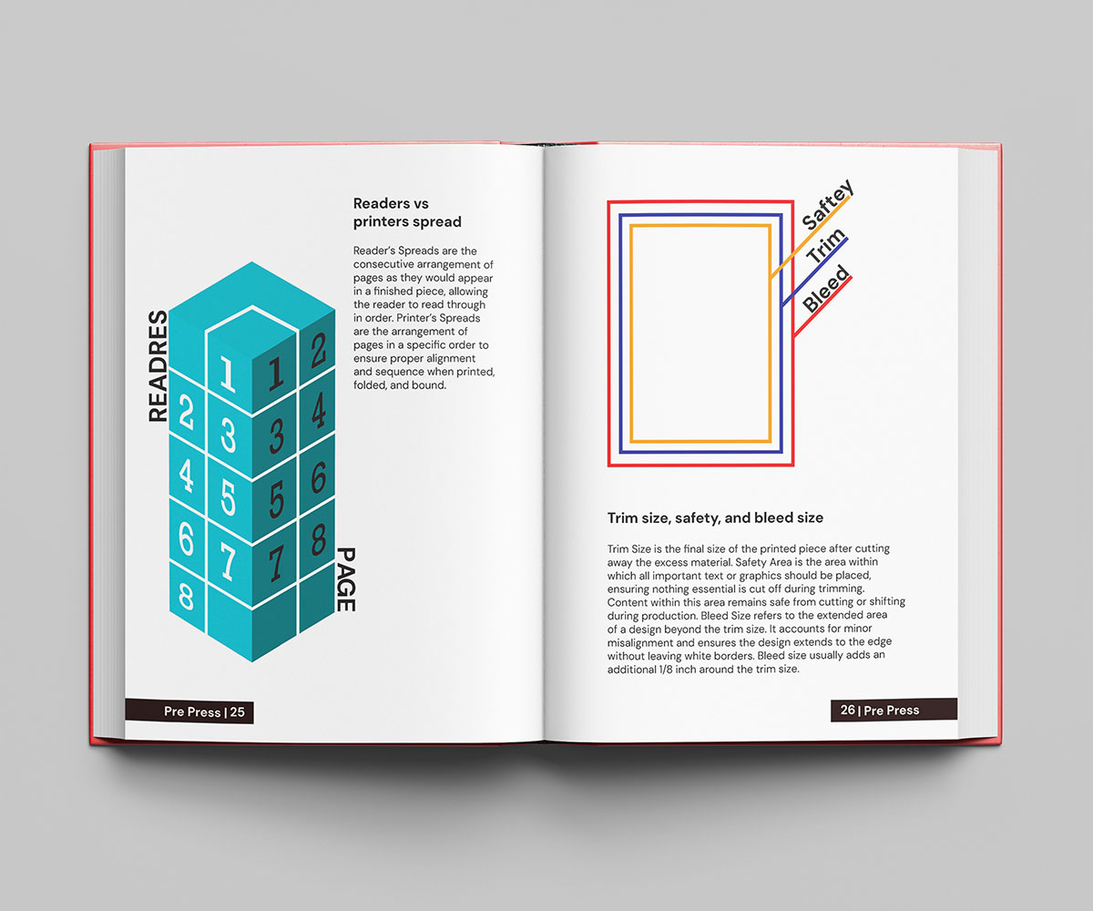
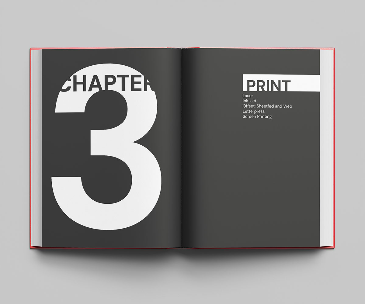
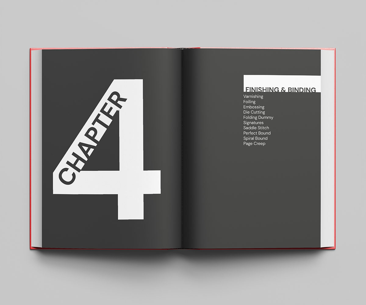
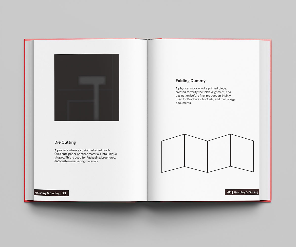
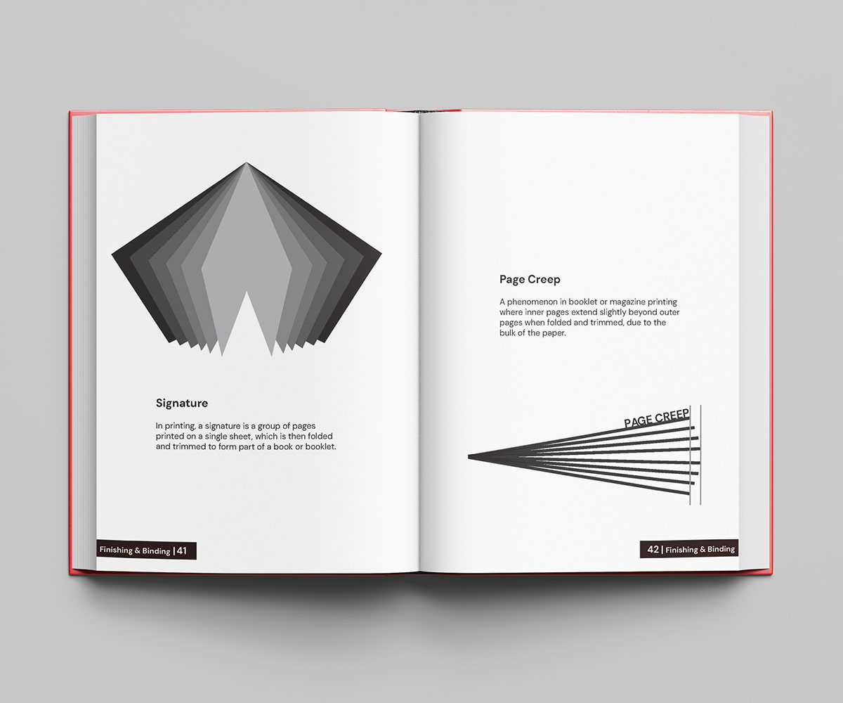
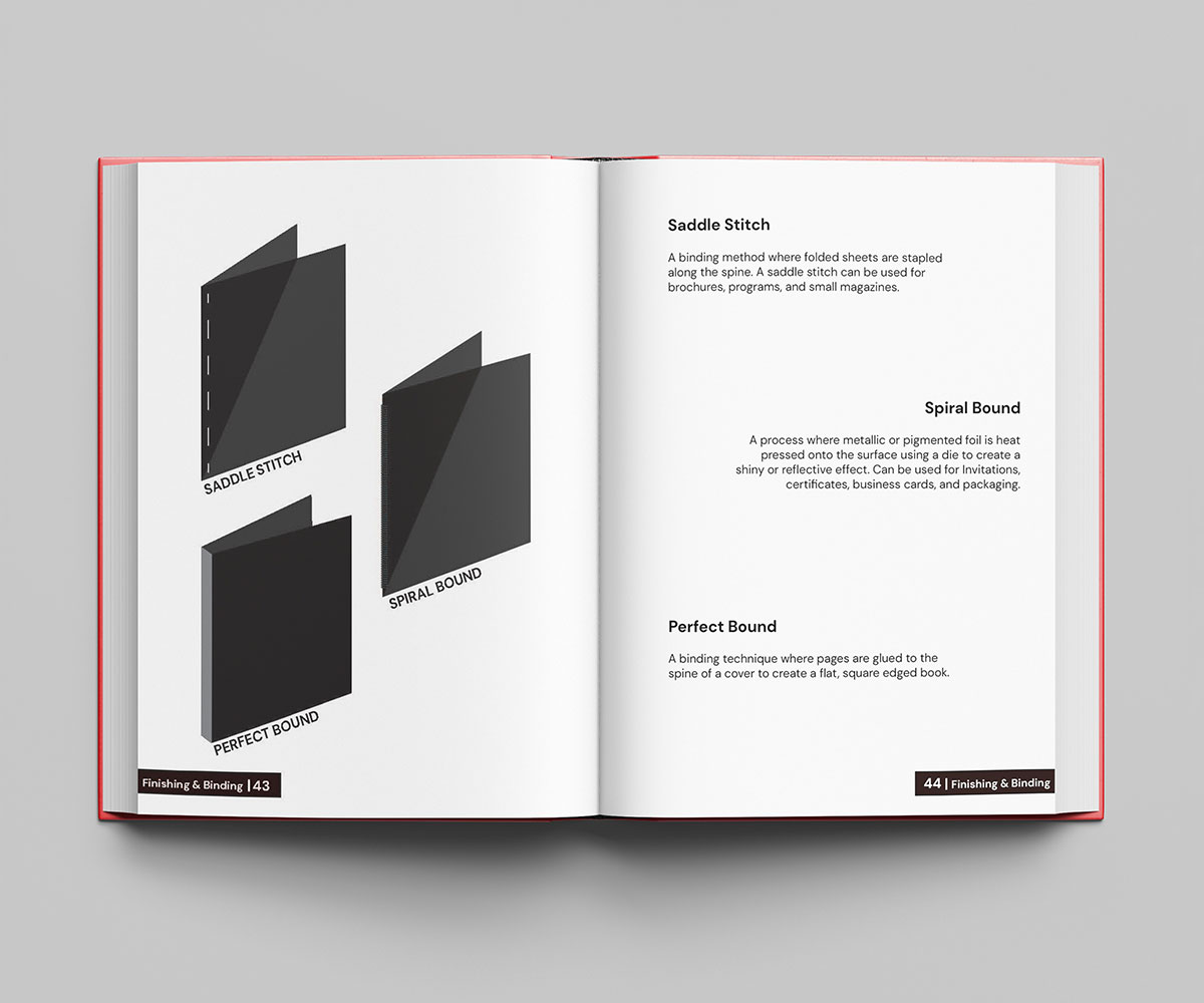
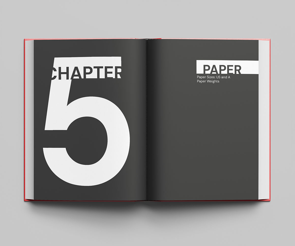
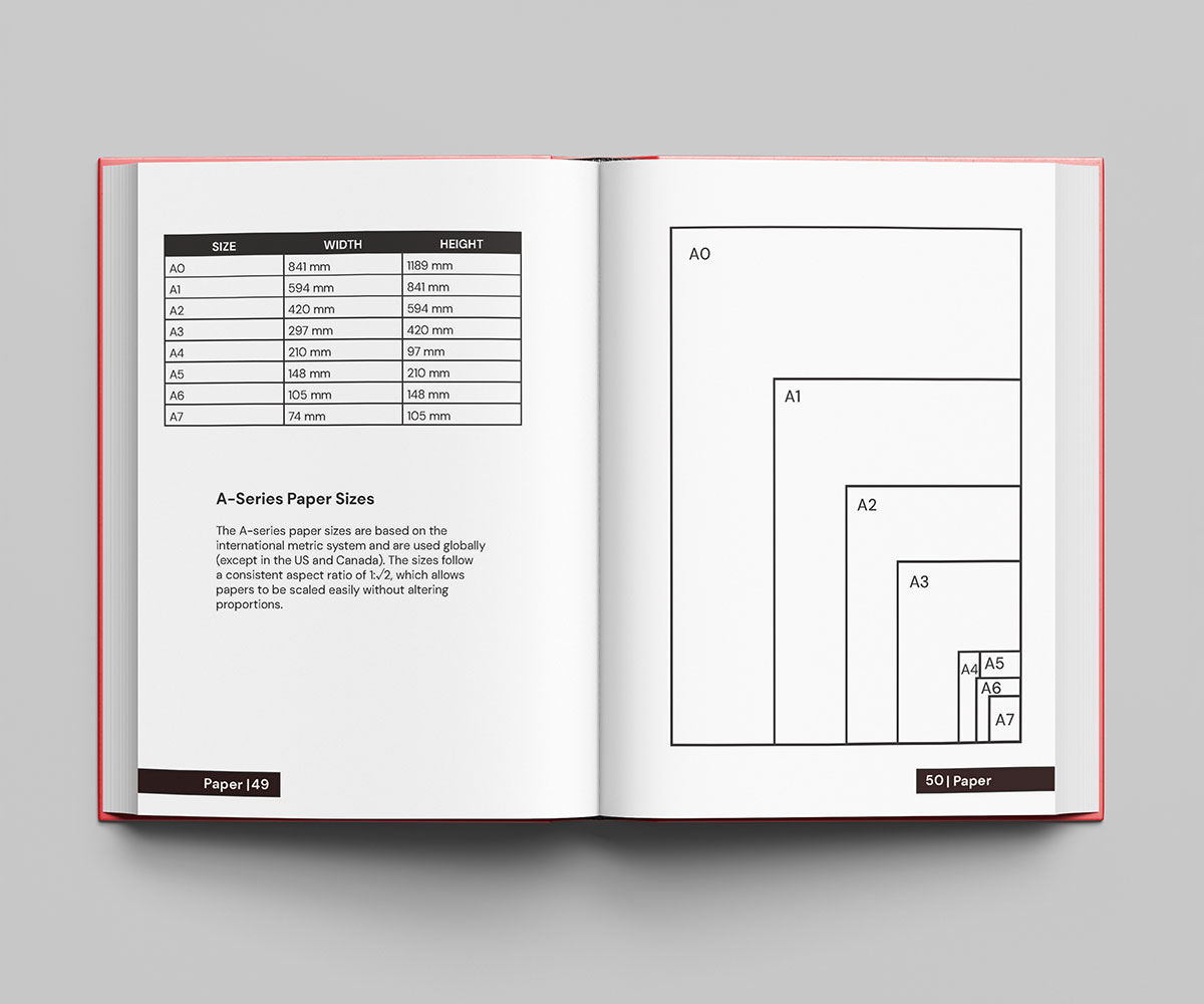
This was a class project for Pre Press & Production. In this project we are supposed to design and excecute and produce a pocket book based on the 5 chapters of the fundamentals of Pre Press. We were supposed to choose and excecute a consitent theme throughout the book. I chose to design my book influenced by the style of De Stijl.


Hello my name is Saro Karageozian, and I am a passionate Graphic Designer dedicated to achieving excellence in my field. I am always eager to learn new skills and grow as an inspiring designer. My objective is to create and manage design products that contribute to my professional growth.
I became a designer because of how fluidly you can express your creative mindset into an organized well thought project. Being creative and having a free mind was something I always had as a kid and to find a skill that requires such creativity and loose mind, it was a perfect fit. Ever since 8th Grade I knew I was going to be a graphic designer. I remember that a lot of kids my age were still clueless on what they wanted to do with their life but it was always so clear for me. My inspiration is my aunt. My aunt is a graphic designer and one of her first projects was to create the design and layout of this scratch off app called Lucktastic. She now designs the packaging of kitchen products such as KitchenAid. I thought it was so cool that she was making actual products that were being released to the public and I wanted to do just that. The thing that really motivates me to keep going is my family. I really want to make it big in the graphic design field to make my family proud and retire my mom and dad.