


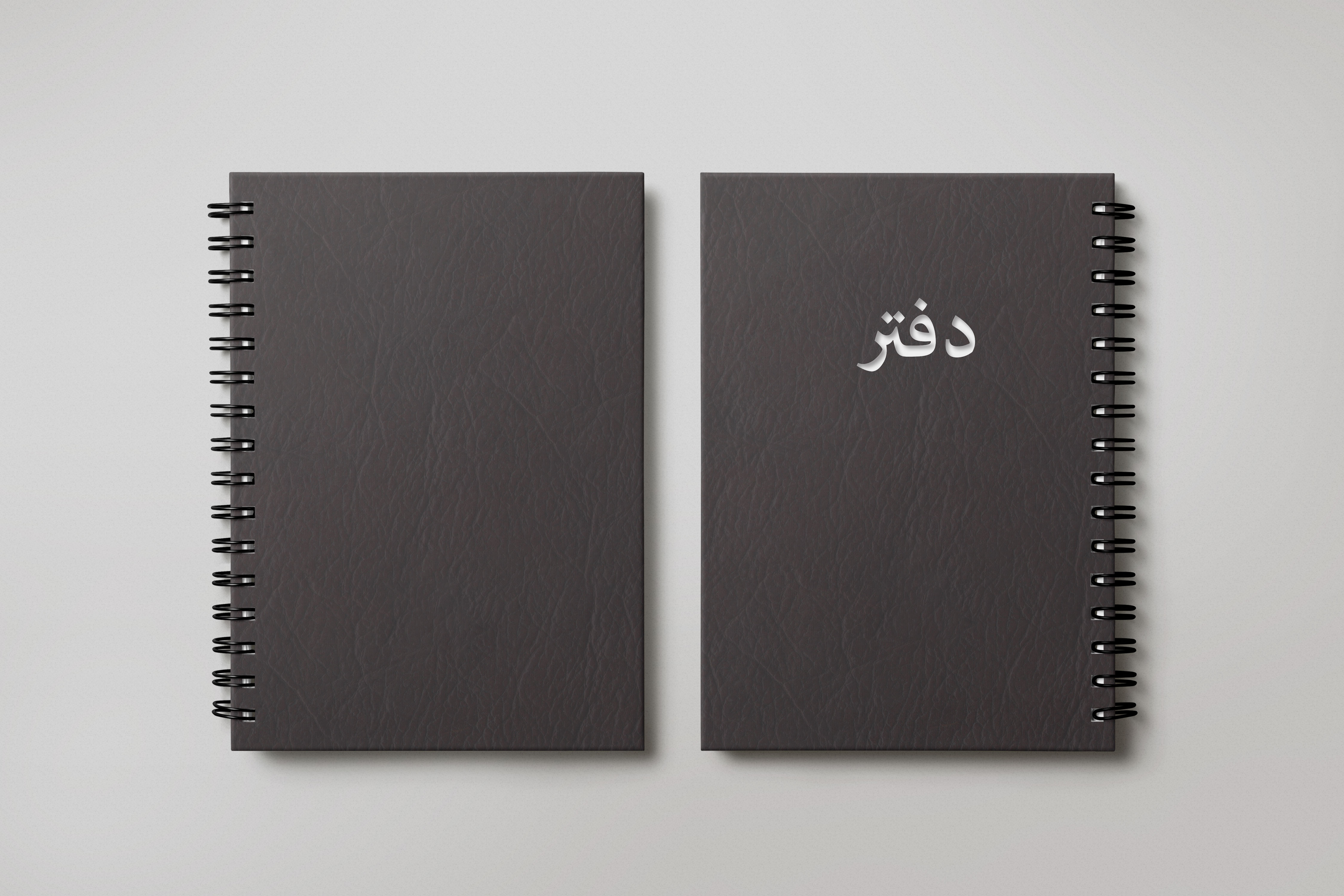
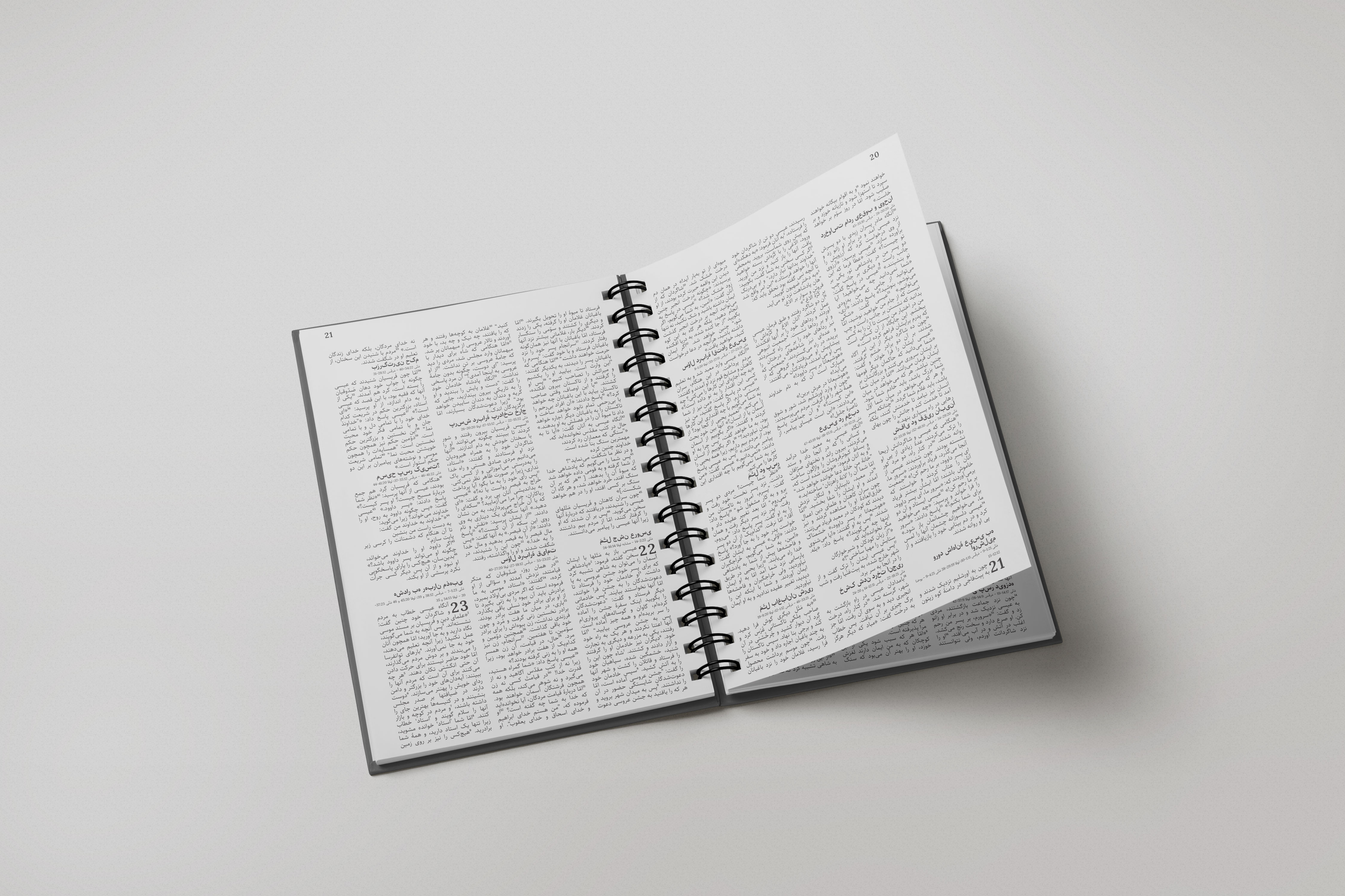
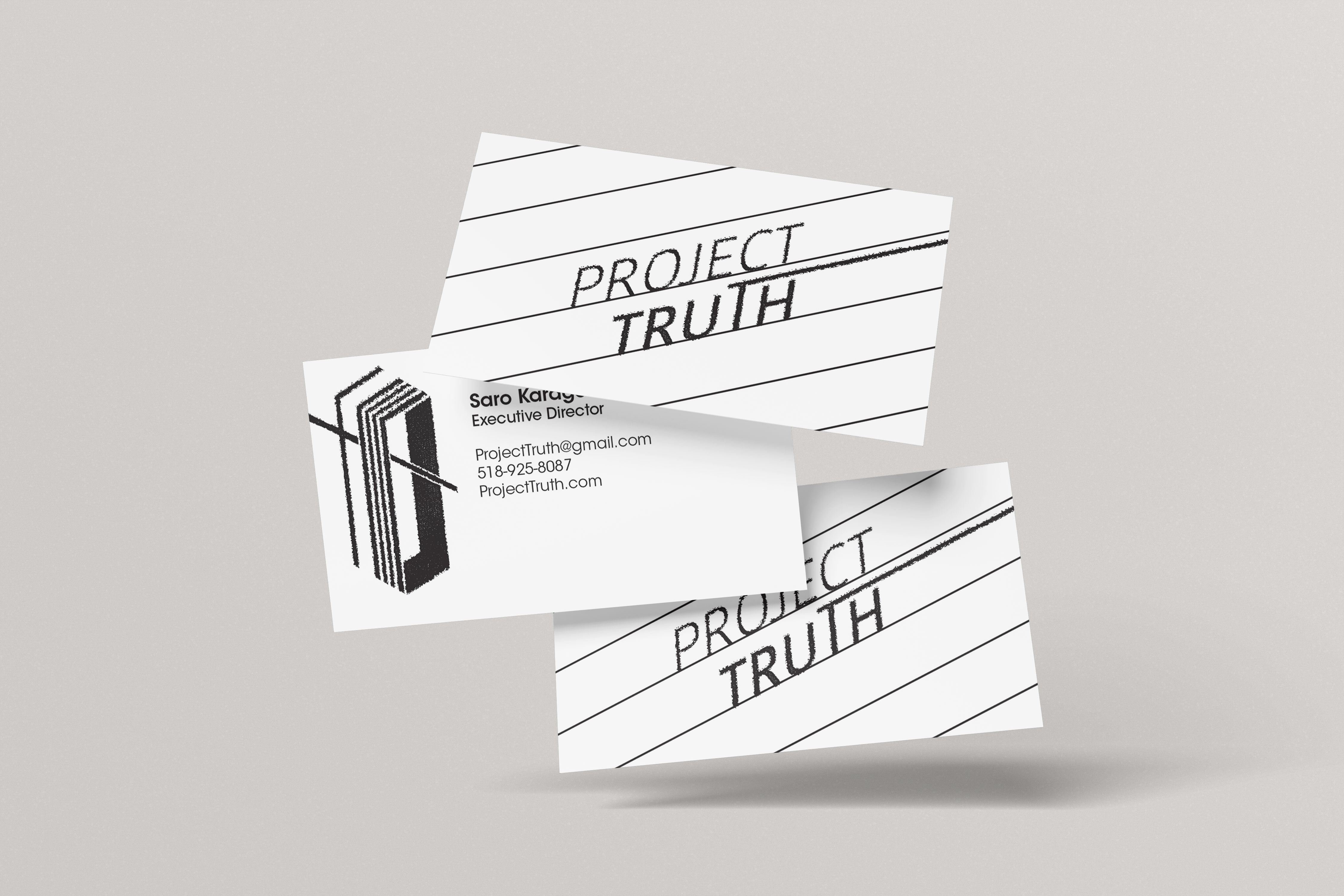
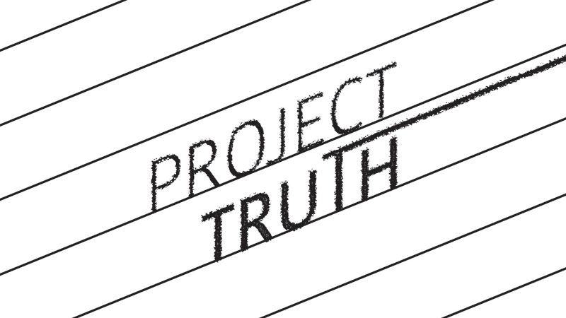
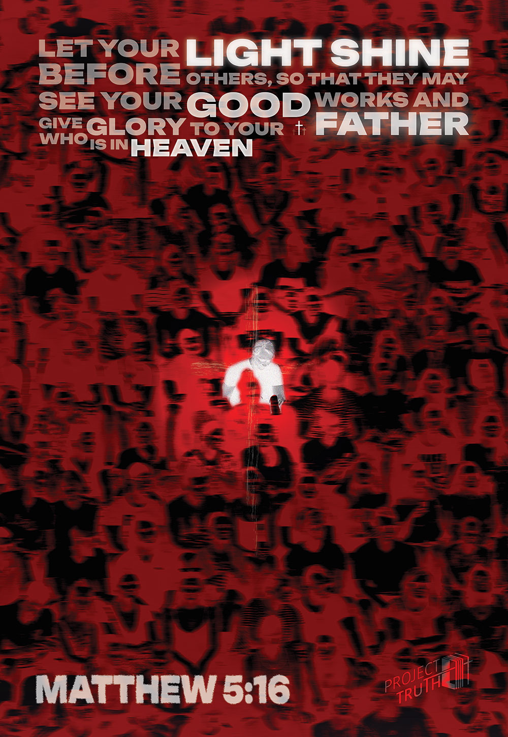
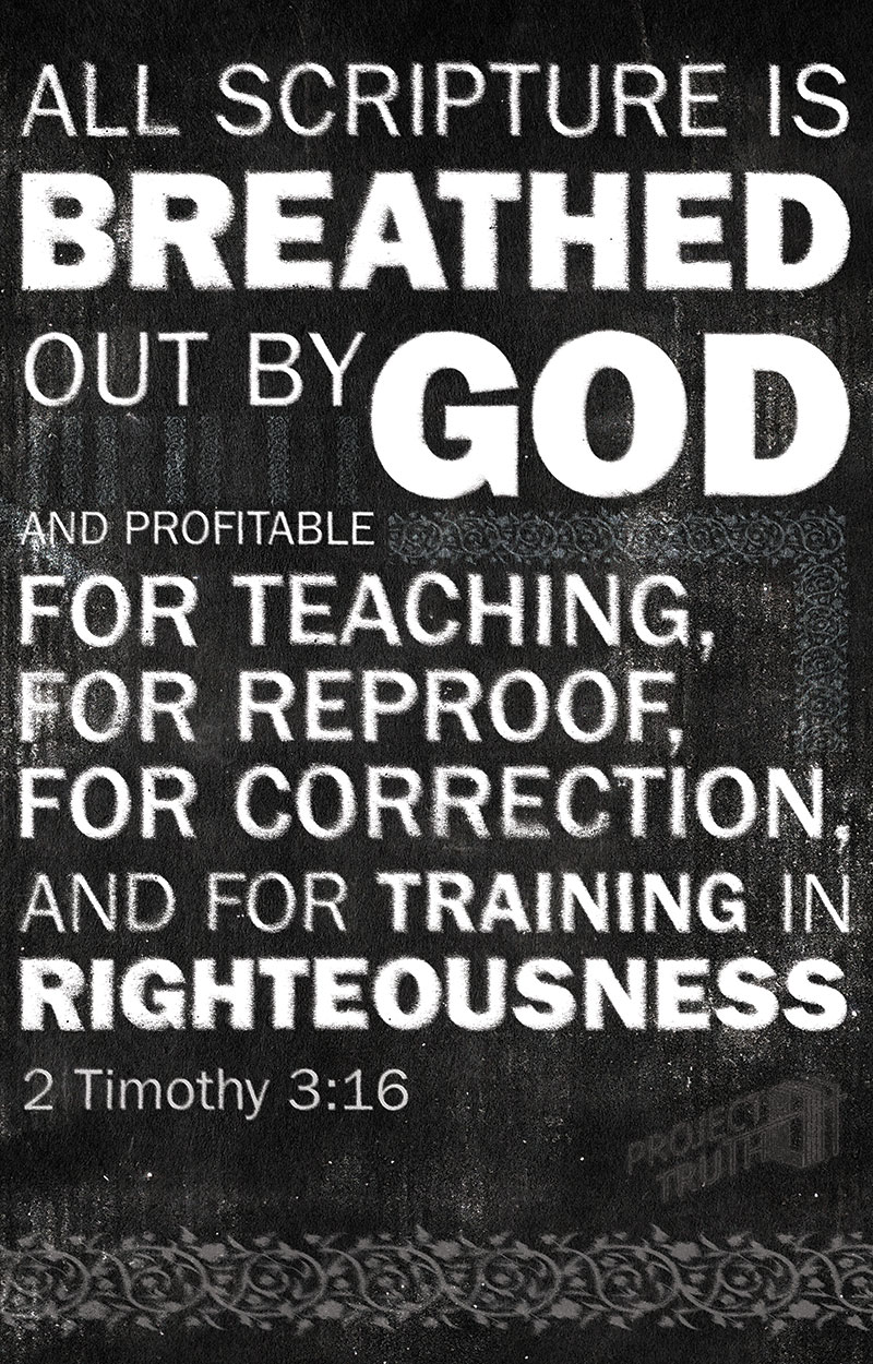
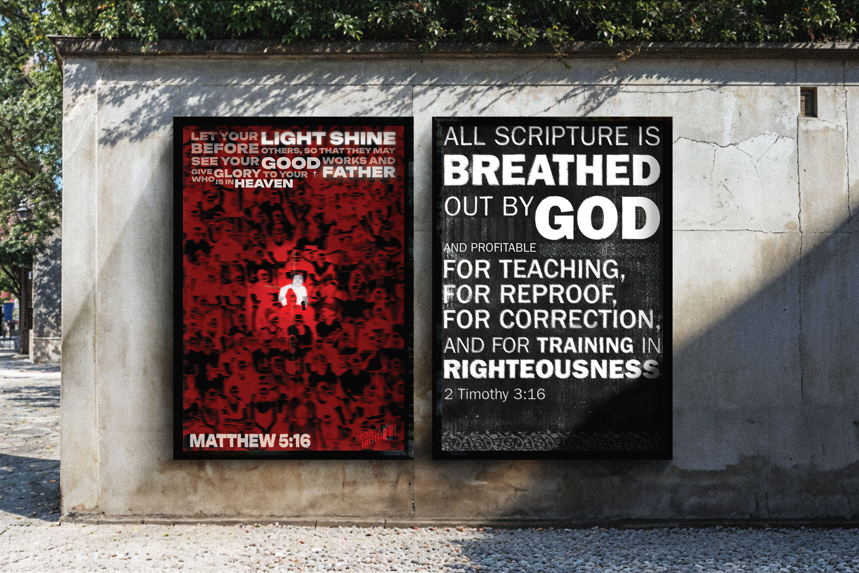
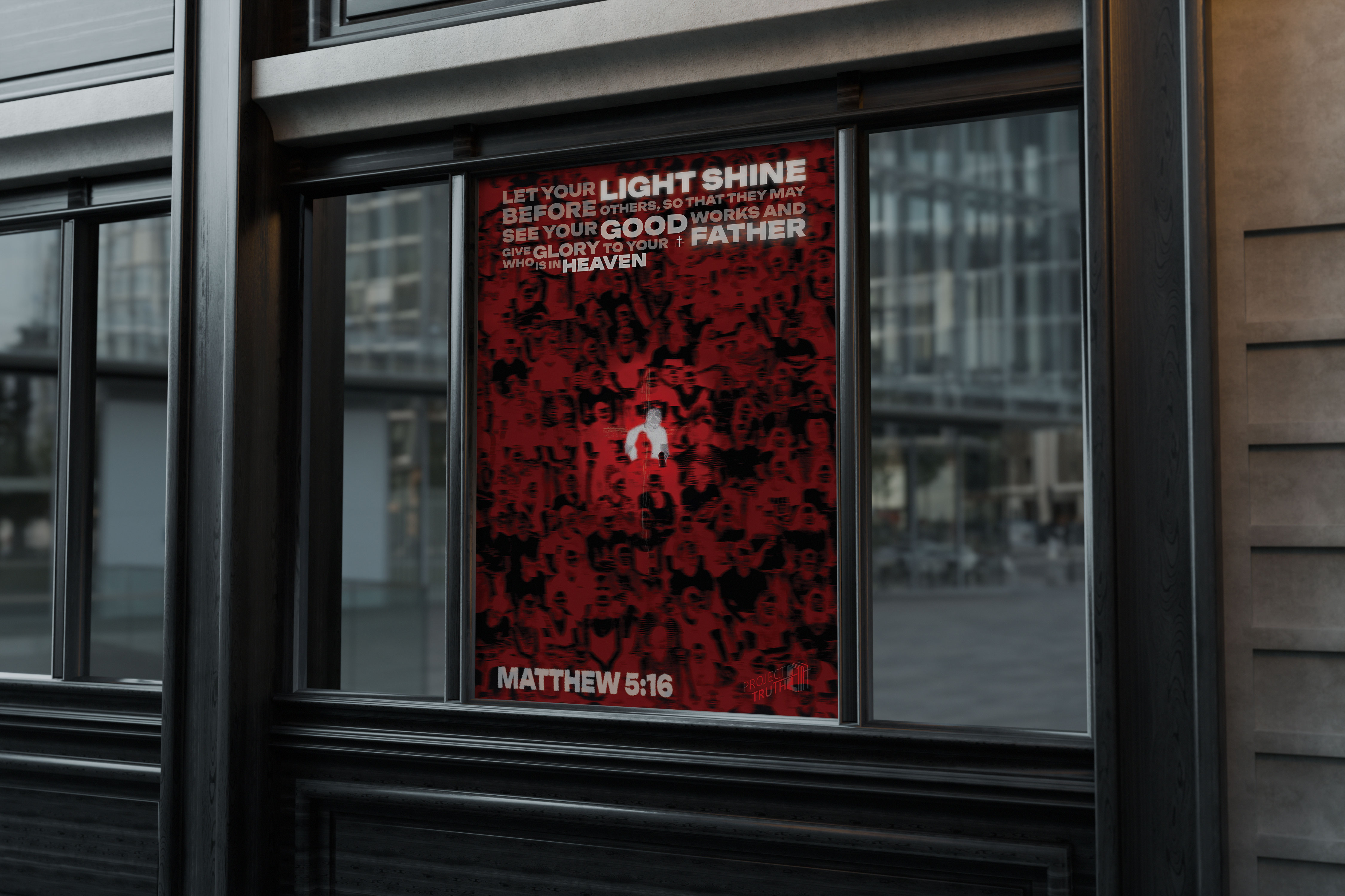
Project Truth is a nonprofit organization dedicated to spreading the Word of God to countries where Christians face religious persecution, with a particular focus on Iran. The organization works to raise awareness in the United States while also helping distribute Bibles to individuals in restricted regions. One of the most meaningful aspects of this mission is the distribution of Farsi-language Bibles, which are designed to resemble everyday notebooks in order to protect those receiving them. The goal of the organization is to support believers in persecuted areas while also building awareness and advocacy in America. This project reflects a mission centered on faith, protection, and the global spread of Jesus.
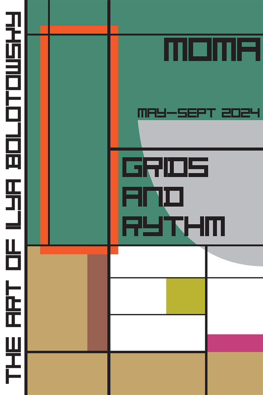
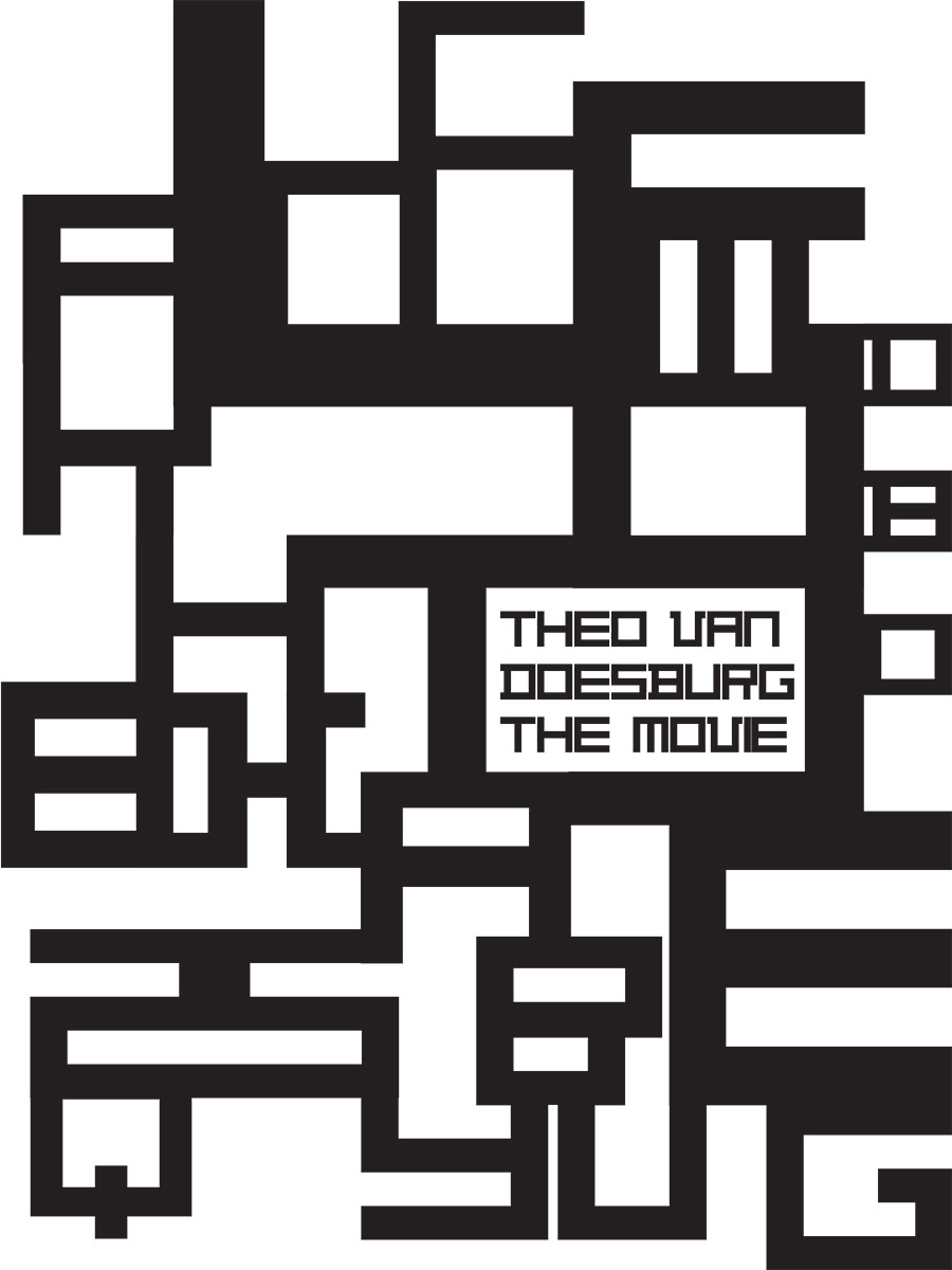
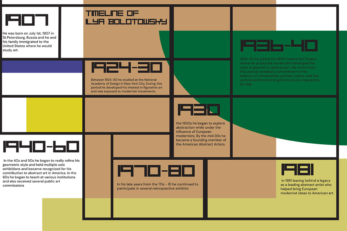
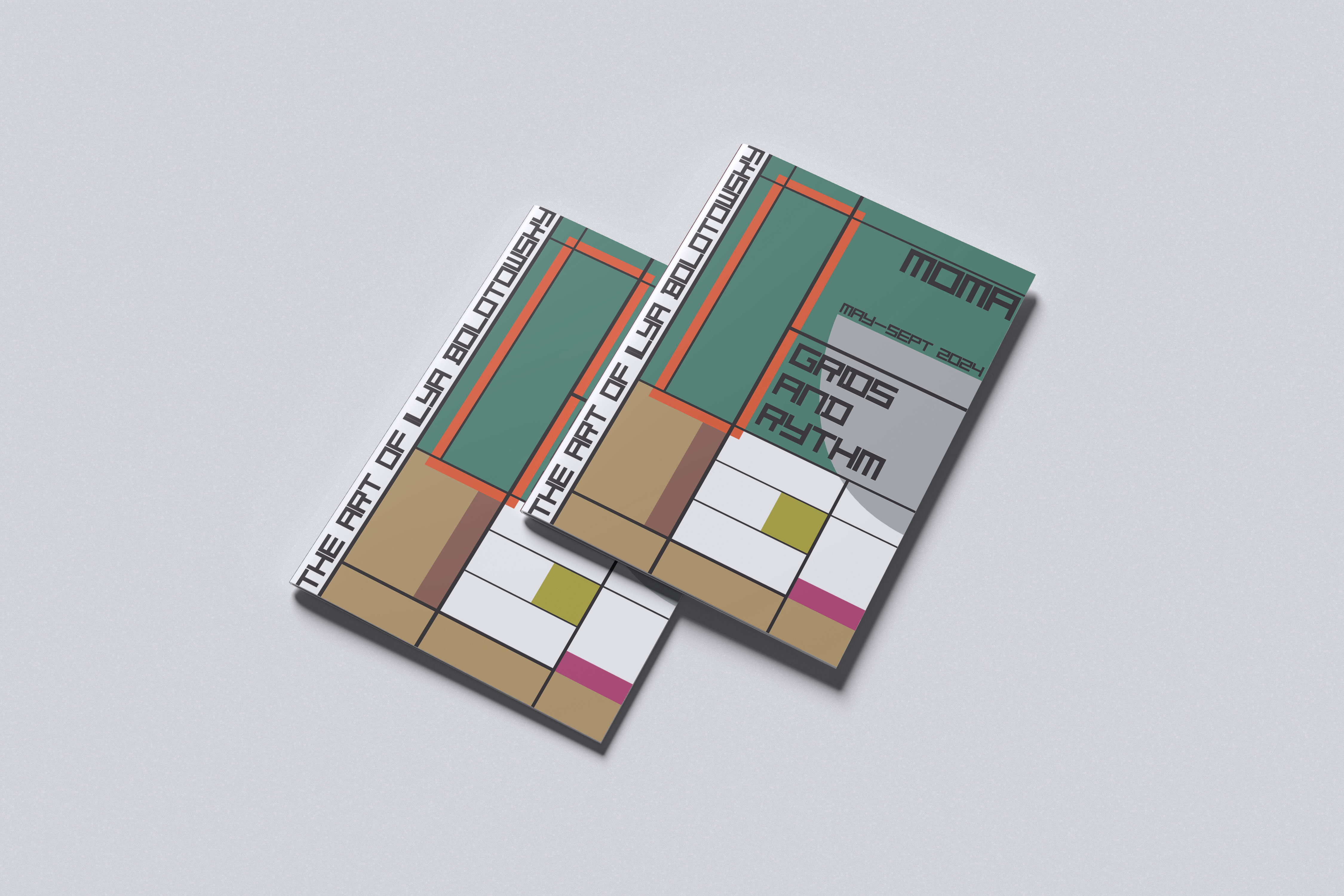
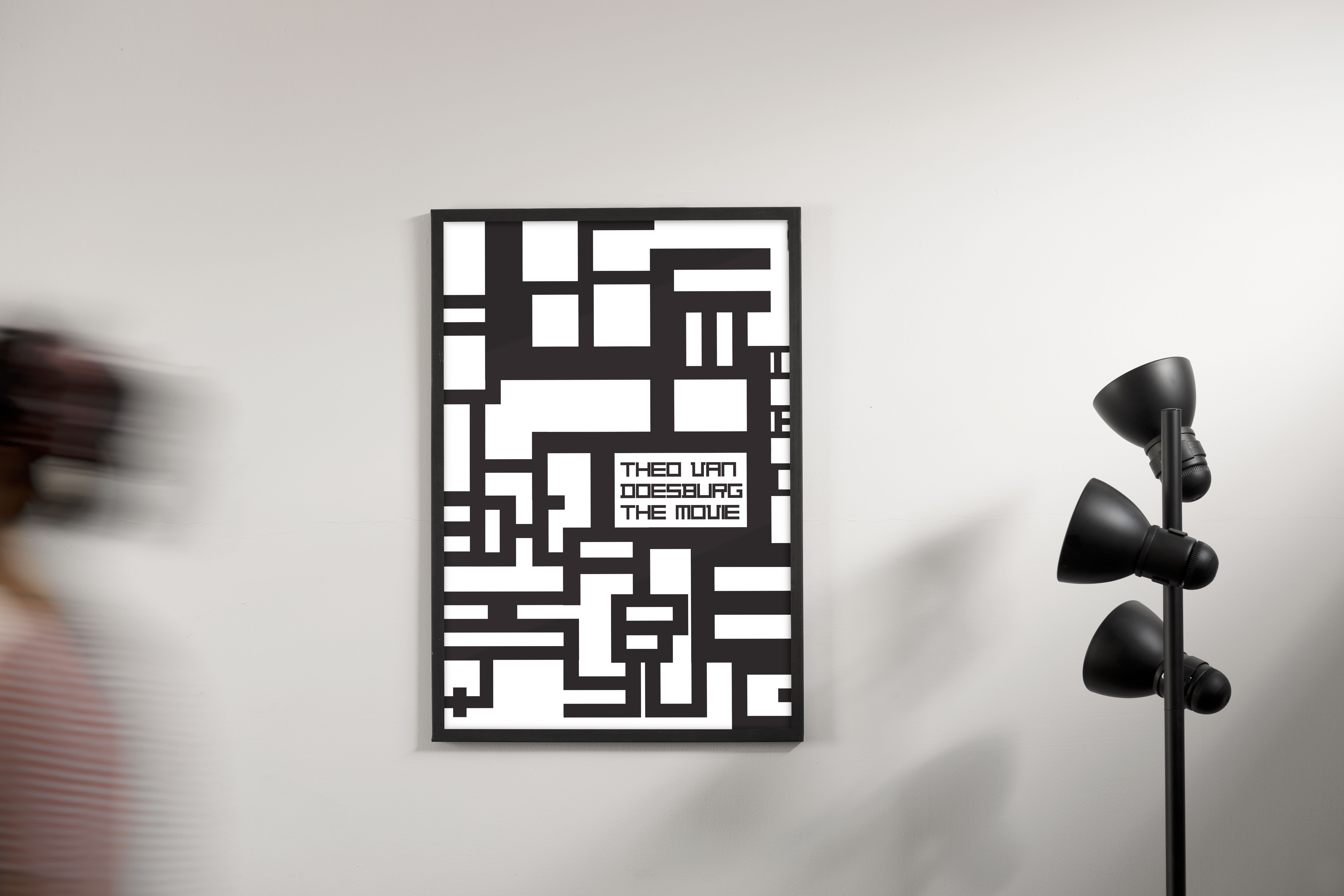
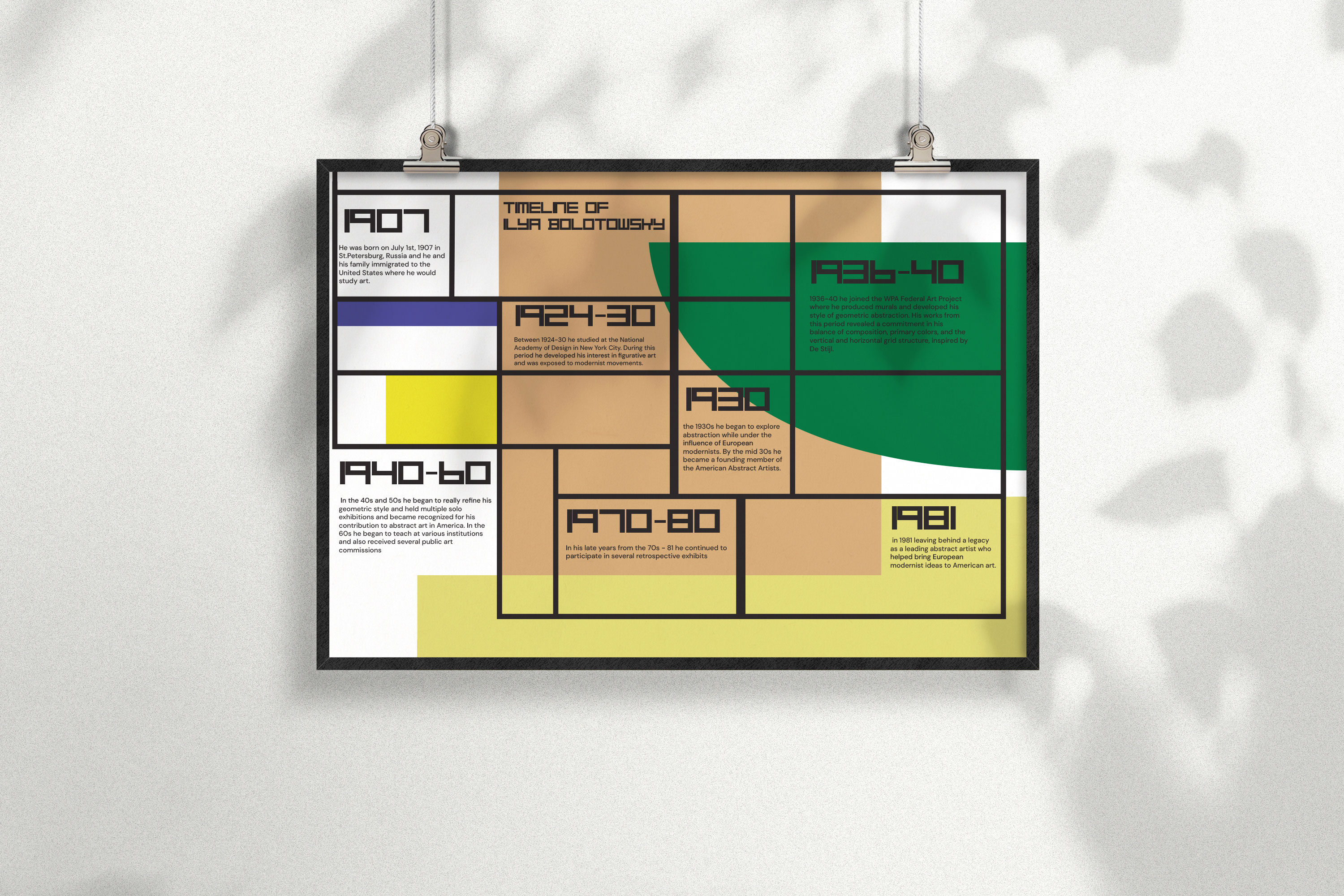
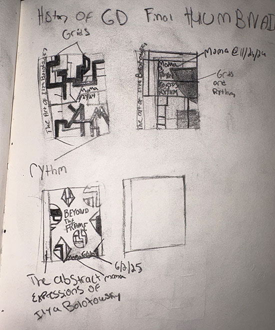
This final project was created for my History of Graphic Design course and centered around researching an underrecognized designer while developing a cohesive visual system inspired by their work. The project also required the use of a single typeface across all deliverables to maintain consistency and conceptual clarity. I chose to base my project on Ilya Bolotowsky and used the Theo van Doesburg typeface as the typographic foundation throughout the series. Inspired by Bolotowsky’s minimalist, grid-based, and structure-breaking compositions, I developed a collection of pieces that translated his visual language into contemporary design outcomes. The final project included a typographic movie poster constructed only from letterforms, a timeline inspired by the artist’s style, and a hypothetical exhibition catalog cover. Together, these pieces demonstrate my ability to work within historical influence, typographic limitation, and a unified design system.
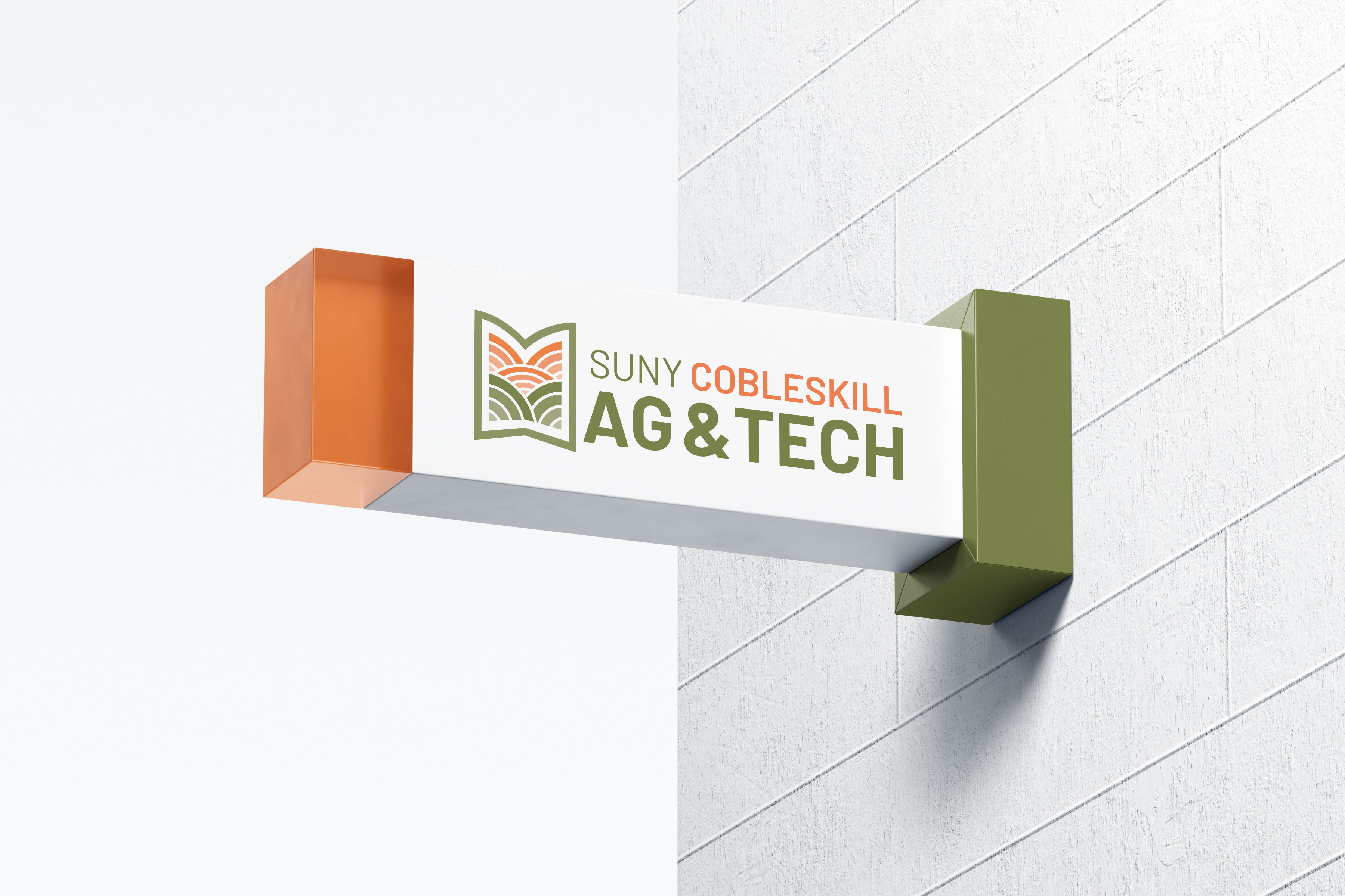
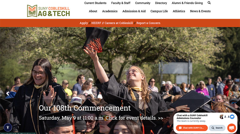
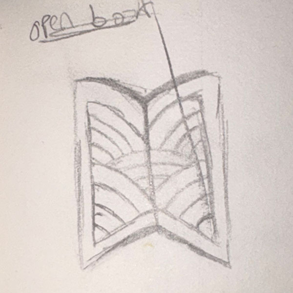
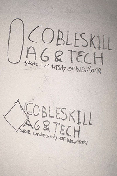
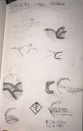
This branding project was developed during my internship with the SUNY Cobleskill Marketing Department, where I worked alongside a team of fellow interns to help ideate, conceptualize, and execute a new visual identity for SUNY Cobleskill. As part of the college’s rebrand, each team member explored a range of logo concepts and visual directions for the institution. One of my logo concepts was ultimately selected as the final mark for the official SUNY Cobleskill Ag & Tech rebrand. Inspired by the structured abstraction of Frank Stella, I developed a sleek, minimal, and modern wordmark that visually references the rolling hills of Cobleskill contained within the form of an open book. The final identity was designed to reflect both the academic foundation and agricultural character of the college through a clean and contemporary visual system.

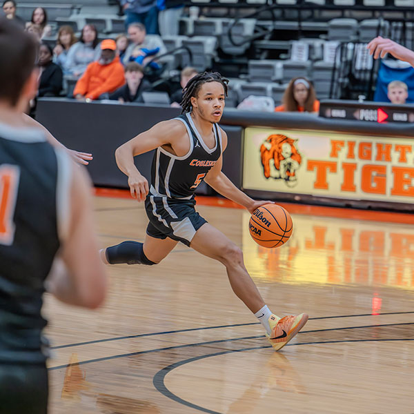
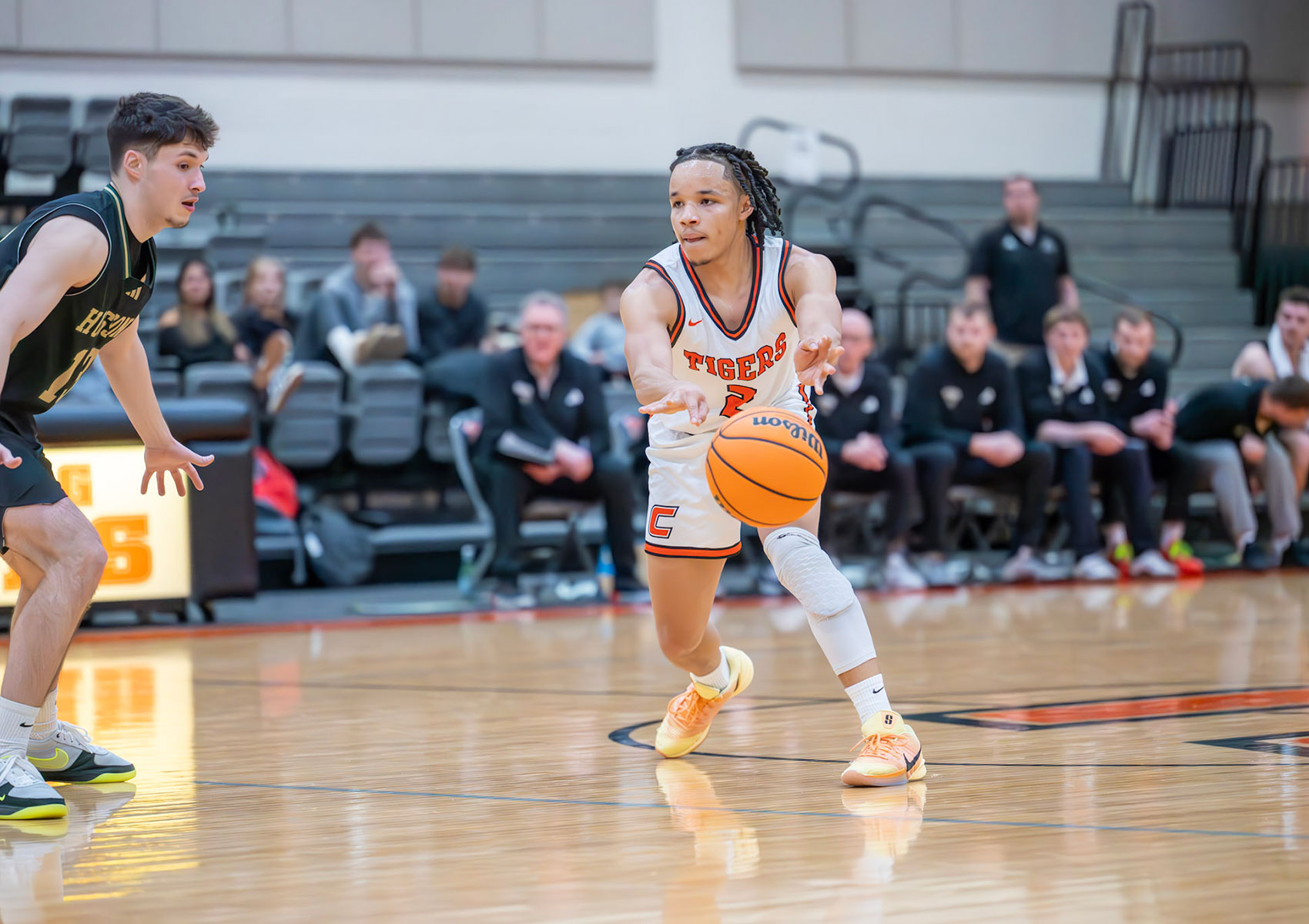
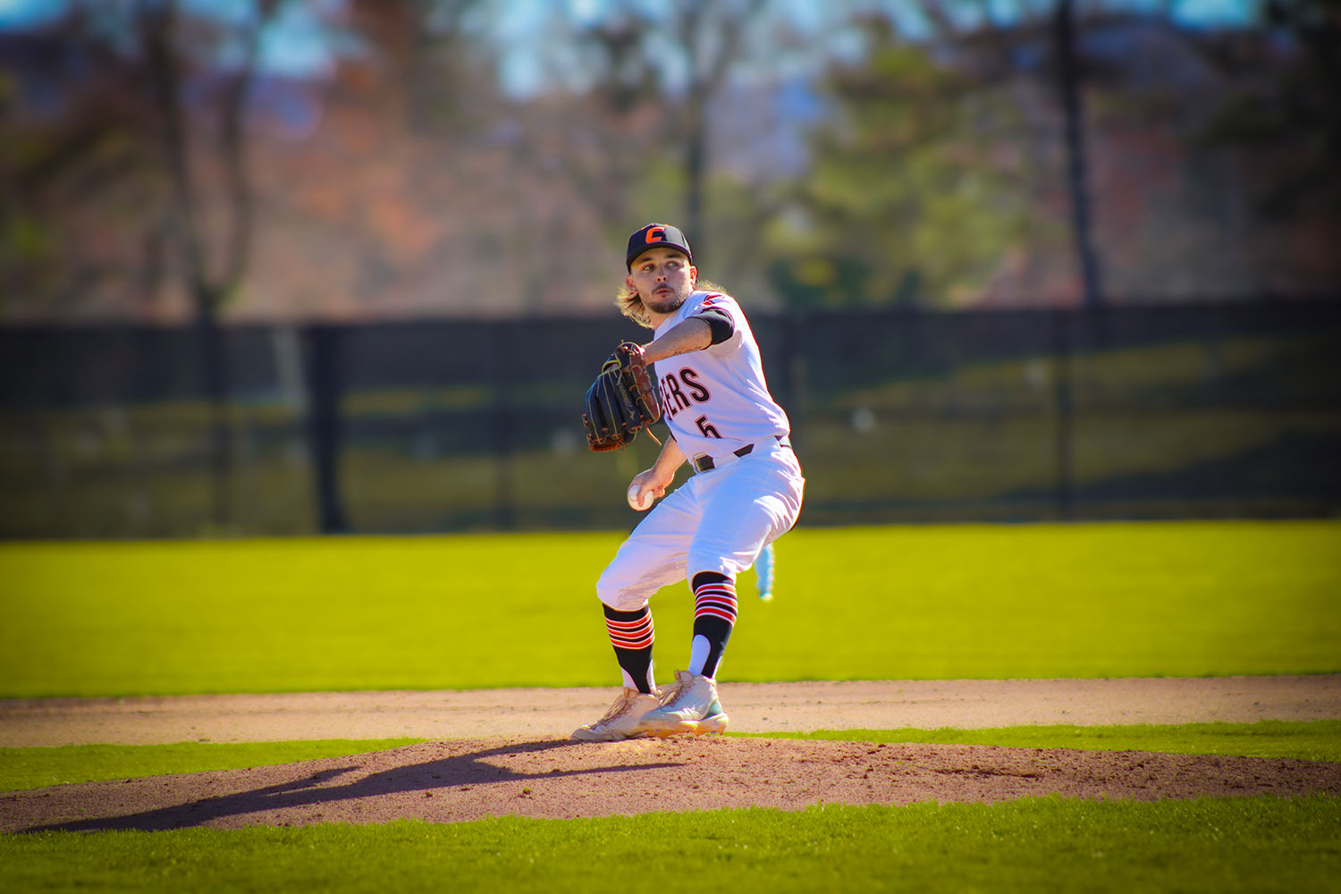
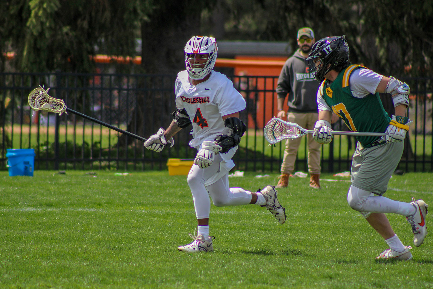
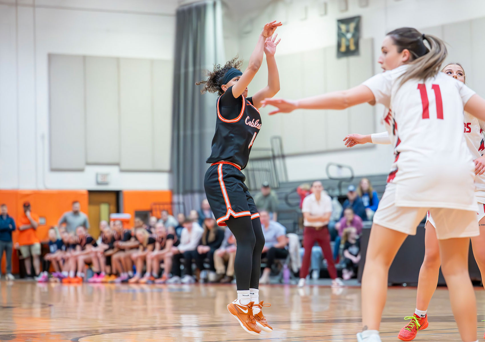
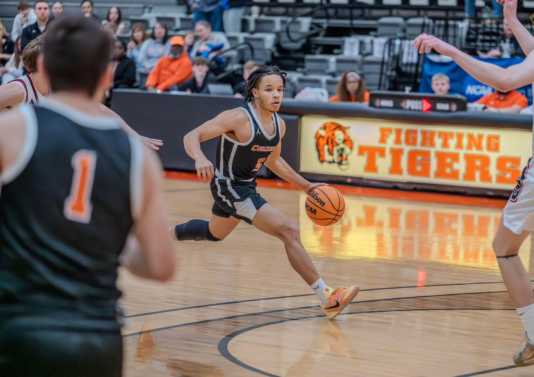
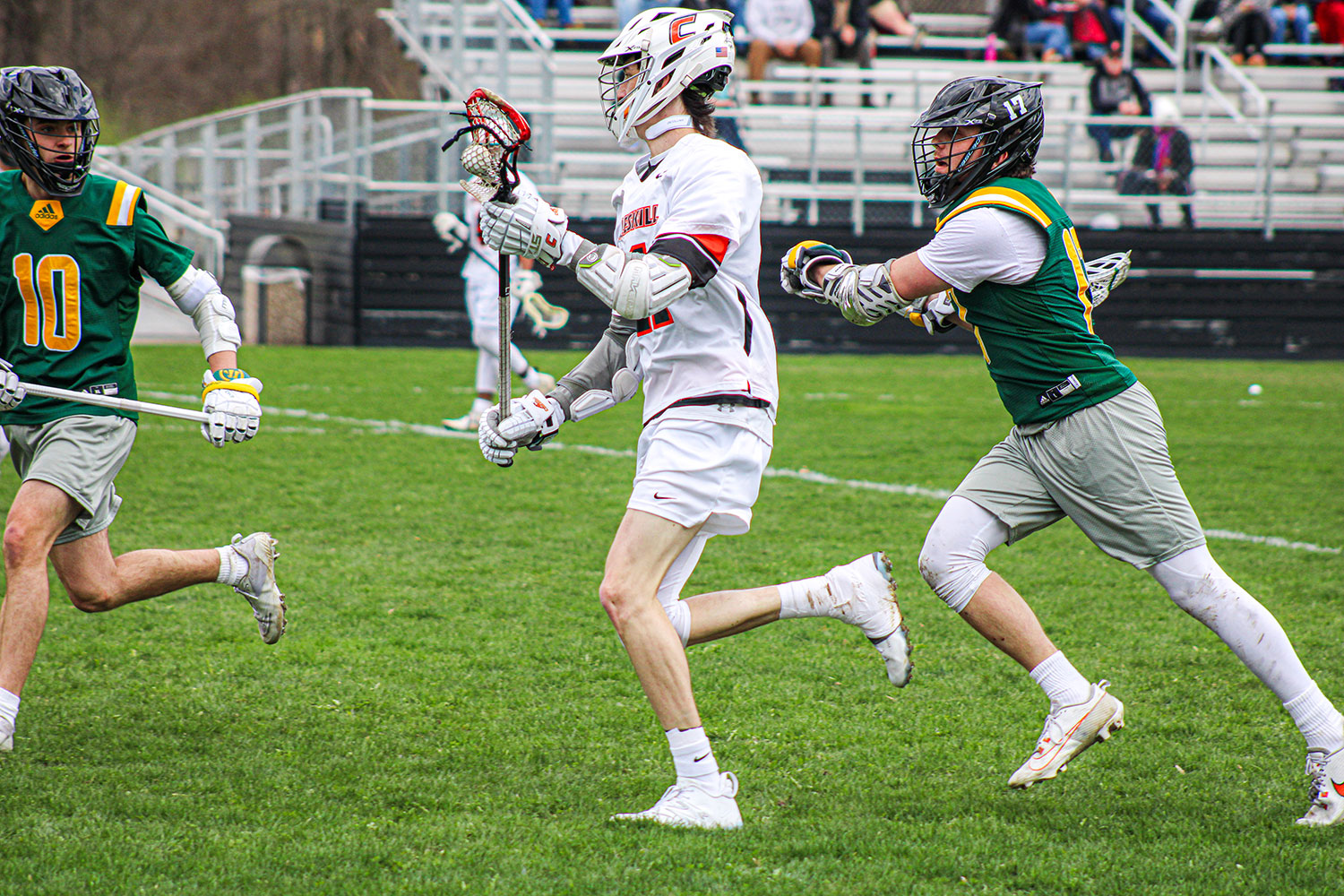
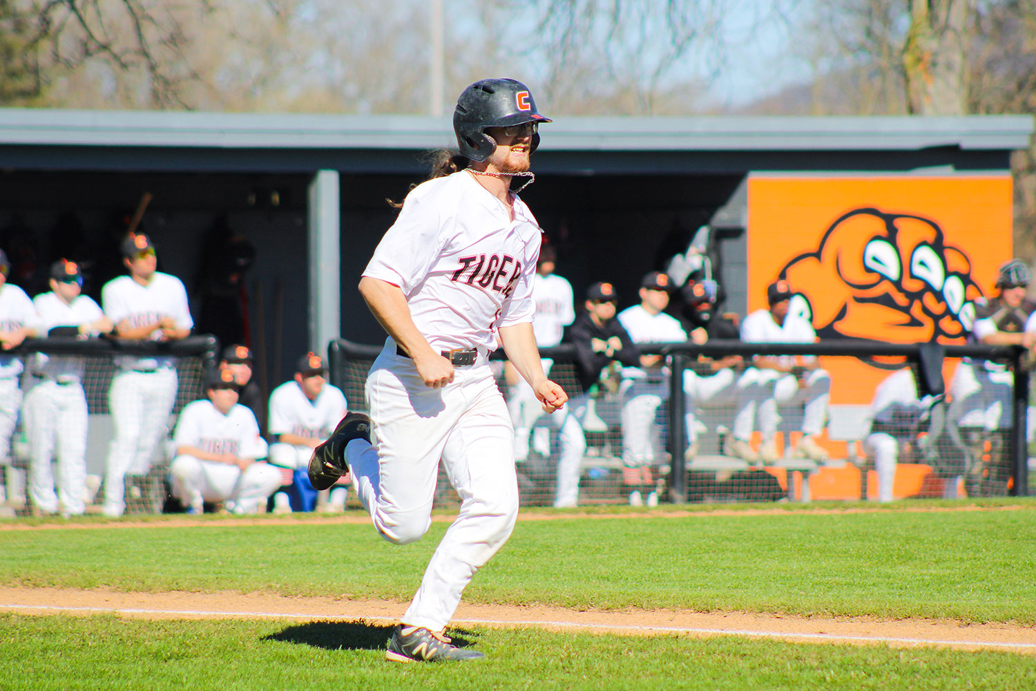
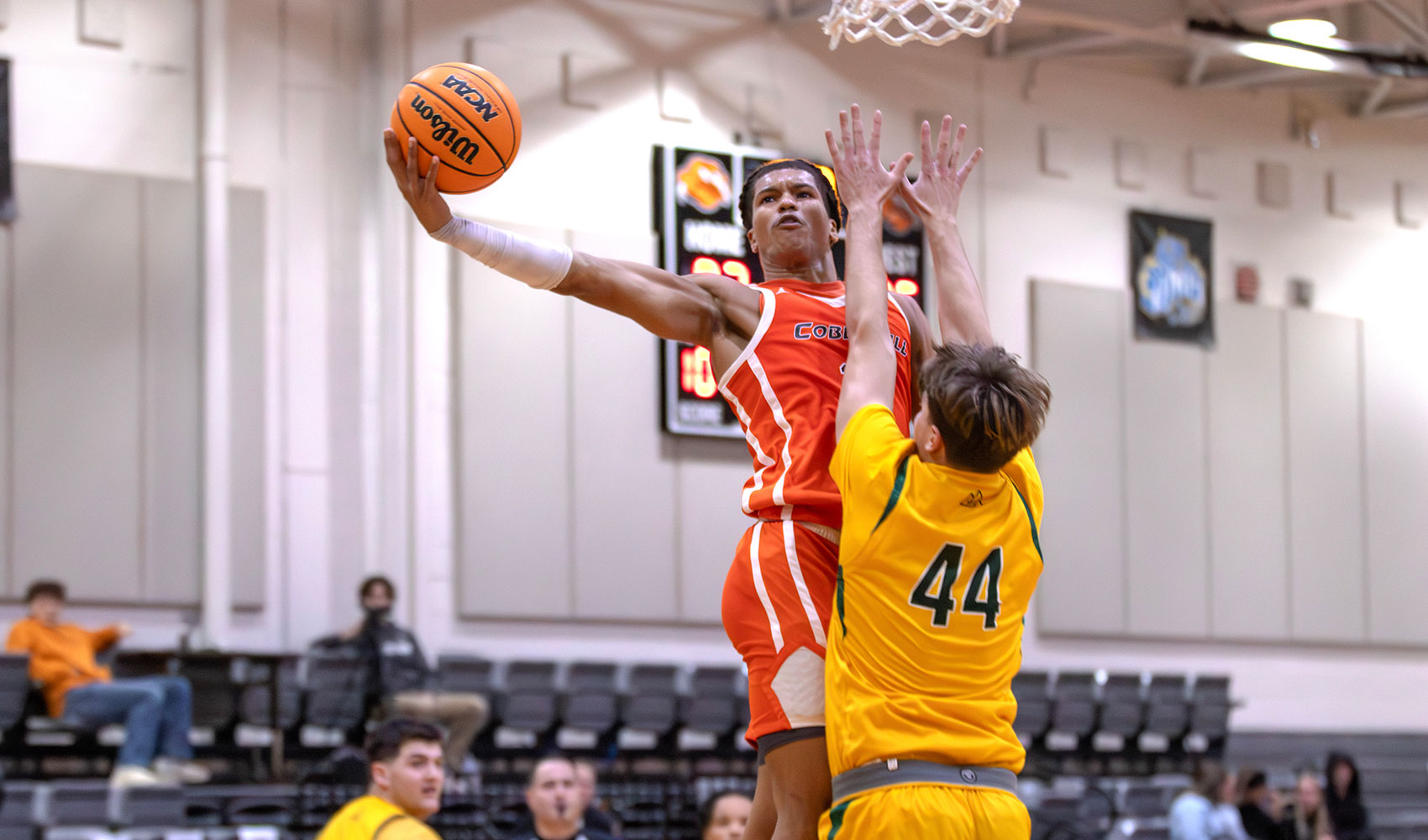
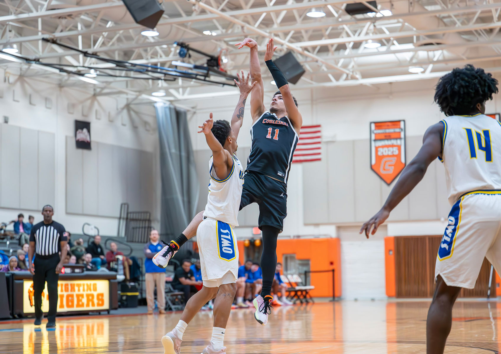
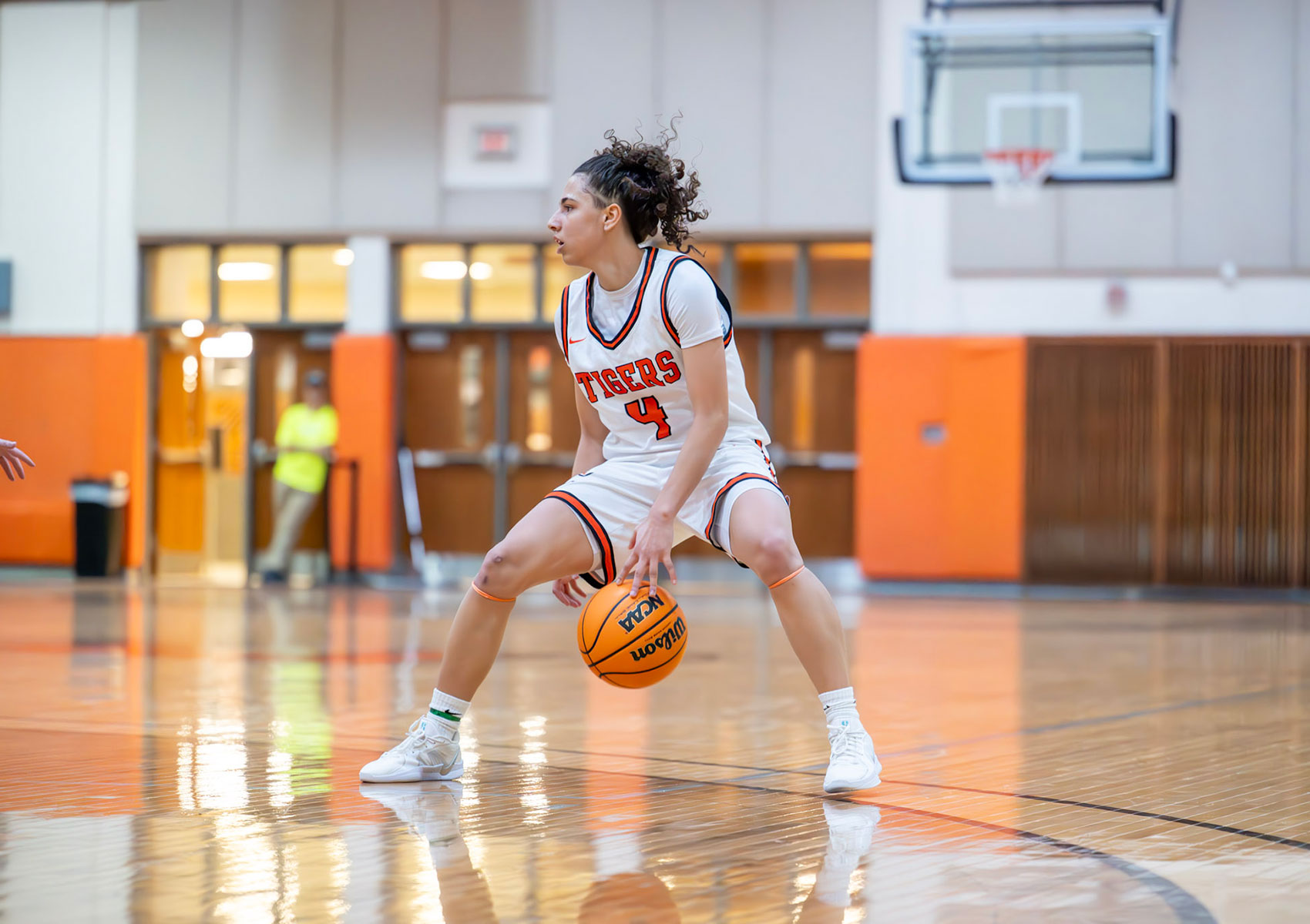
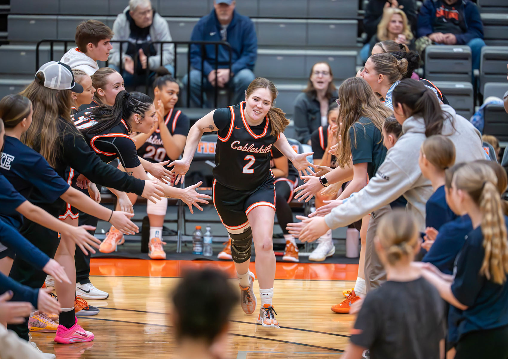
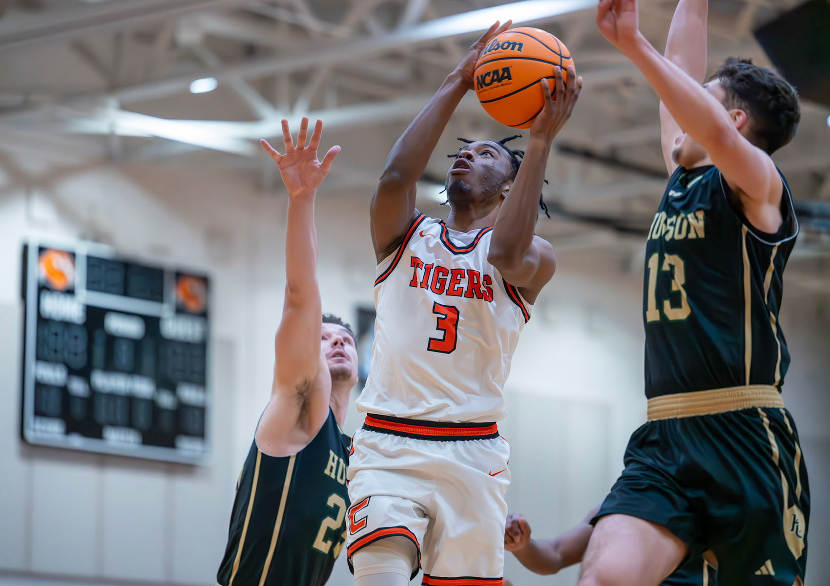
During my time at SUNY Cobleskill, I worked as one of the school’s primary sports photographers, documenting athletic events across campus. This role gave me the opportunity to grow technically and creatively while capturing fast-paced moments in real time. Sports photography taught me how to anticipate action rather than direct it, allowing me to focus on timing, emotion, and authenticity within each frame. Through this work, I developed a stronger ability to capture movement, intensity, and the emotional energy that defines live competition.
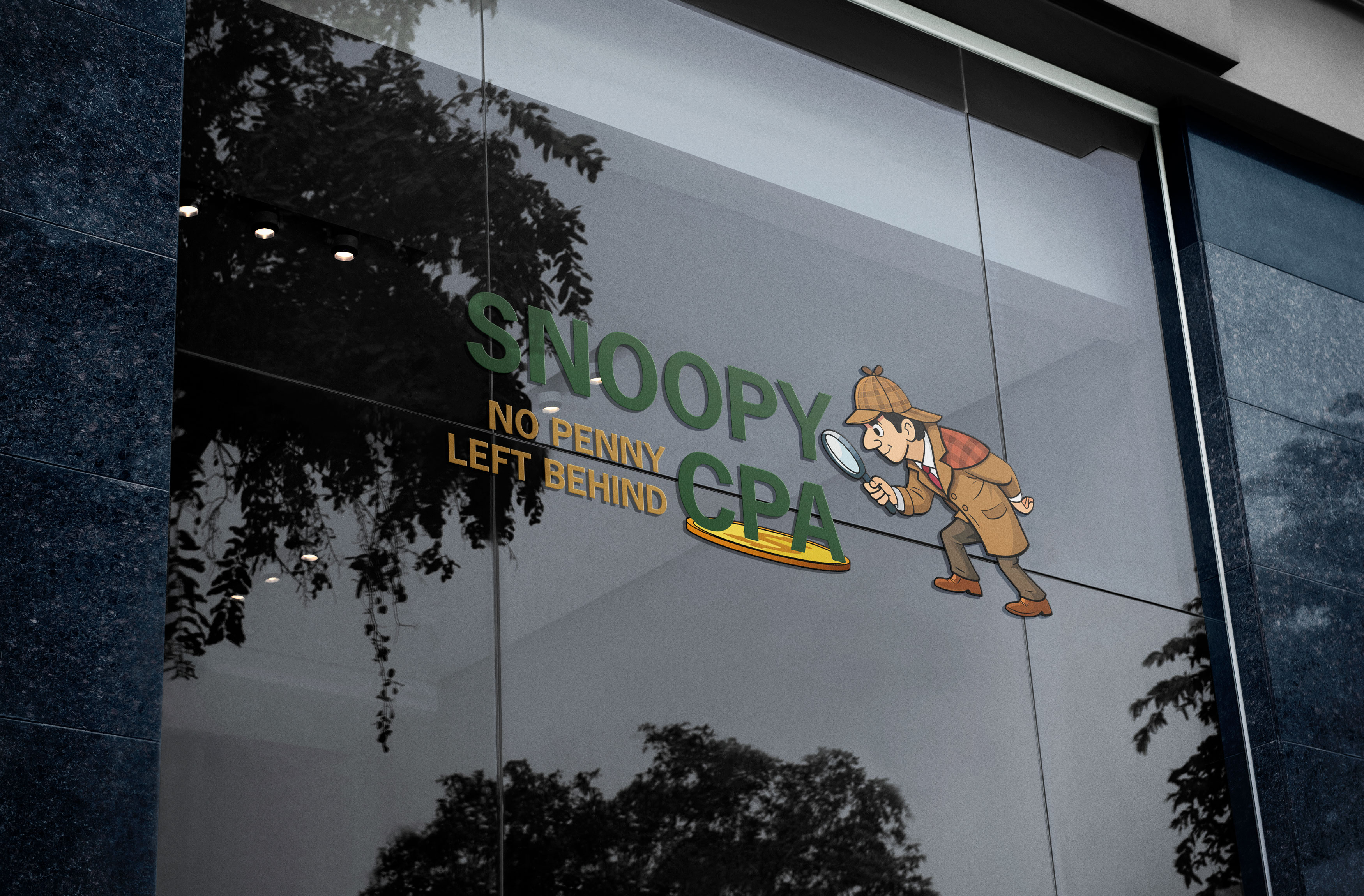
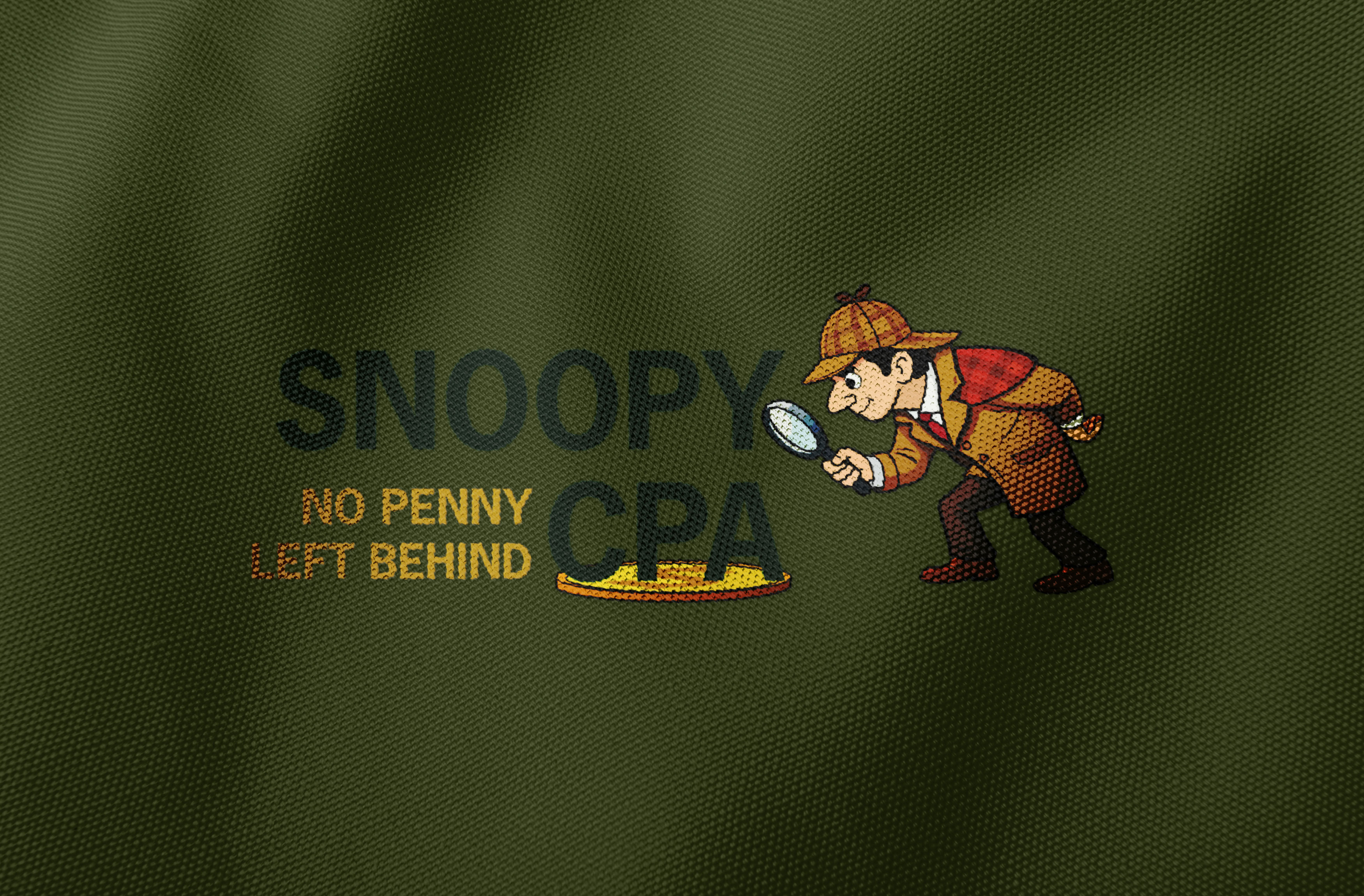
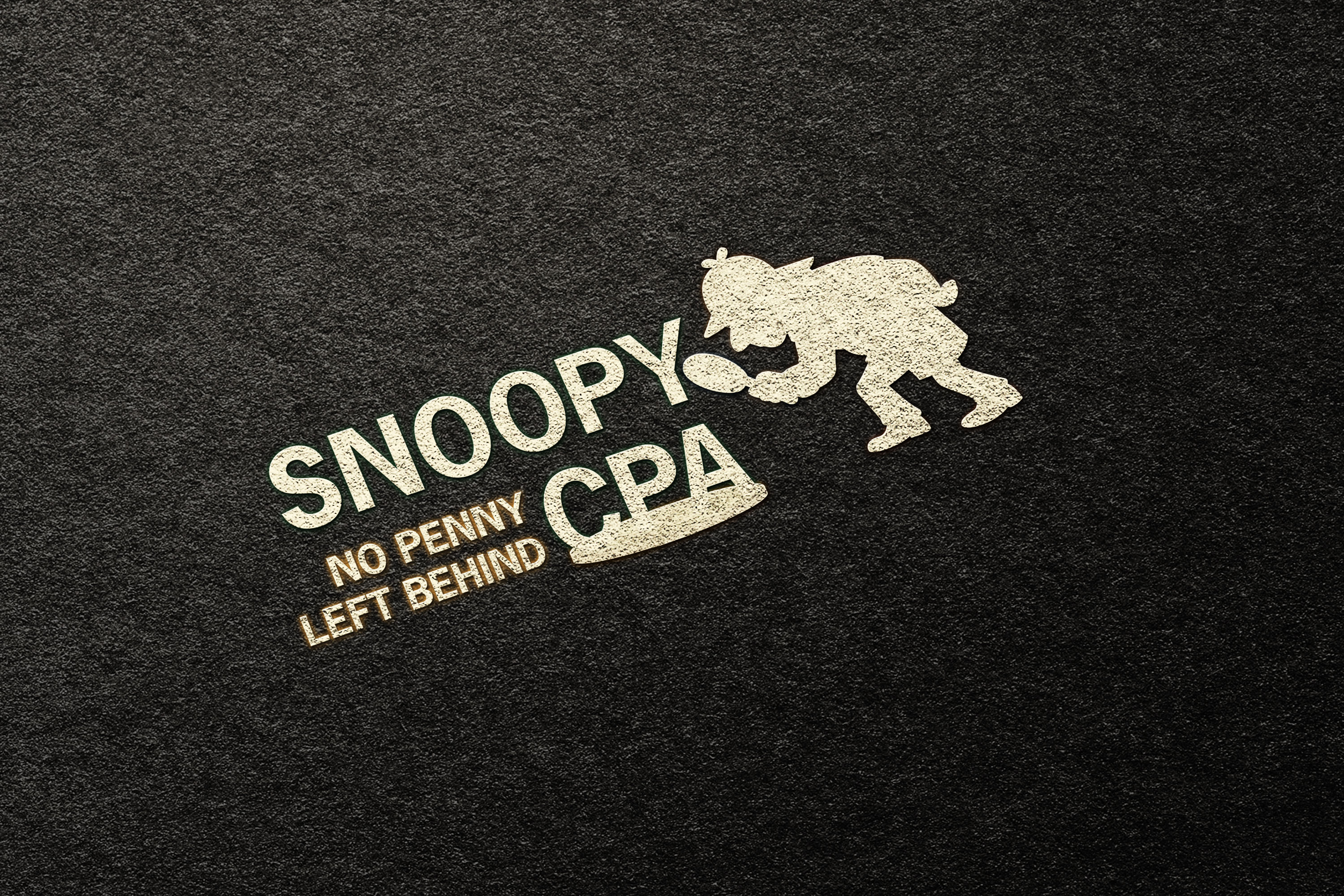
This freelance branding project was created for a startup certified public accountant firm specializing in tax returns and audits. The client wanted a logo that felt memorable and approachable while centering around the slogan “No Penny Left Behind.” To bring that concept to life, I developed a playful investigator-style cartoon identity that visually reinforced the idea of attention to detail and financial accuracy. The final logo balances character and professionalism, creating a brand that feels friendly, distinctive, and trustworthy while still maintaining the credibility expected from an accounting business.
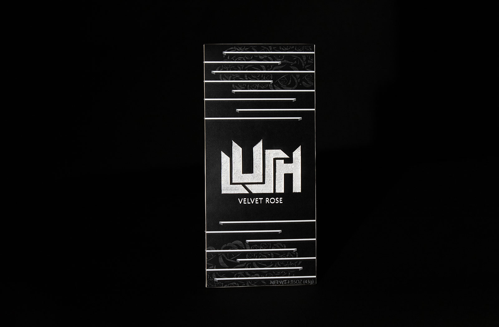
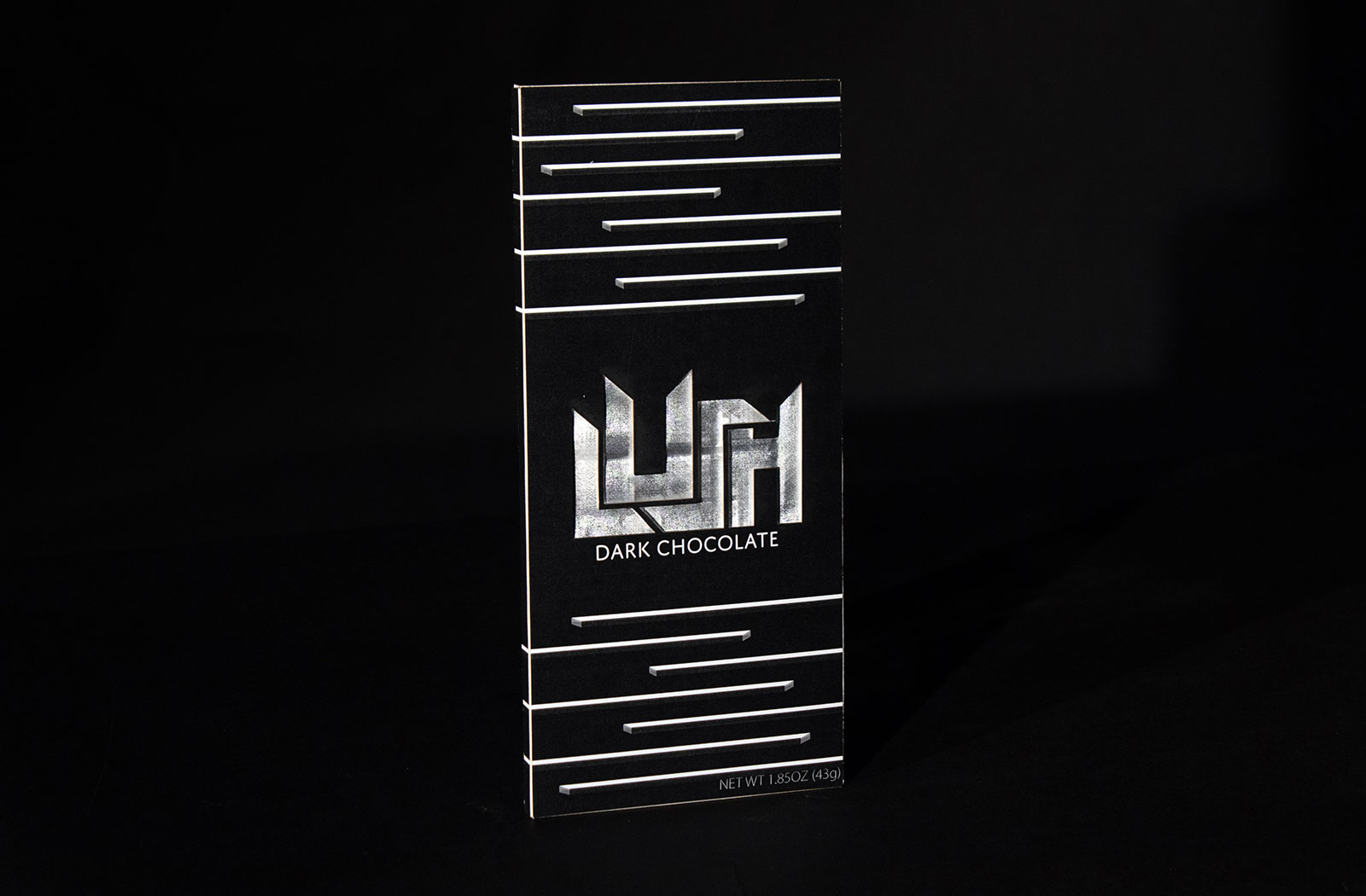
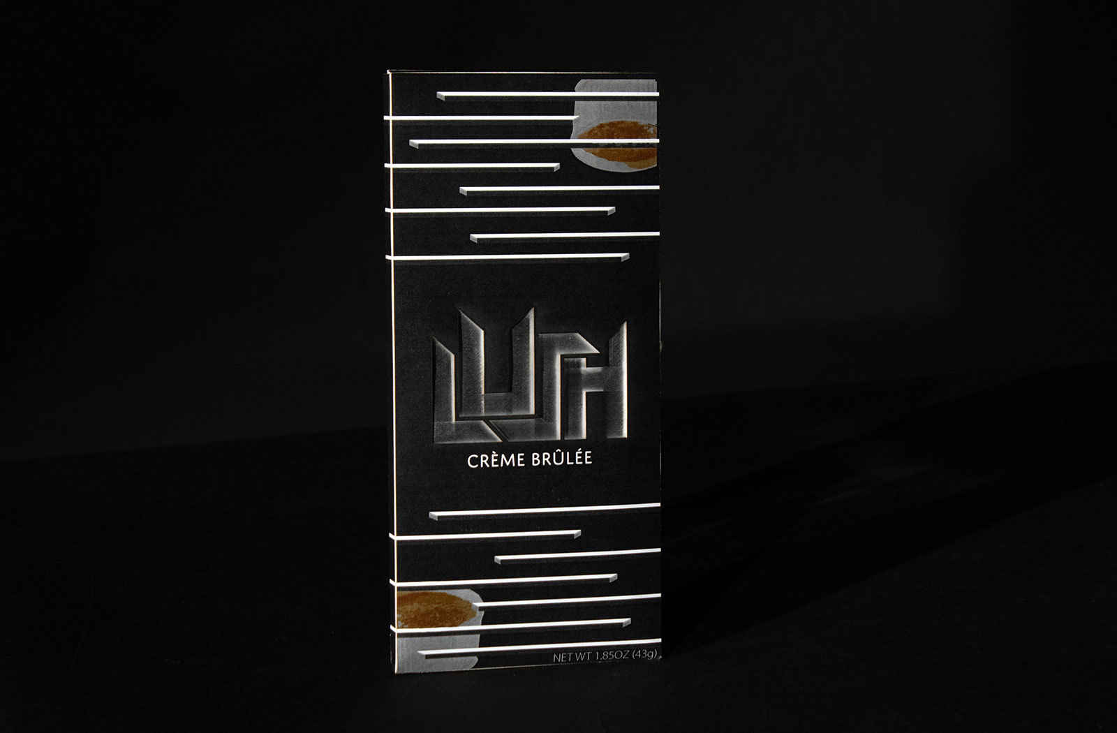
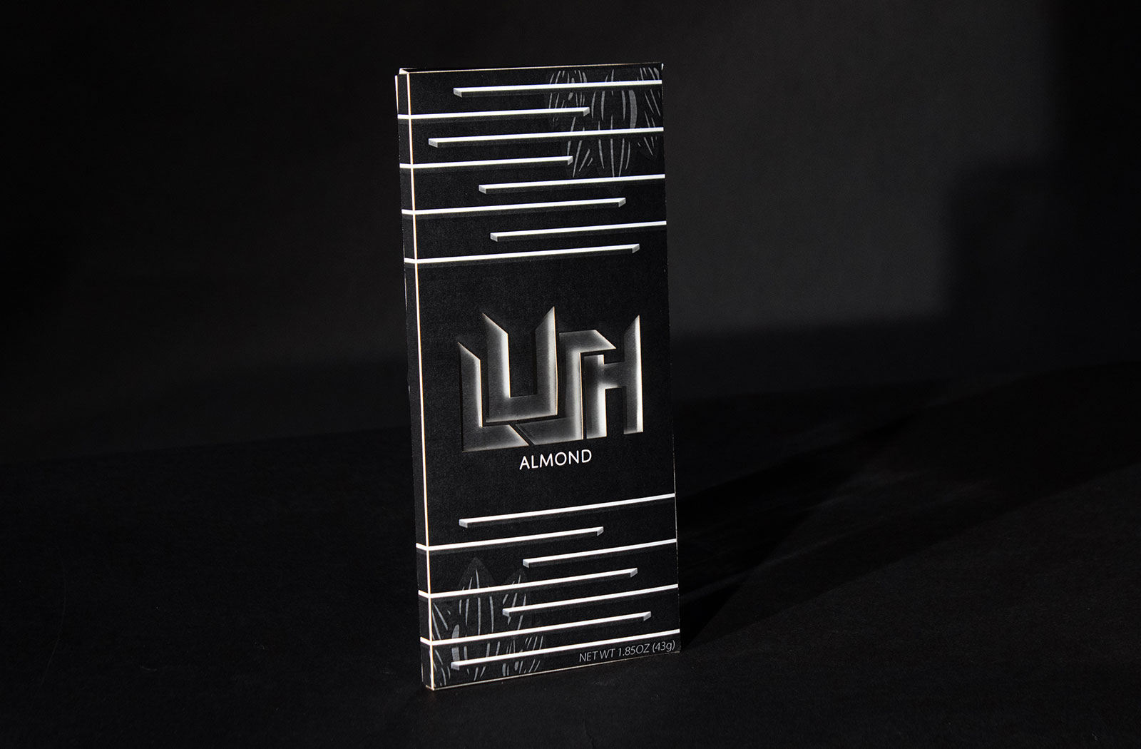
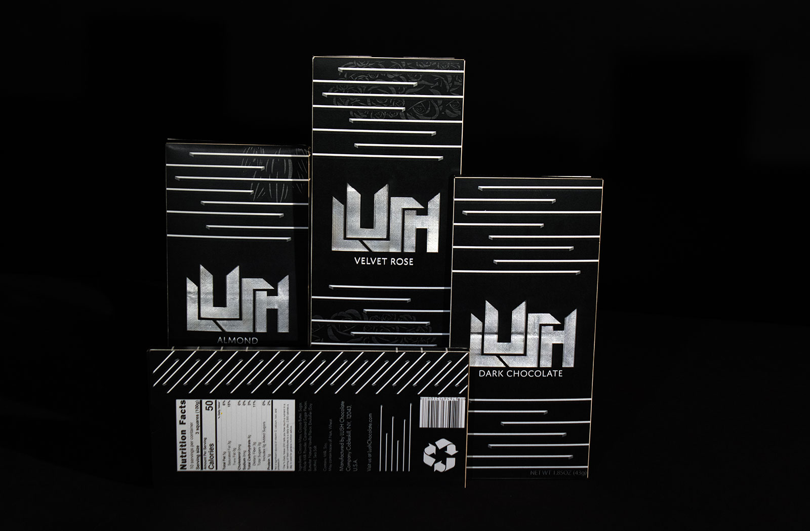
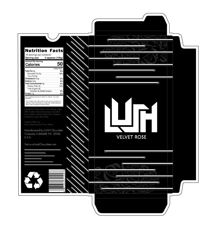
This packaging project was created as part of a class assignment to design a chocolate bar with full creative freedom. The goal was to develop a cohesive brand and packaging system that could extend across multiple flavors. I approached the design with a modern and minimalist aesthetic, making the logo the primary focal point of each package. The system includes three distinct flavors, unified through consistent typography, layout, and color variation. In addition to the visual design, I developed custom die lines and cut structures for each package, ensuring the final product could be fully assembled and function as real-world packaging.


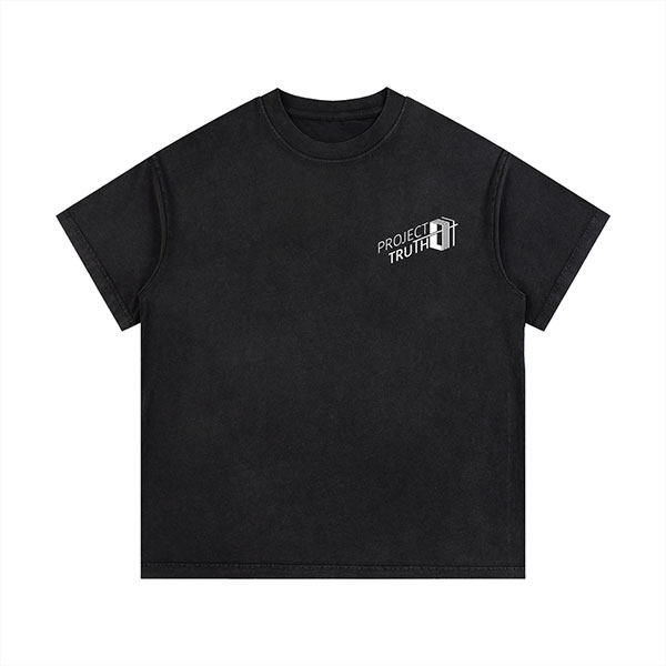
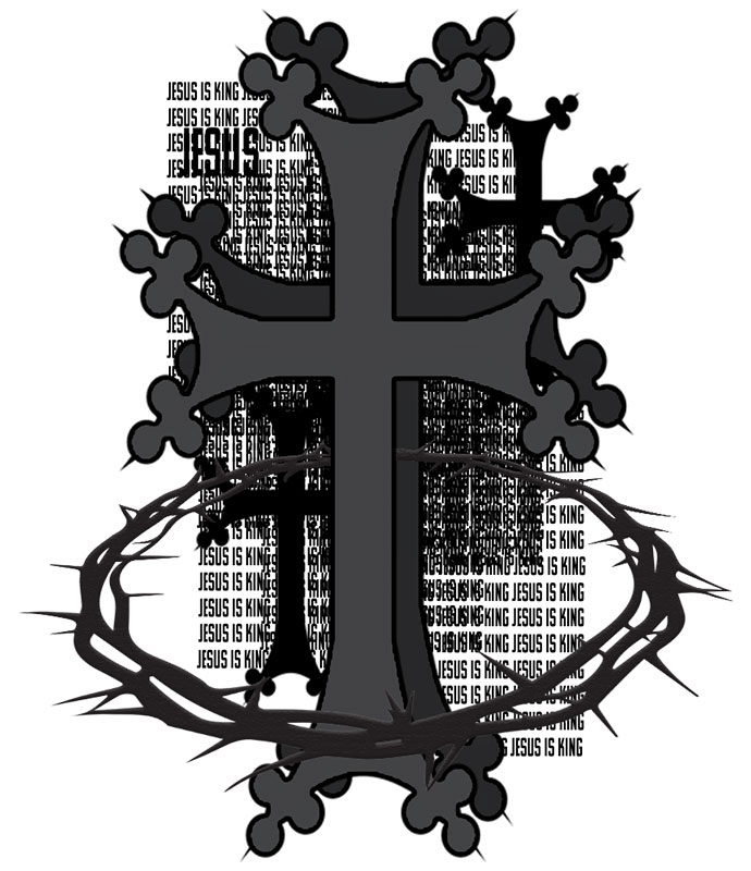
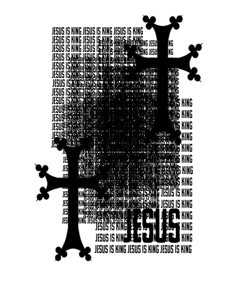
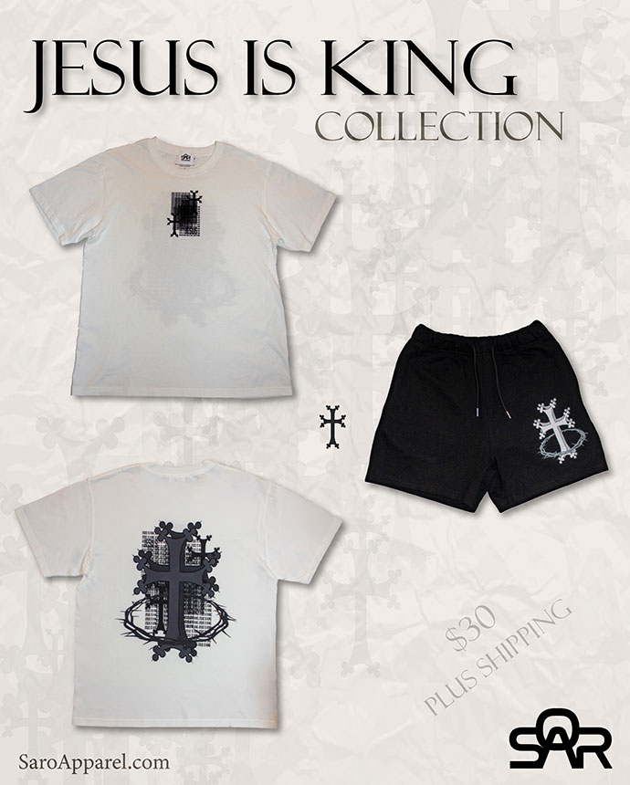
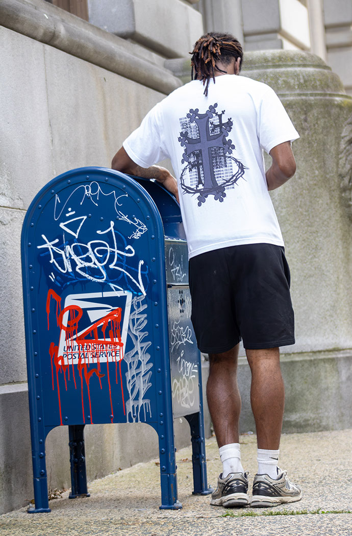
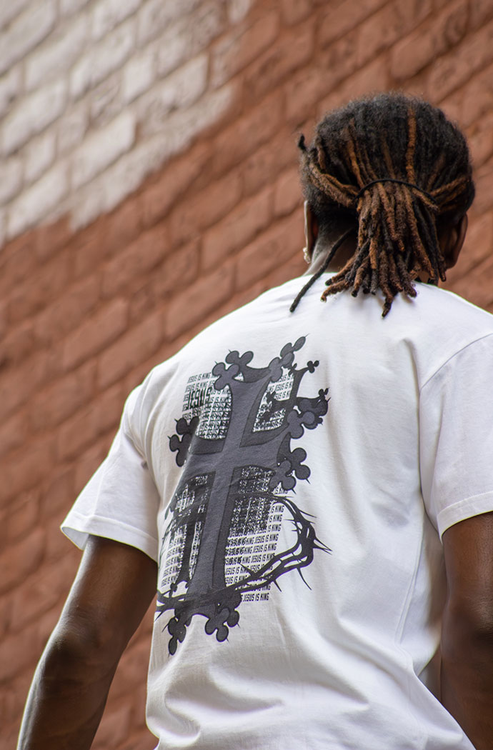
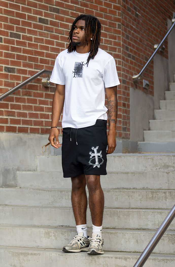
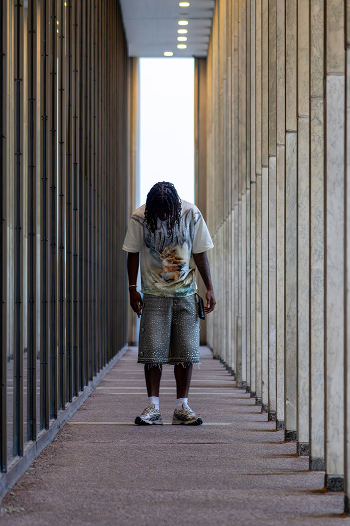
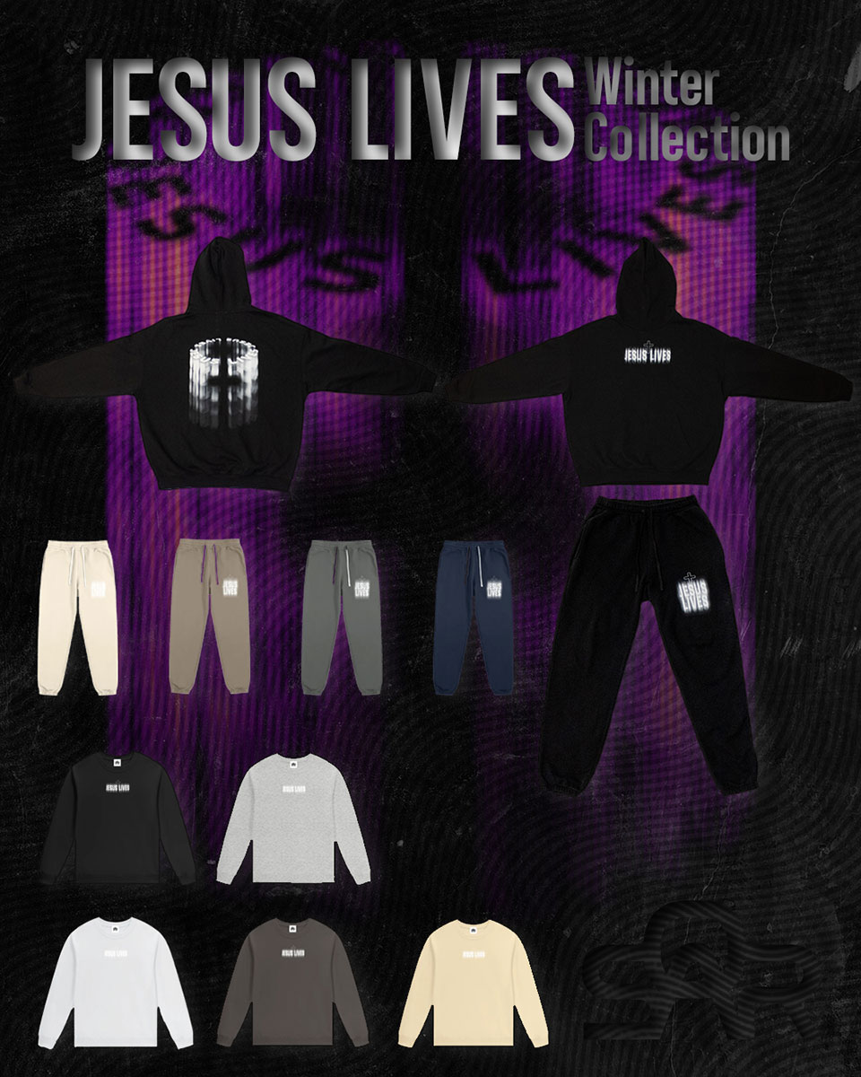
This apparel design was created as part of the first collection for my clothing brand, Saro Apparel. For the brand’s debut drop, I wanted to develop pieces that combined typography and graphic design within a wearable streetwear format while establishing a clear identity as a Christian-inspired brand. The goal was to create clothing that felt stylish and desirable enough for everyday wear, while also communicating faith in a subtle but meaningful way. Through type-driven design and intentional visual messaging, the collection was designed to balance contemporary streetwear aesthetics with a message centered brand identity.
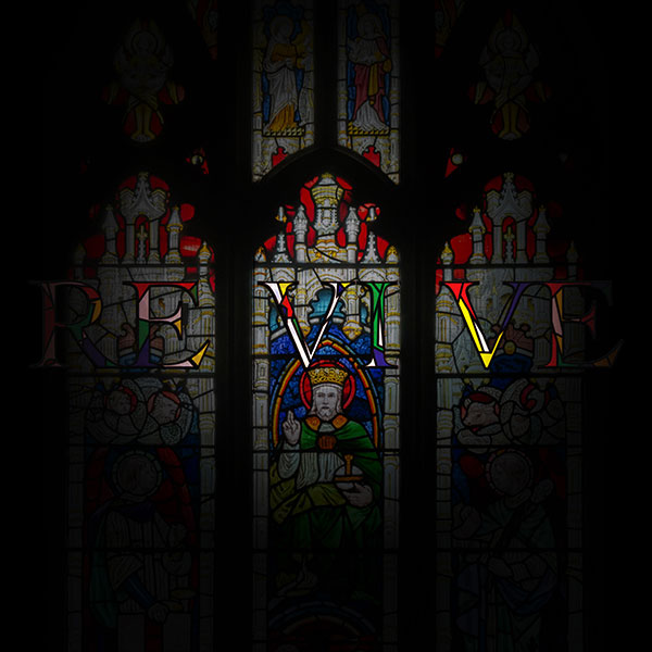
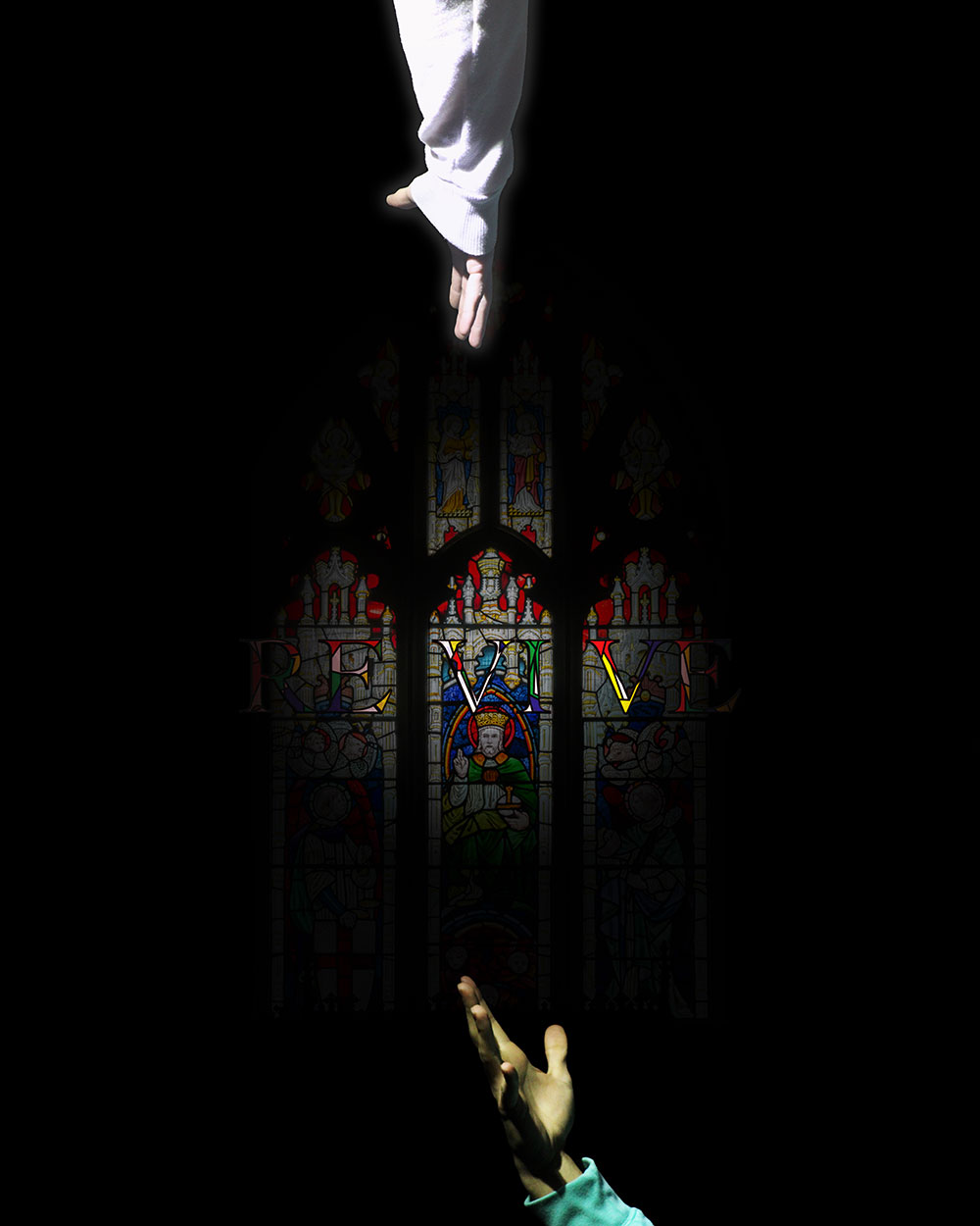
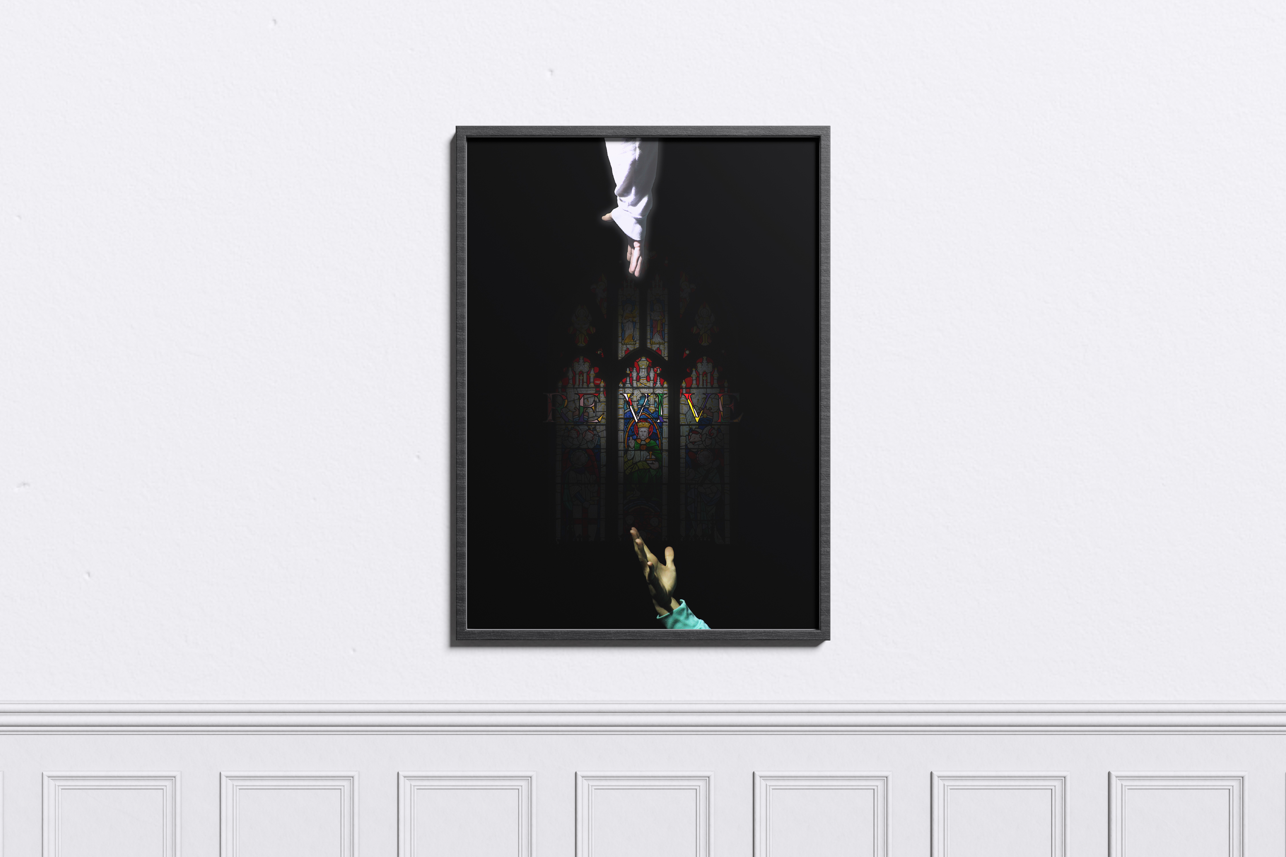
This conceptual poster was created as part of a class project in which each student was assigned a single word to visually interpret. My assigned word was “Revive,” and the goal of the project was to integrate the typography into the composition so that the word became part of the image rather than the dominant focal point. I approached the concept through themes of renewal, restoration, and faith. The composition features a luminous hand representing God reaching toward a darker hand symbolizing someone in need of revival. To further support the message, I blended the word “Revive” into a stained-glass church-inspired visual treatment, allowing the typography to feel embedded within the spiritual atmosphere of the piece. The final poster combines symbolism, image-making, and typographic integration to communicate the idea of being made new.
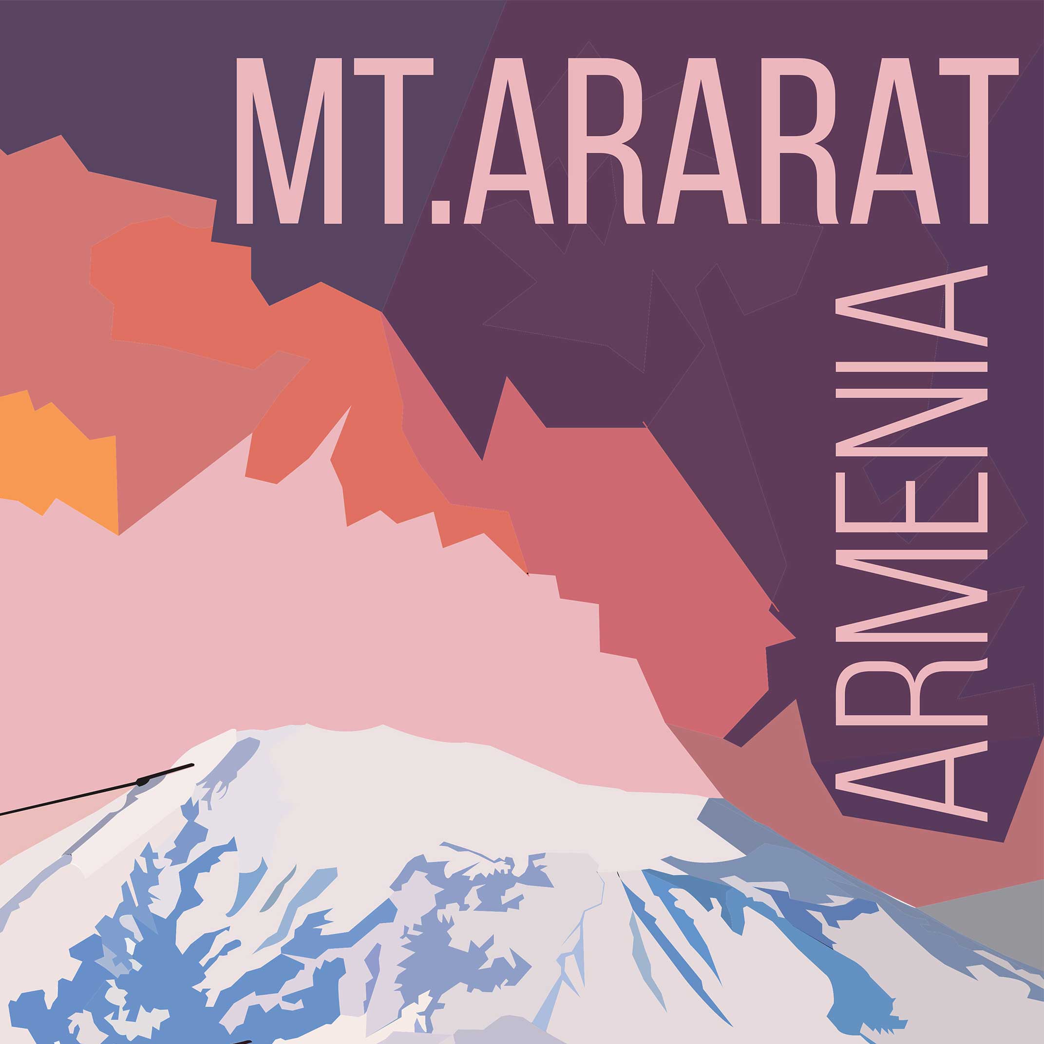
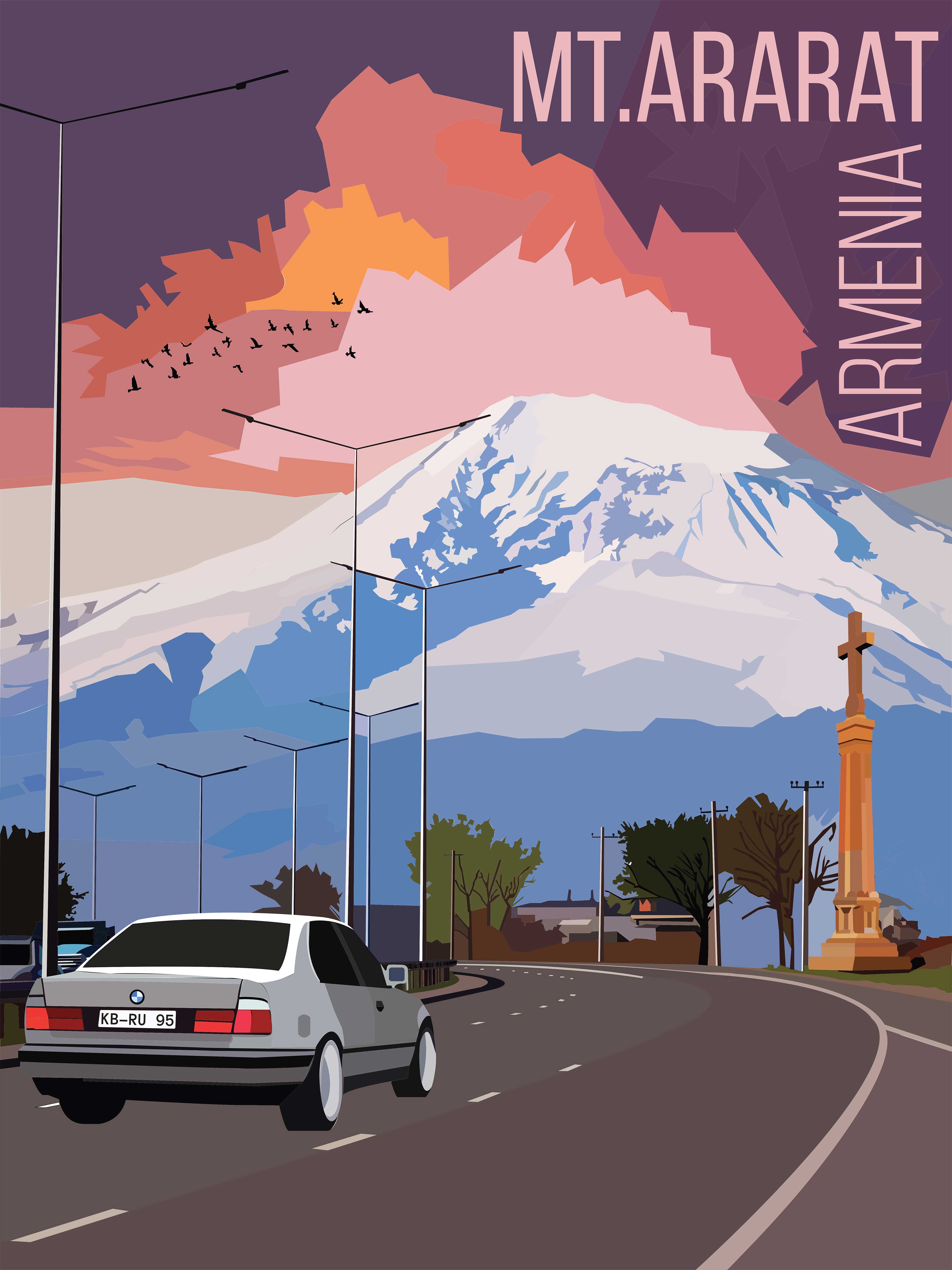
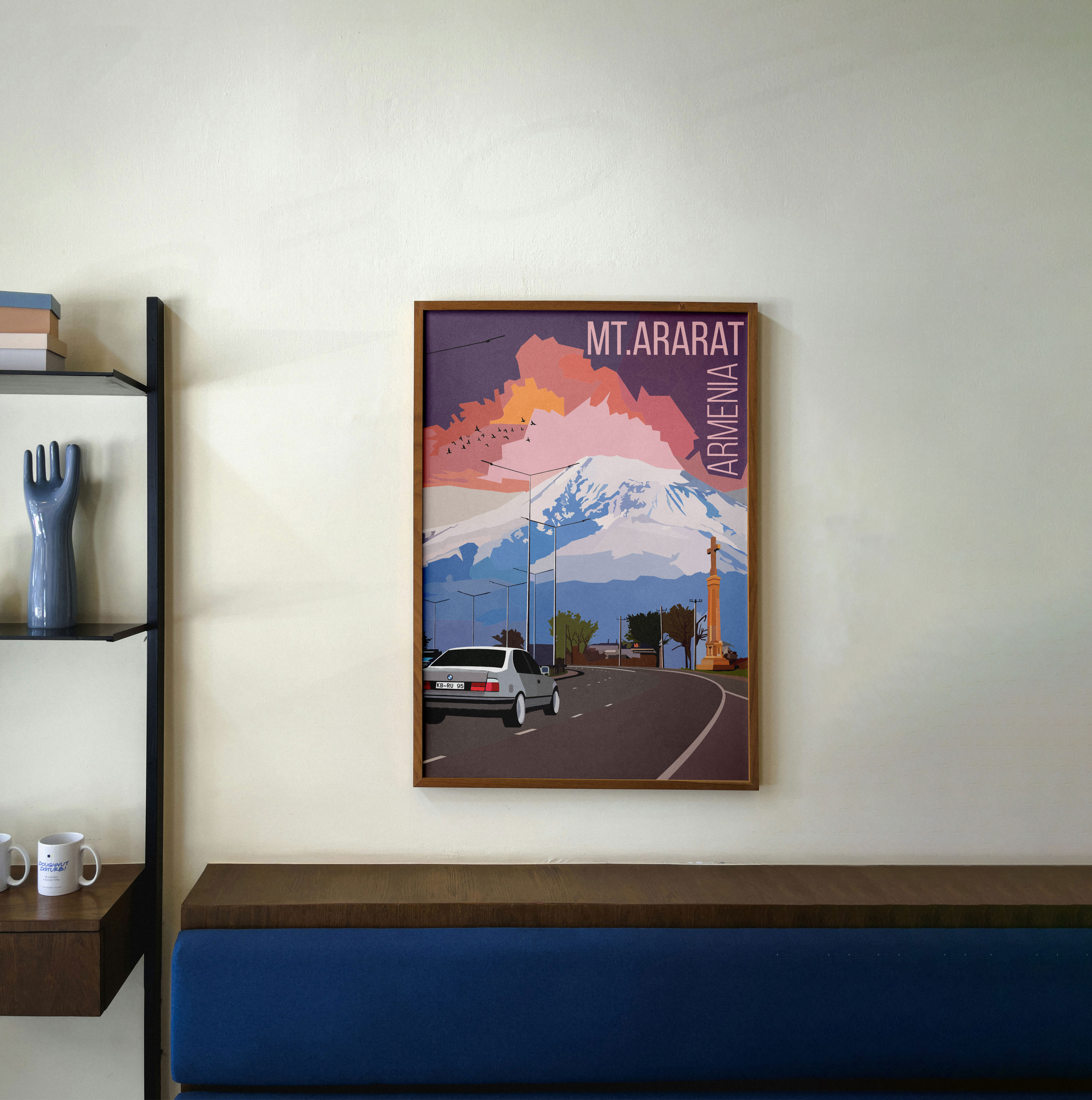
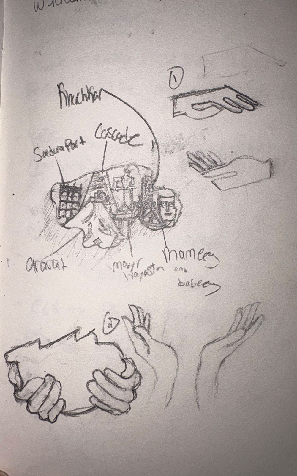
This travel poster was created as part of a class project focused on designing a destination based visual that incorporated culturally significant symbolism. Given the freedom to choose any city or location, I chose to center my poster around Armenia as a reflection of personal identity and cultural heritage. The composition is built around Mount Ararat, one of the most recognizable and meaningful symbols in Armenian culture. Additional elements were included to reflect broader themes of faith, identity, and lifestyle, such as a cross monument and a vintage car, to reference cultural pride and visual familiarity. The final poster blends symbolism, atmosphere, and composition to create a piece that feels both personal and visually impactful.
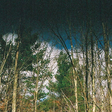
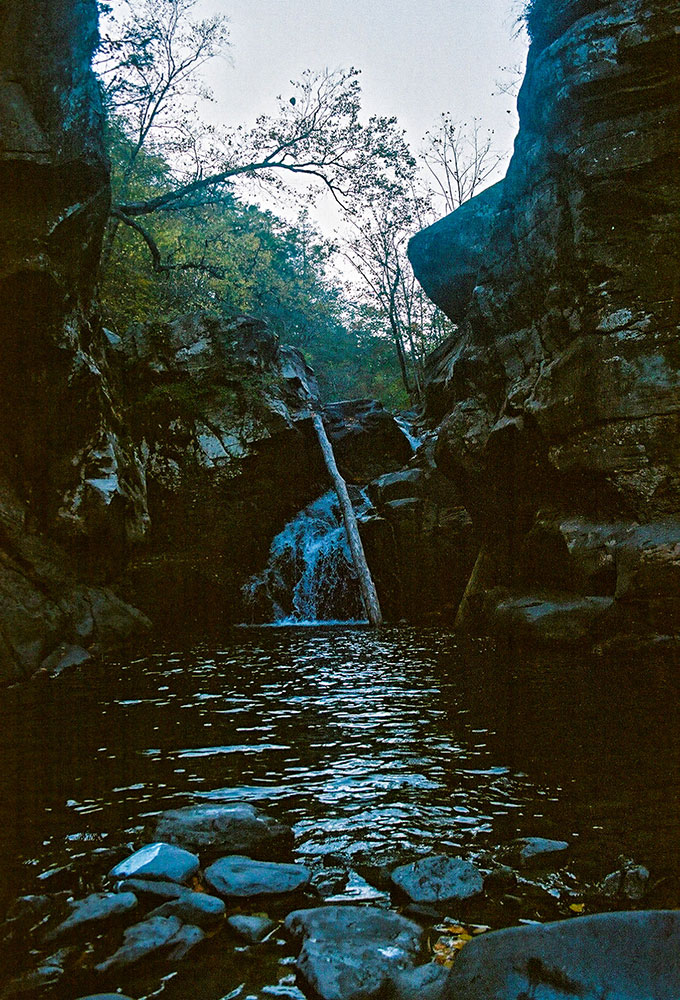
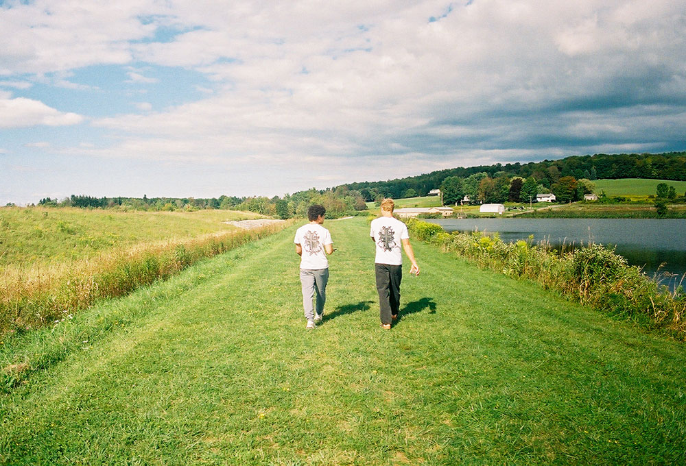
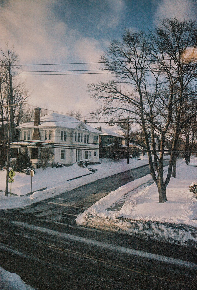
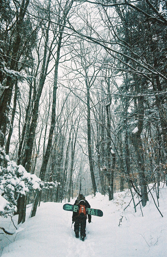
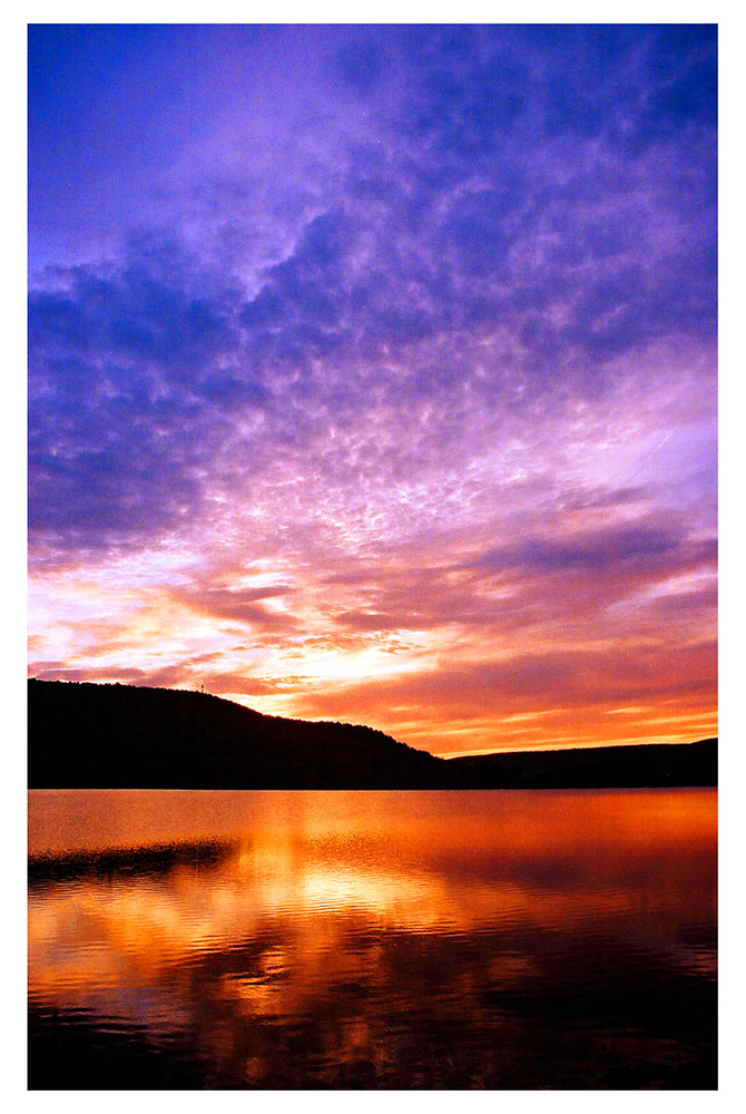
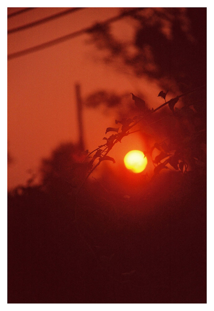
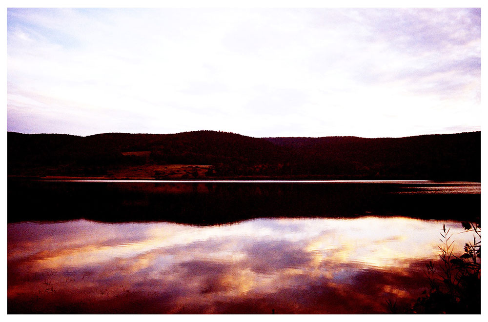
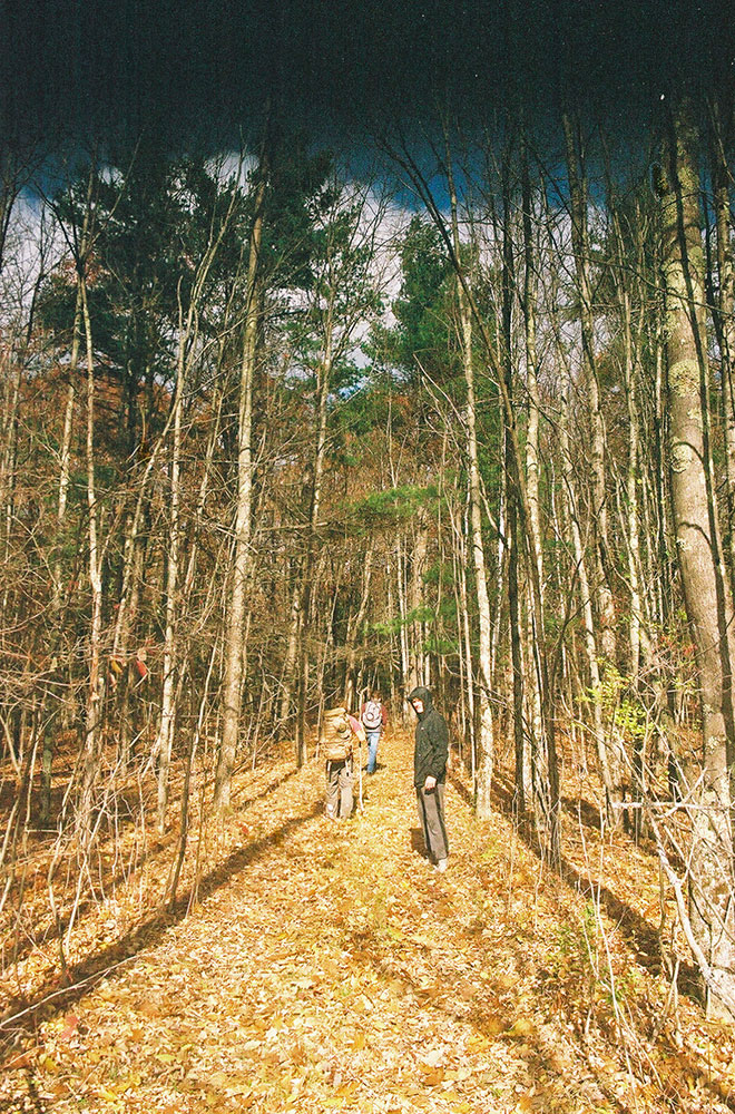
These photographic compositions were captured on 35mm film using a Canon AE-1. This body of work reflects my growing interest in film photography and my appreciation for capturing raw, unfiltered moments. Each image focuses on the quiet beauty of everyday environments, aiming to evoke a sense of calm and visual clarity. The photographs on this page are presented in their original, unedited form to preserve their natural tone and atmosphere, while the following page features edited versions that explore color, contrast, and mood.
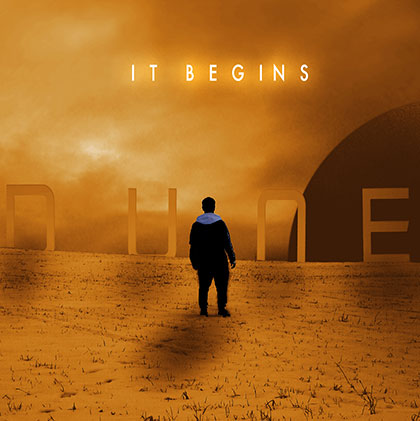
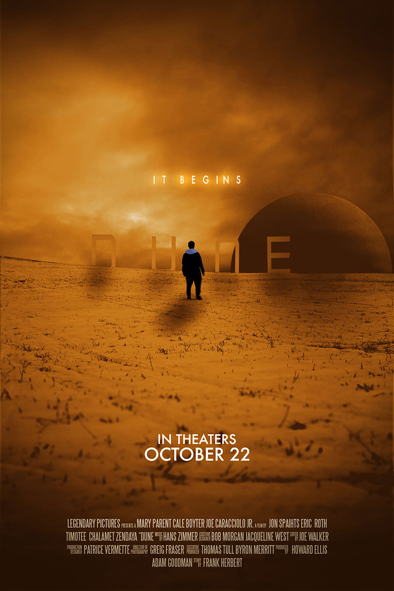
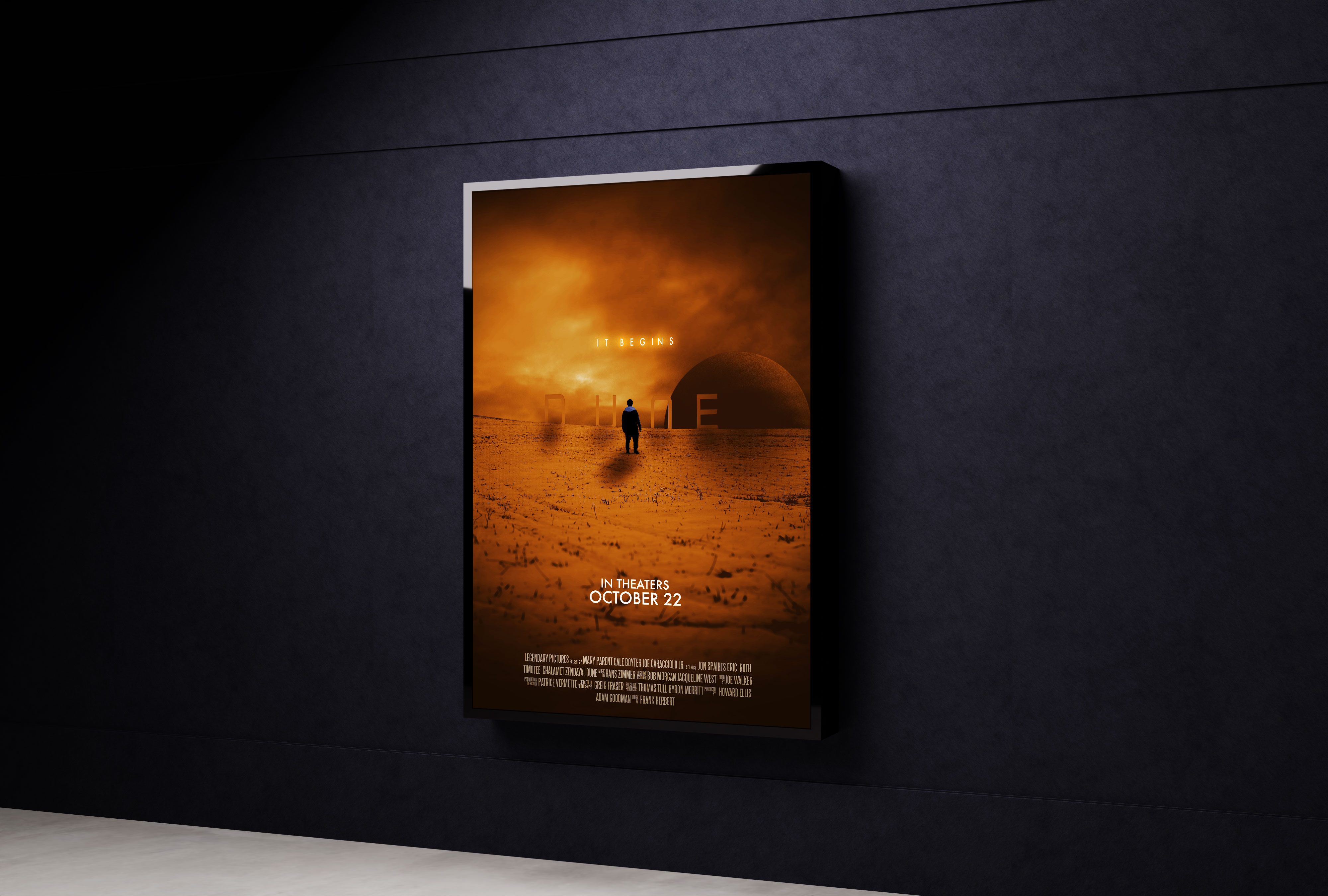
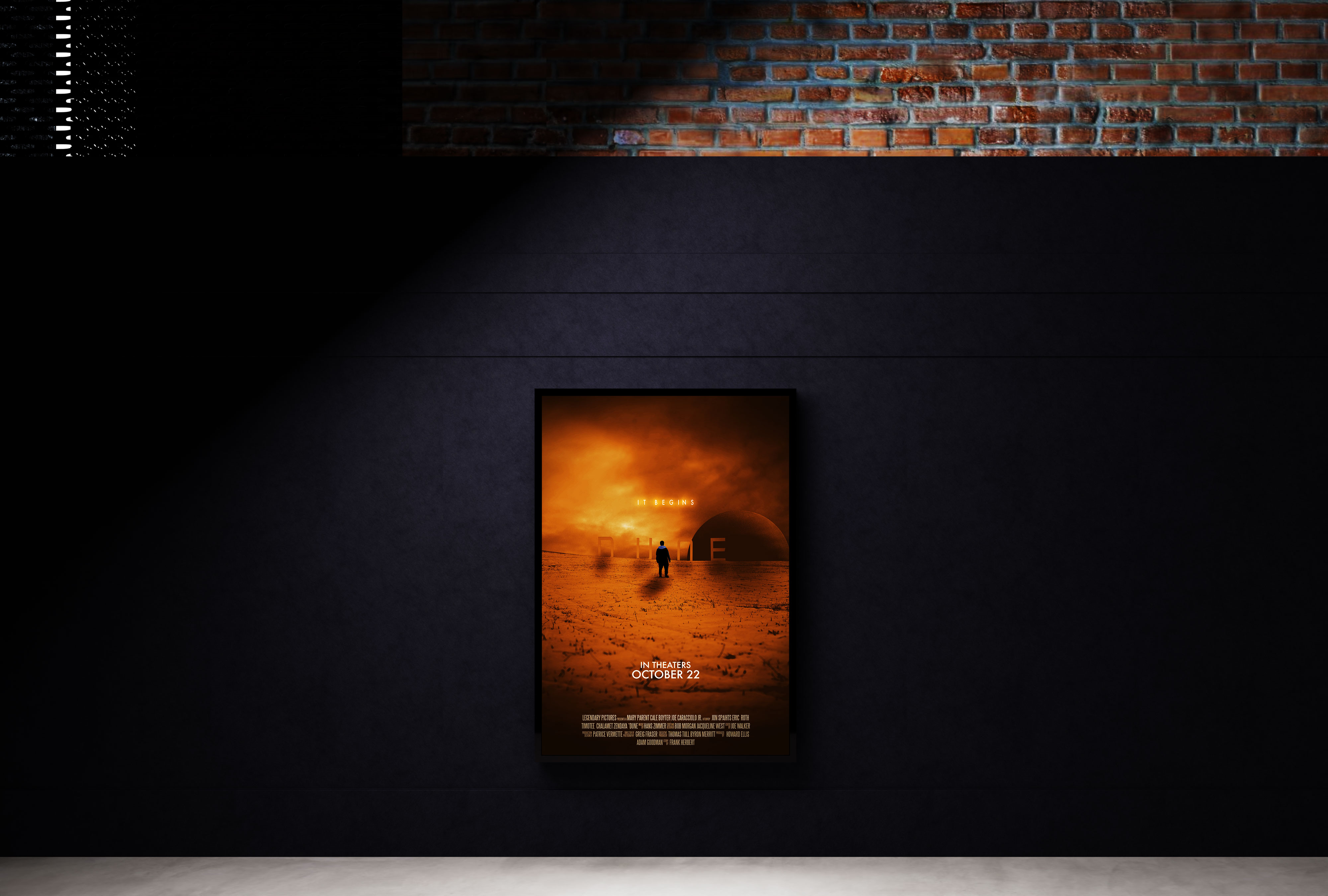
This poster redesign was created as part of a class project centered around reinterpretation and visual contrast. The assignment challenged us to redesign an existing movie poster using a completely different visual approach from the original, while only using typography that appeared on the original poster itself.I chose to redesign the poster for Dune, focusing on the vast, desolate environment of the desert planet and the eerie atmosphere that defines the film. Through composition, texture, and restrained typography, I created a more minimal and atmospheric interpretation that captures both the scale and unsettling tone of the movie while staying within the project’s typographic limitations.
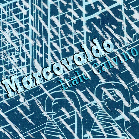
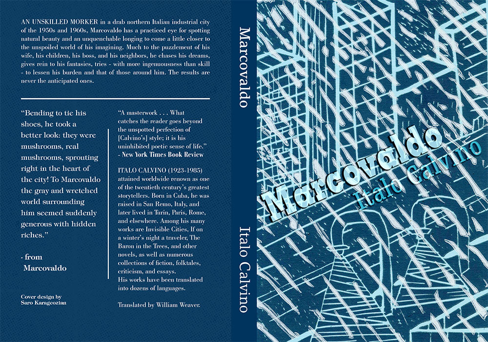
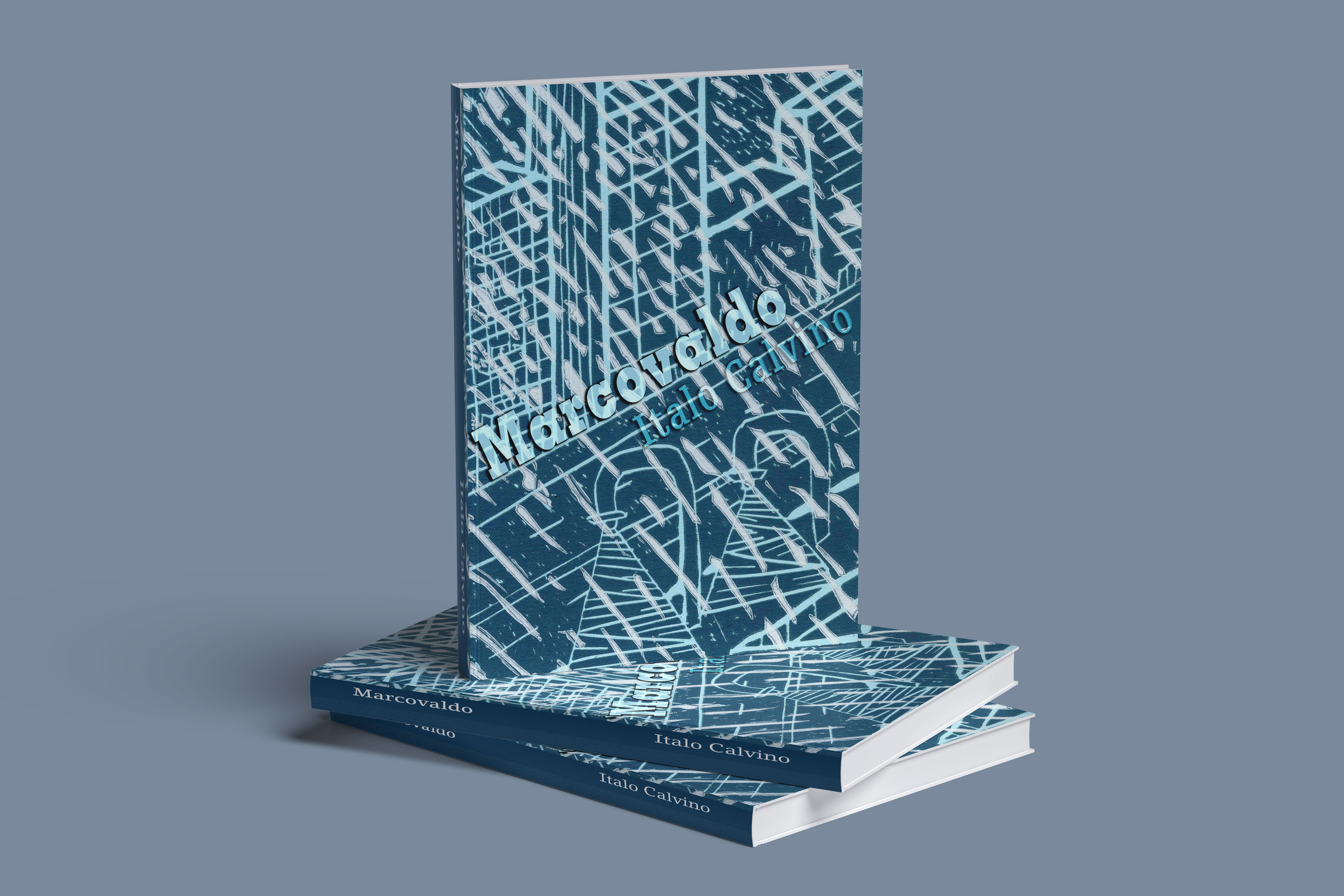
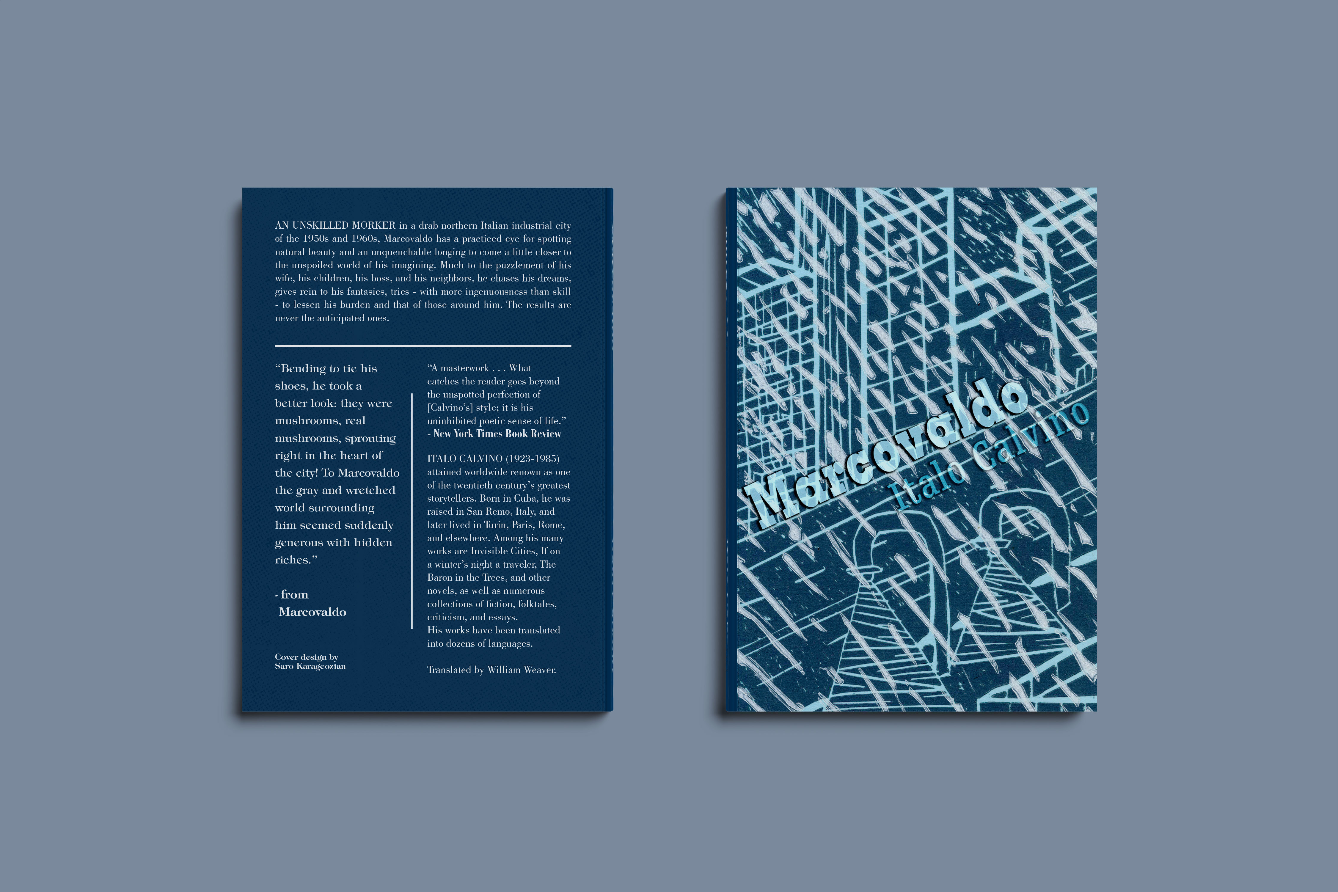
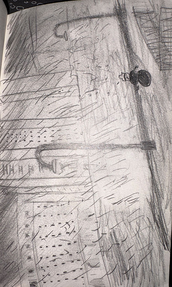
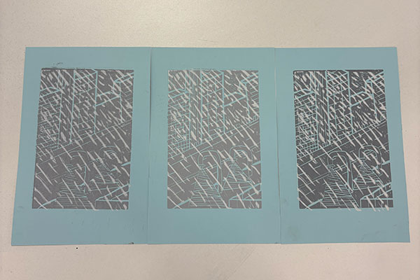
This class project combined book cover design with traditional printmaking techniques. We were tasked with reading a short story from a novel and reimagining its cover as if we were visually stepping into the world of the book itself. For my interpretation, I created a city scene caught in the middle of a snowstorm, aiming to capture both atmosphere and narrative through composition and texture. Using linocut printmaking techniques, I carved and printed the imagery by hand while working to achieve a visual style that felt reminiscent of Renaissance-era illustration. The final piece merges storytelling, print production, and image-making into a cover design that feels both immersive and expressive.
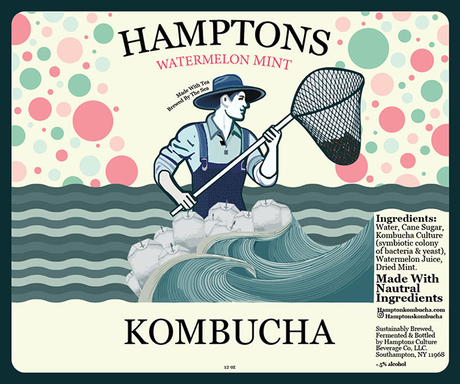
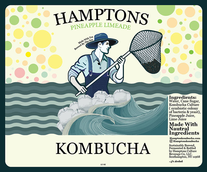
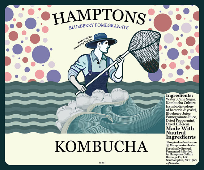
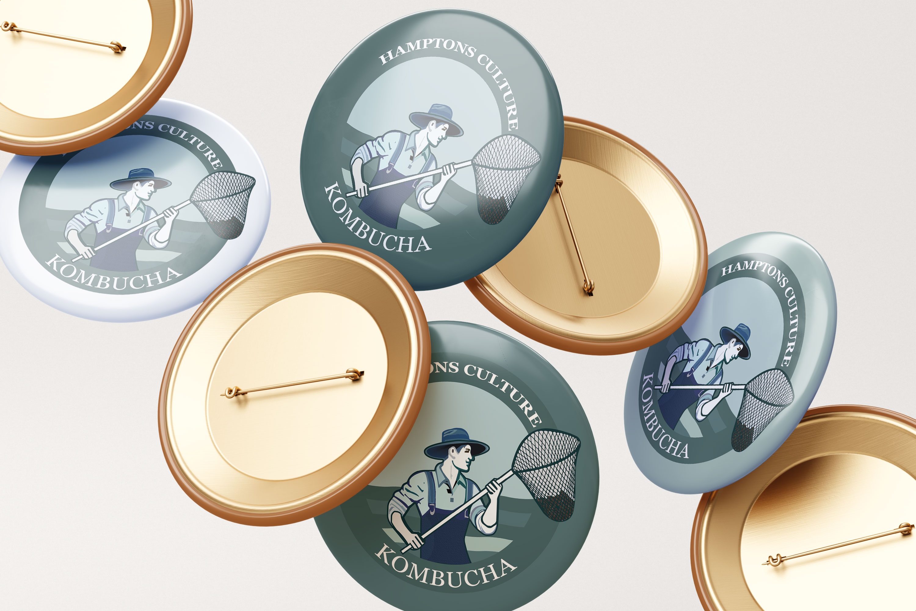
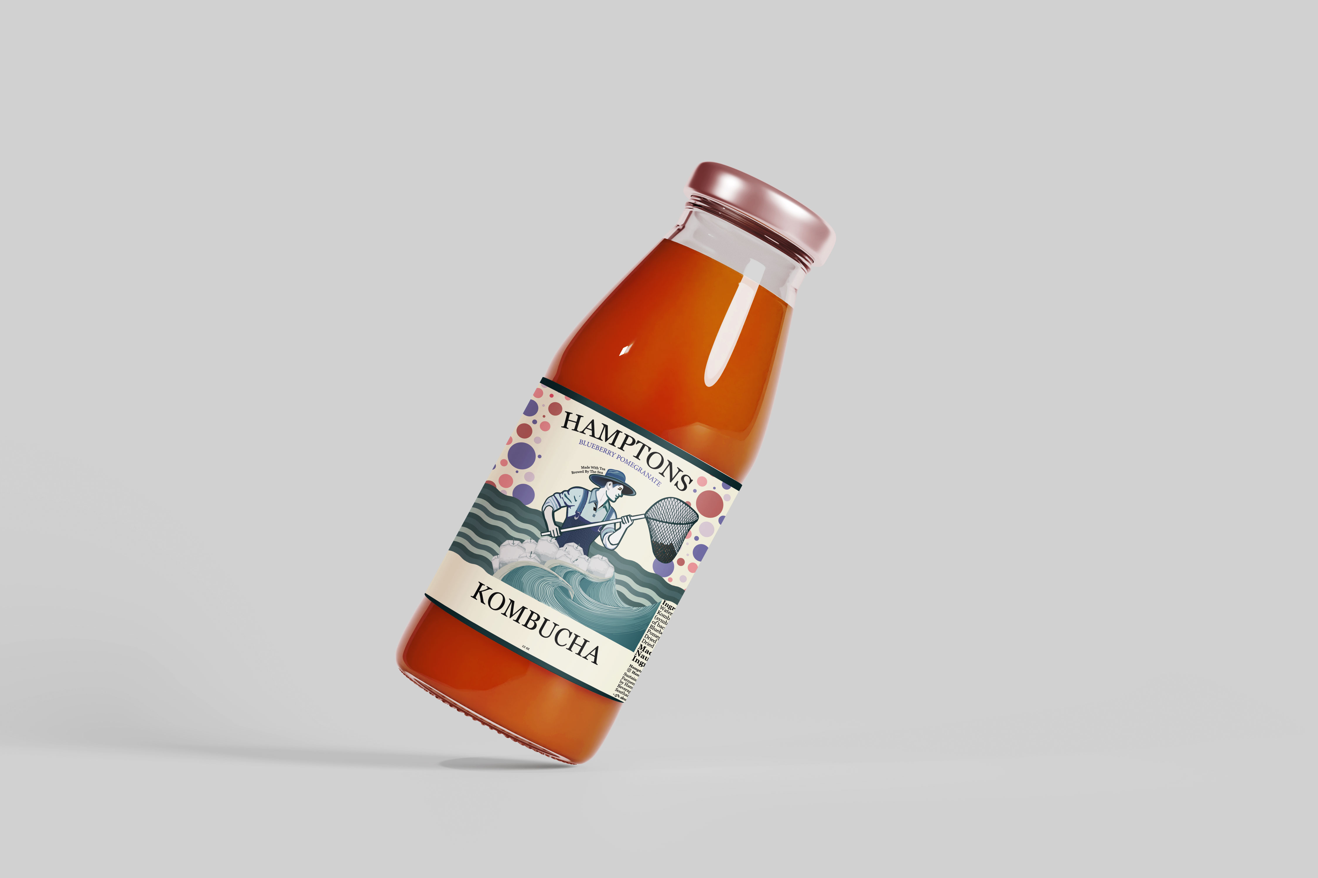
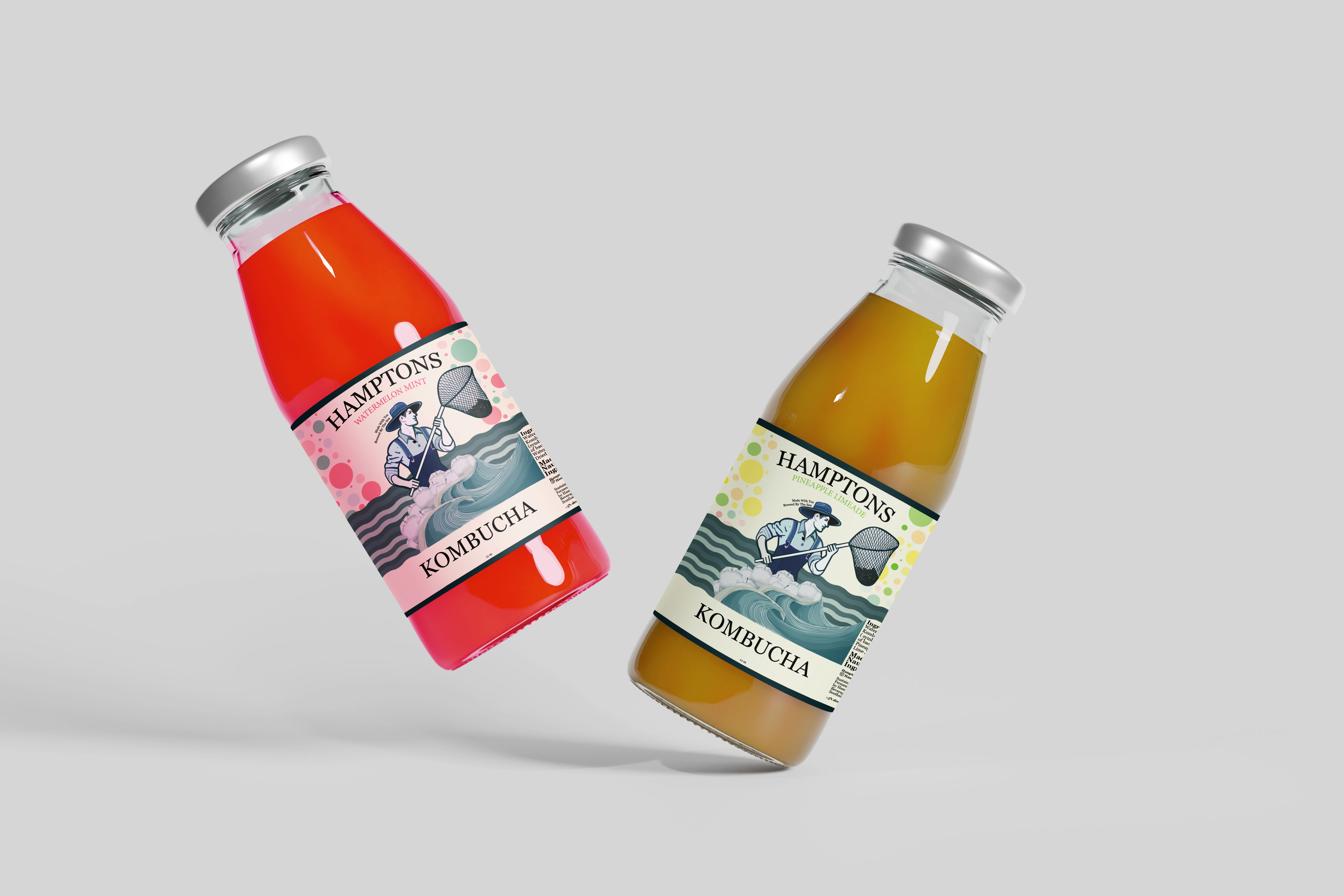
This freelance branding project was created for a startup kombucha company based on Long Island. The client wanted a logo and three beverage labels that captured the culture of the Hamptons while visually representing the coastal identity of Long Island in a vibrant and unique way.The final brand was built around a custom fisherman mascot, shown catching raw tea in his net and surrounded by waves inspired by the Long Island shoreline. Through bold illustration and character-driven branding, I created a playful and memorable identity that feels both local and distinctive.
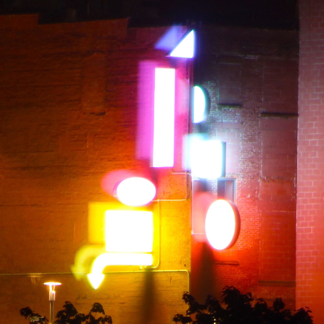
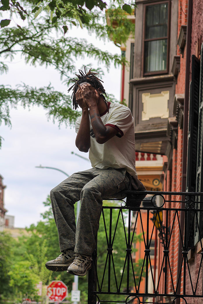
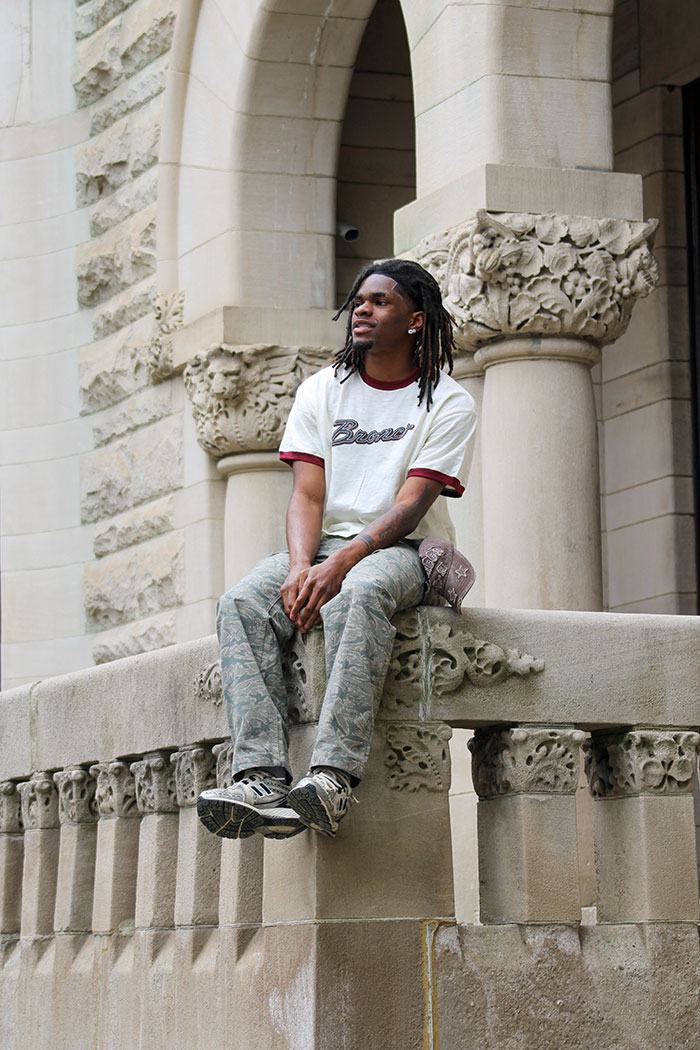
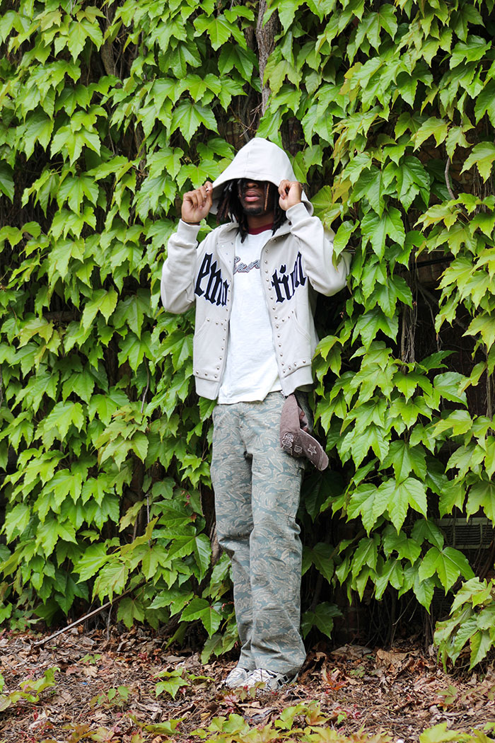
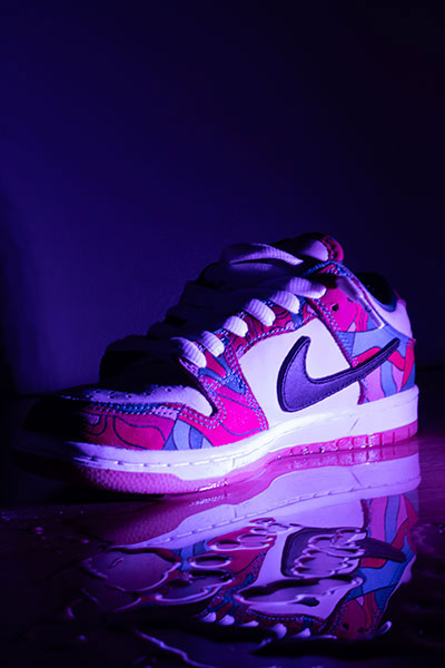
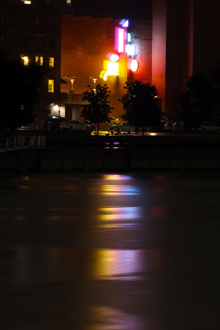
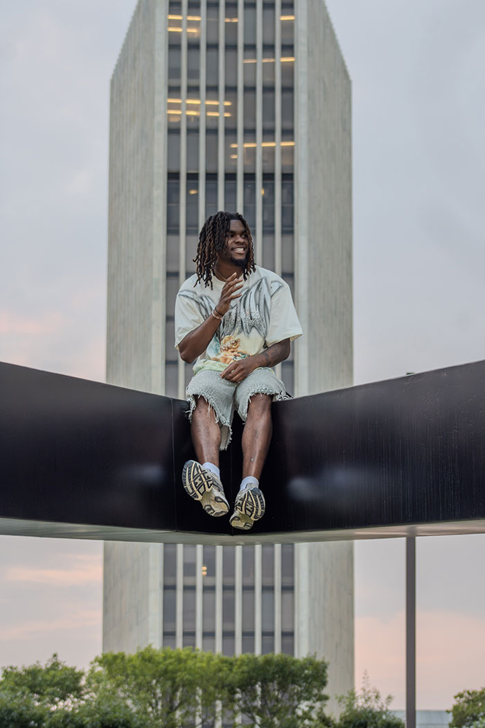
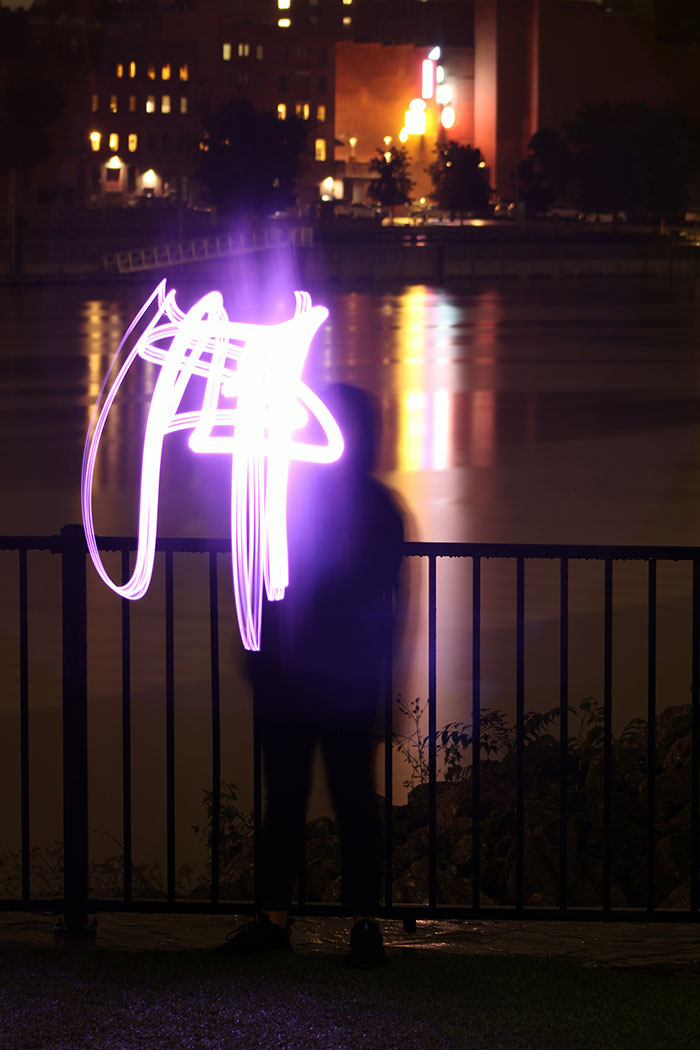
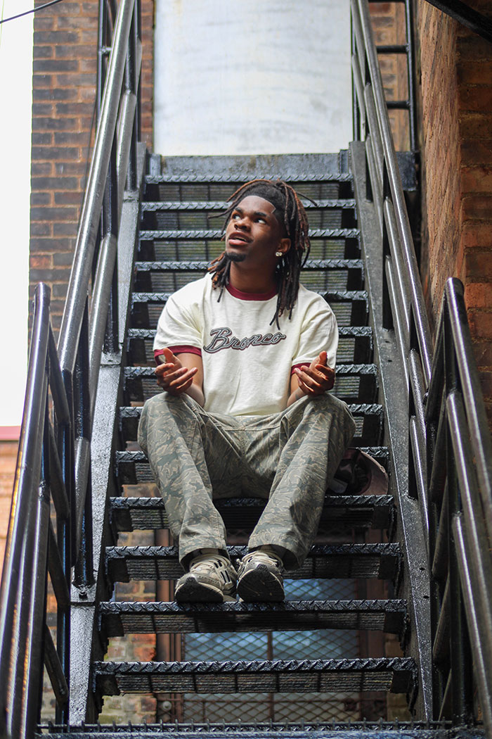
This series focuses on digital photography, with an emphasis on urban and street environments. I’m particularly interested in working with models and capturing scenes at night, where lighting and atmosphere play a key role in shaping the image. The work explores the contrast between shadow and illumination to create a moody, vivid visual tone. Across each composition, I apply core photographic principles such as framing, balance, and depth to produce images that feel both creative and refined. All photographs in this series were captured using a Canon EOS Rebel T7.
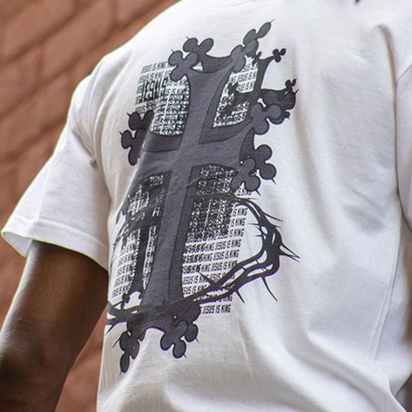
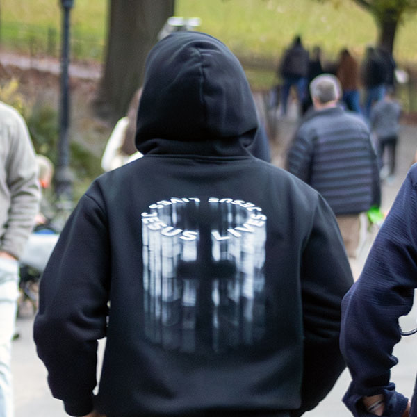
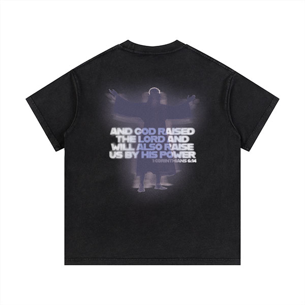
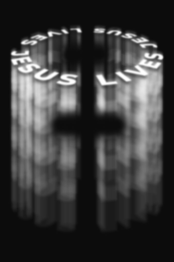
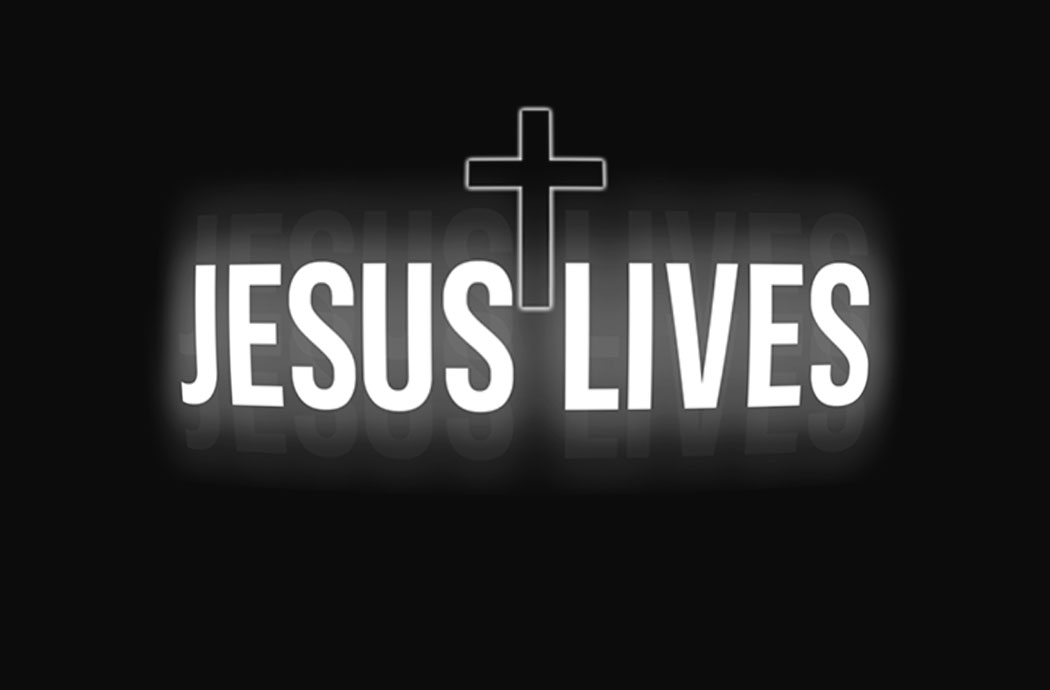
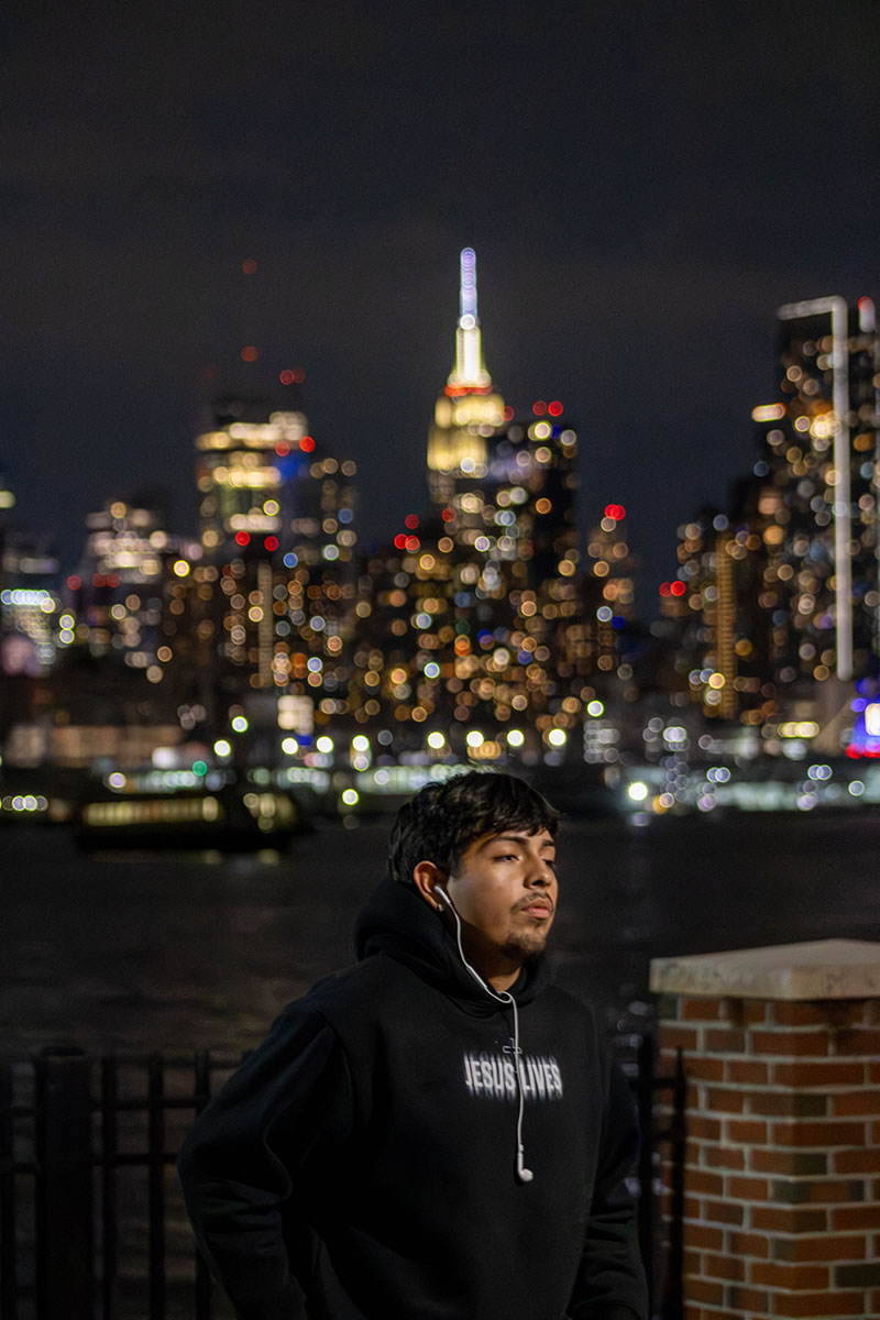
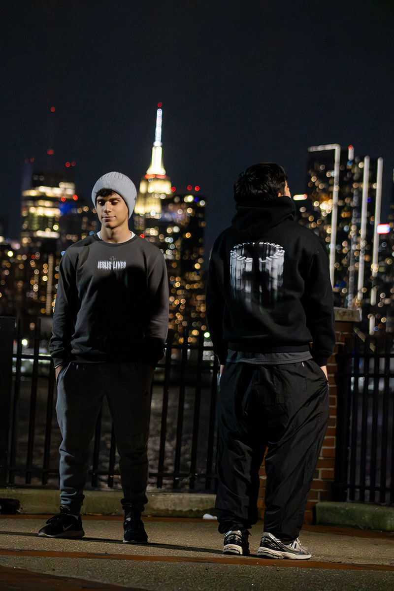
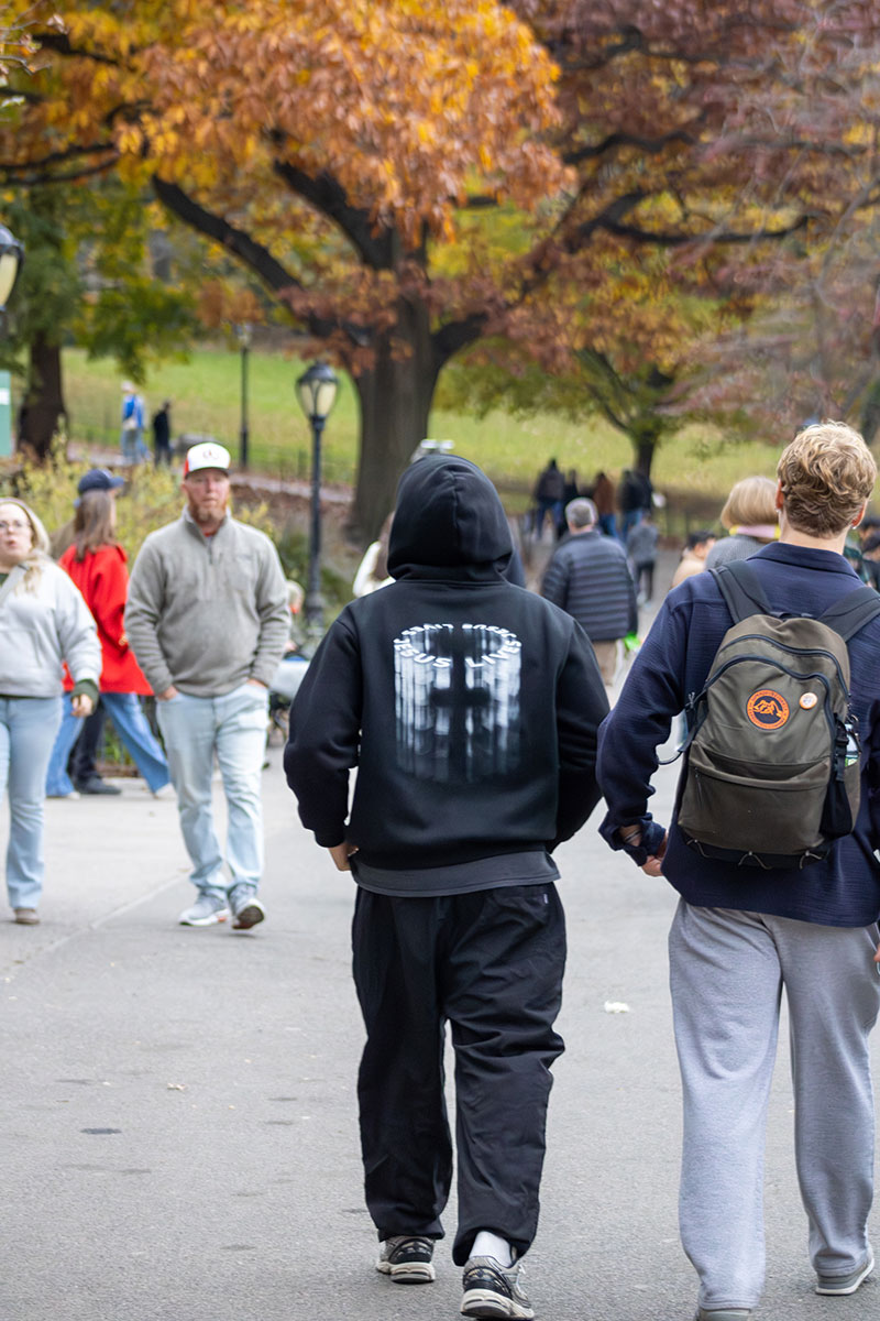
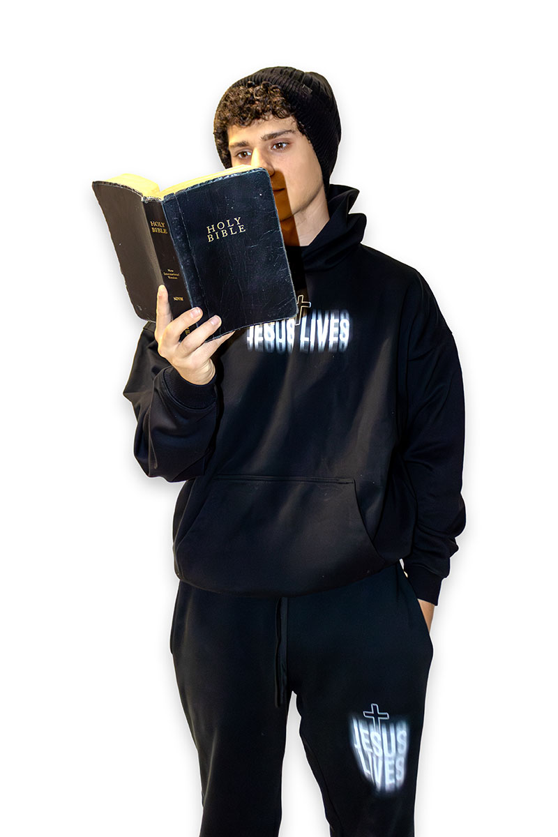
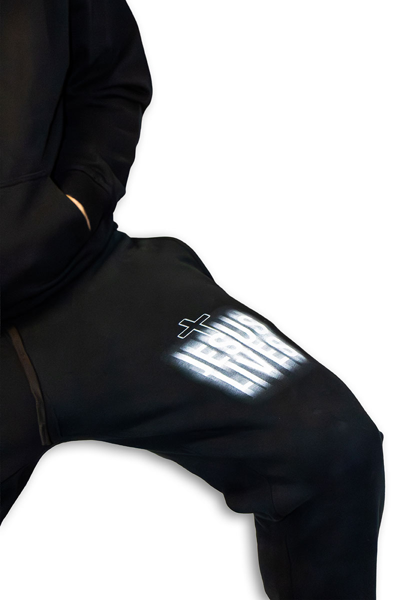
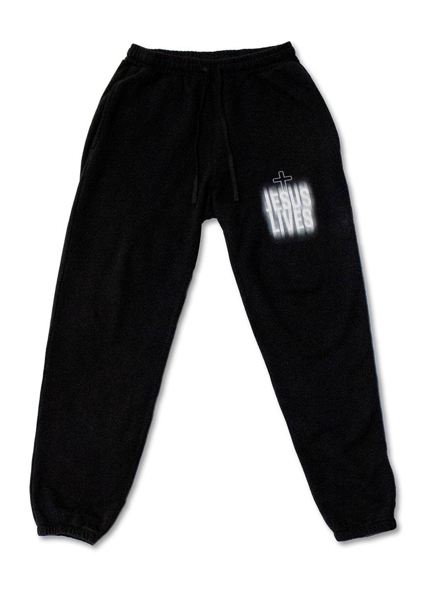
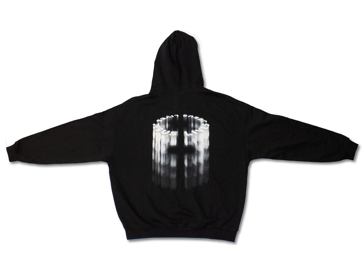
This apparel collection was created as the second drop for my clothing brand, Saro Apparel, and was centered around the message that Jesus still lives, drawing from the resurrection of Christ as the core concept. For this collection, I wanted the design to feel radiant, symbolic, and emotionally impactful. The visual direction focused on light as the primary storytelling element, using contrast and glow to reveal the form of the cross more subtly and mysteriously. The final design blends faith-based meaning with contemporary streetwear aesthetics, creating a piece that feels both expressive and wearable.
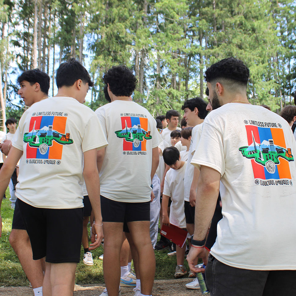
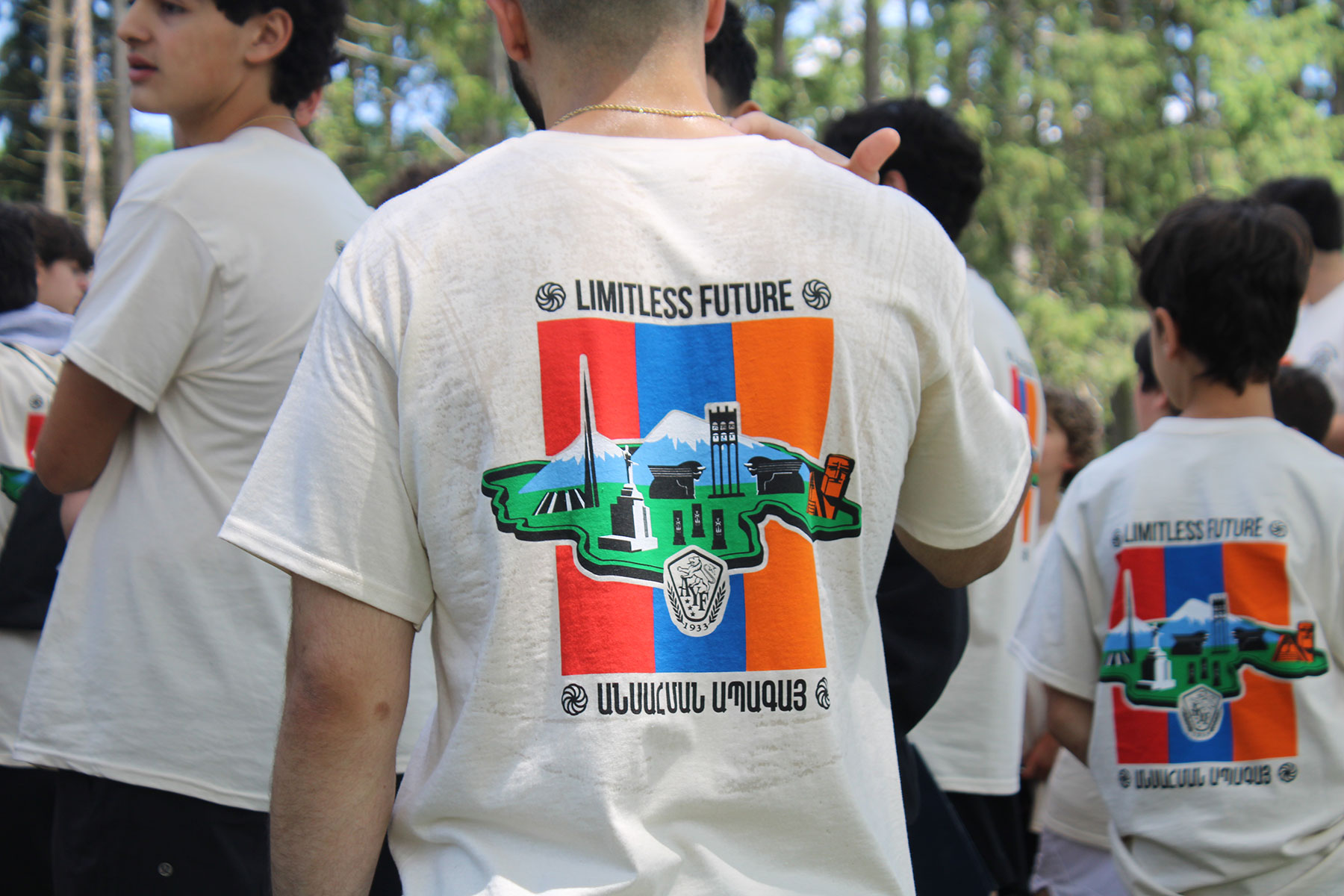
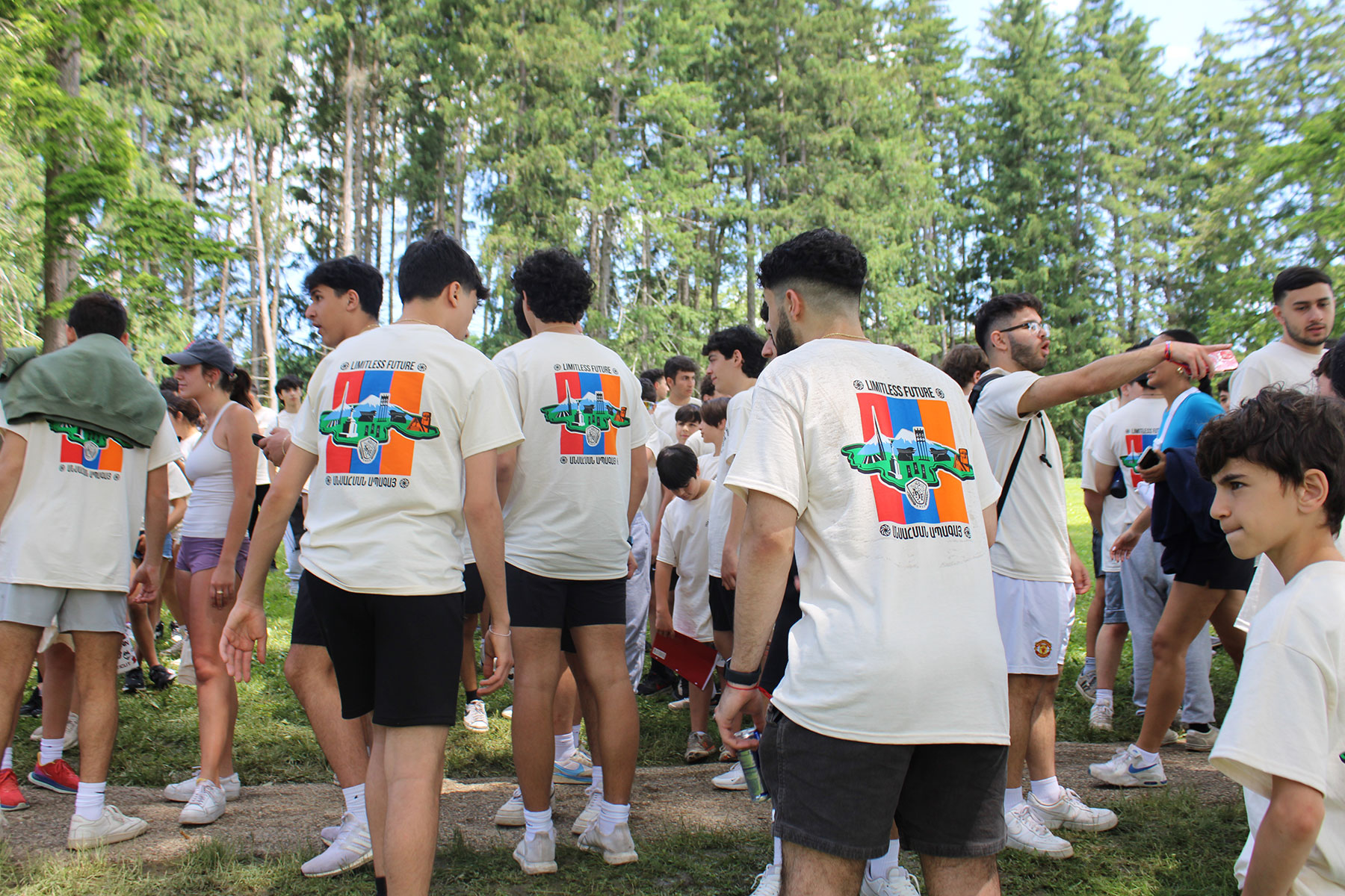
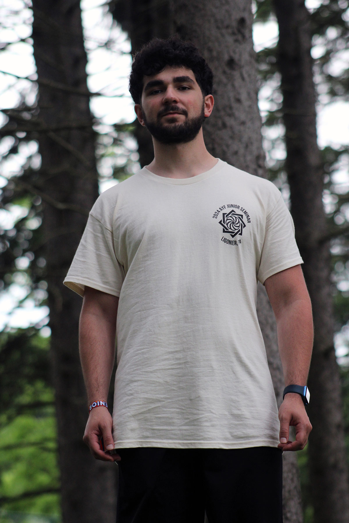
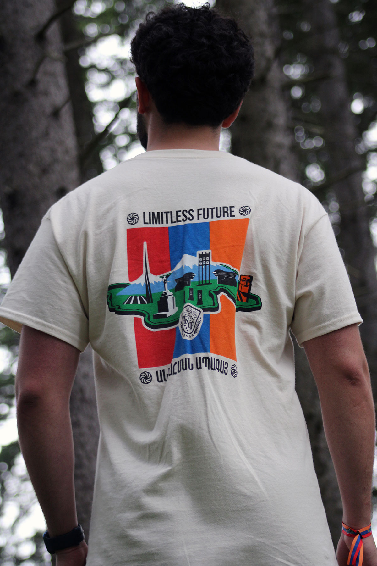
This branding project was created for AYF Junior Seminar, an annual youth event organized by the Armenian Youth Federation. As a member of the organization’s PR committee, I was tasked with designing the event logo around the theme “Limitless Future.” The seminar brings together Armenian youth from across the East Coast for a weekend focused on education, culture, and community. My goal was to create a logo that felt wearable, engaging, and meaningful, something participants could connect with beyond the event itself. The design incorporates symbolic elements rooted in Armenian identity, including references to historic geography and culturally significant imagery. These elements were combined to represent heritage, unity, and the idea of future generations carrying Armenian culture forward. The final mark balances bold visual impact with deeper narrative meaning, resulting in a logo that is both expressive and purposeful.
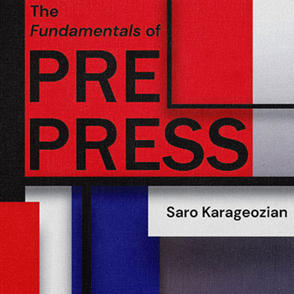
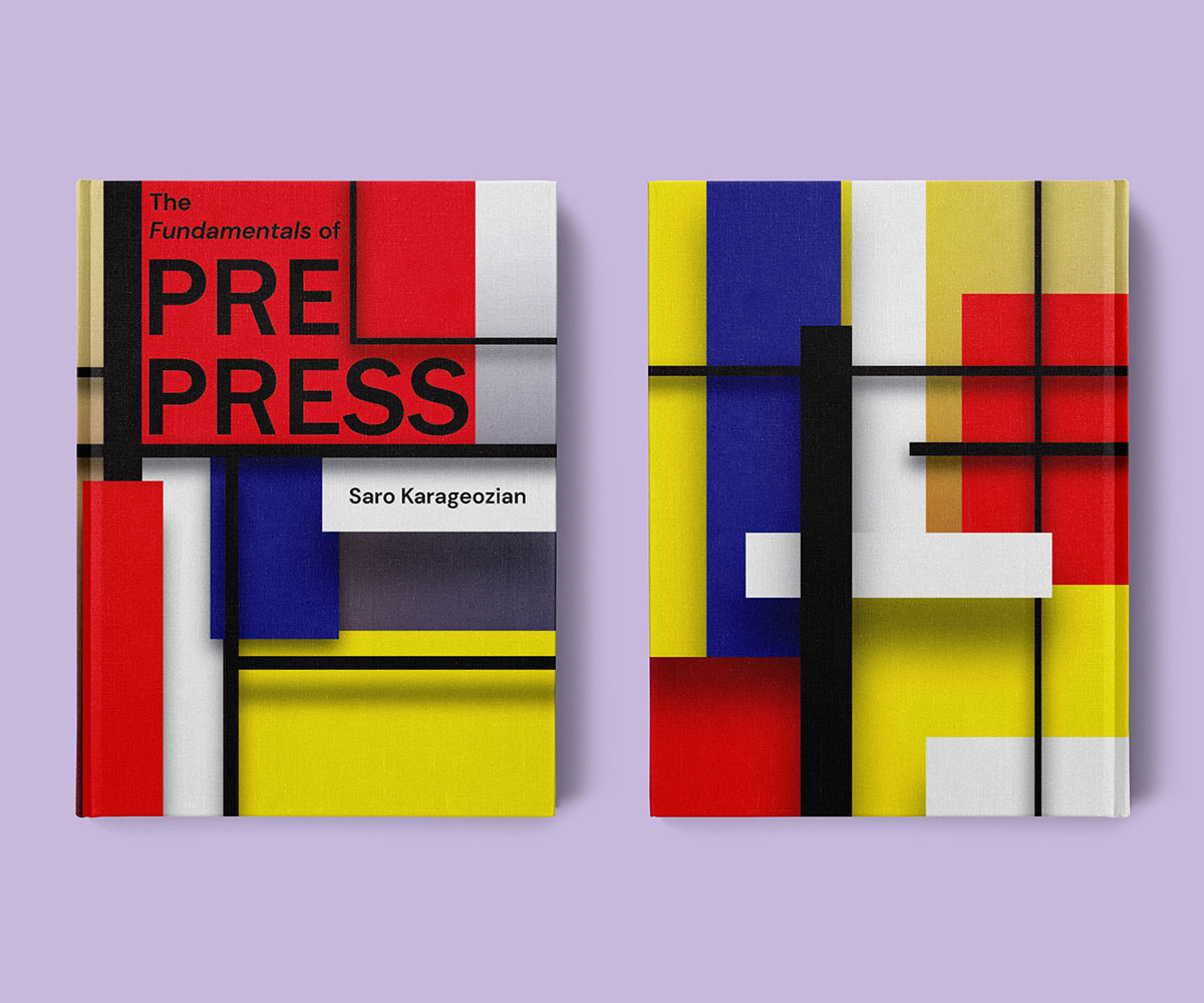
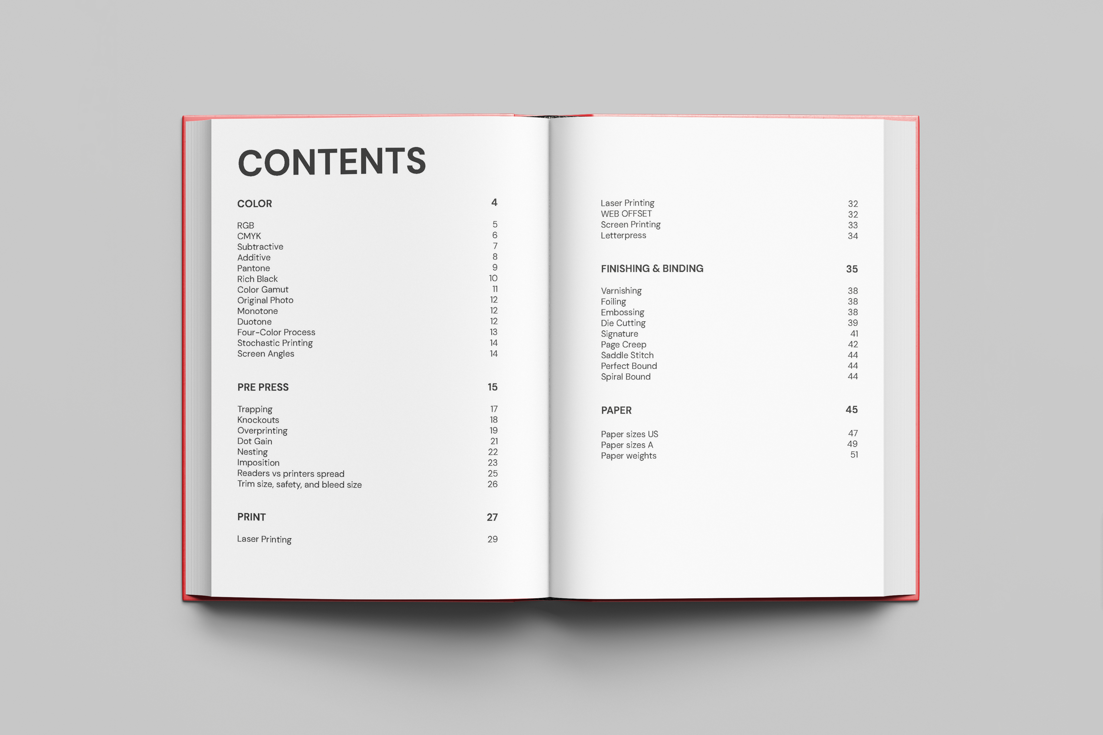
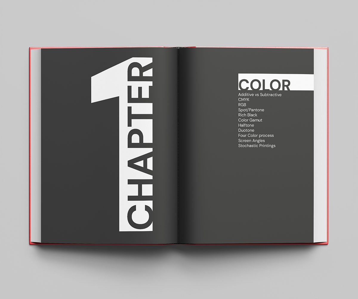
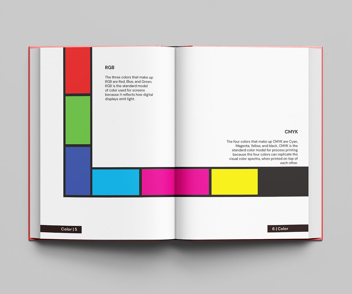
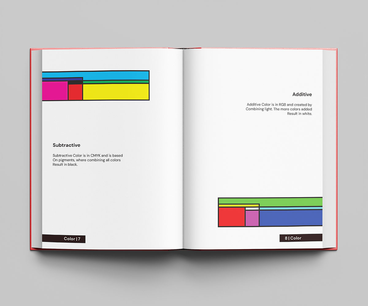
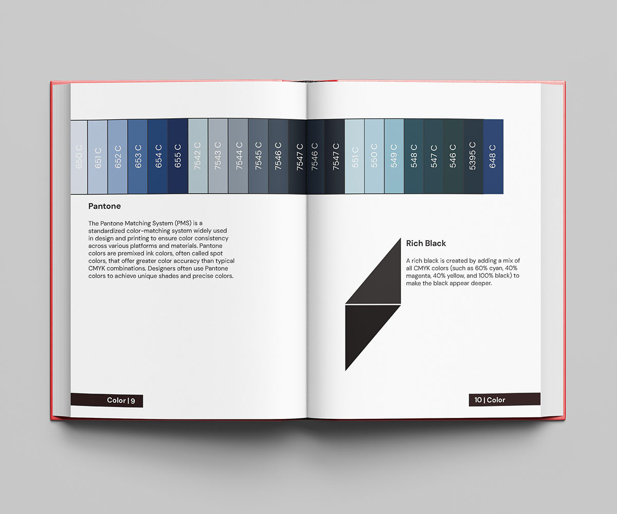
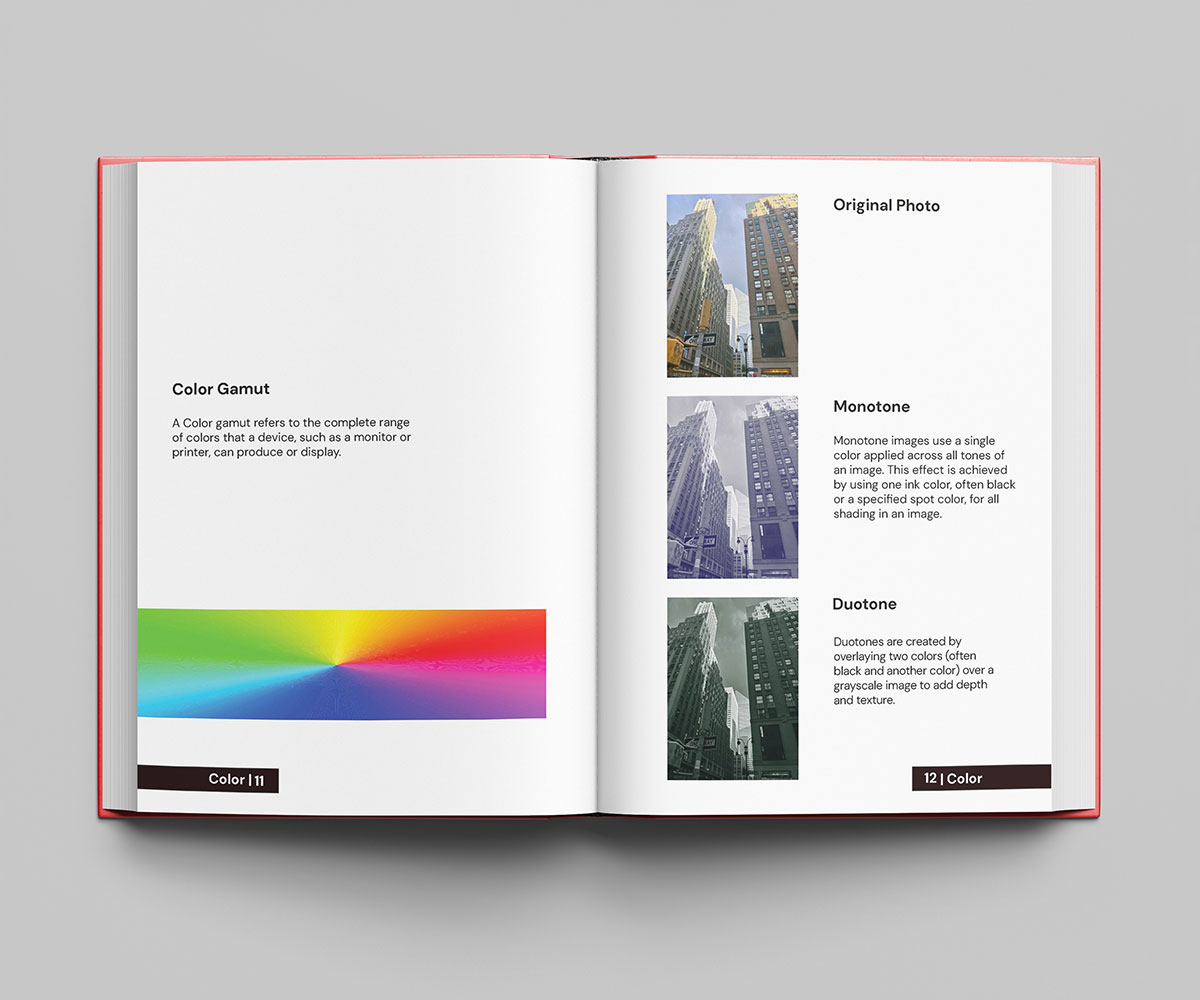
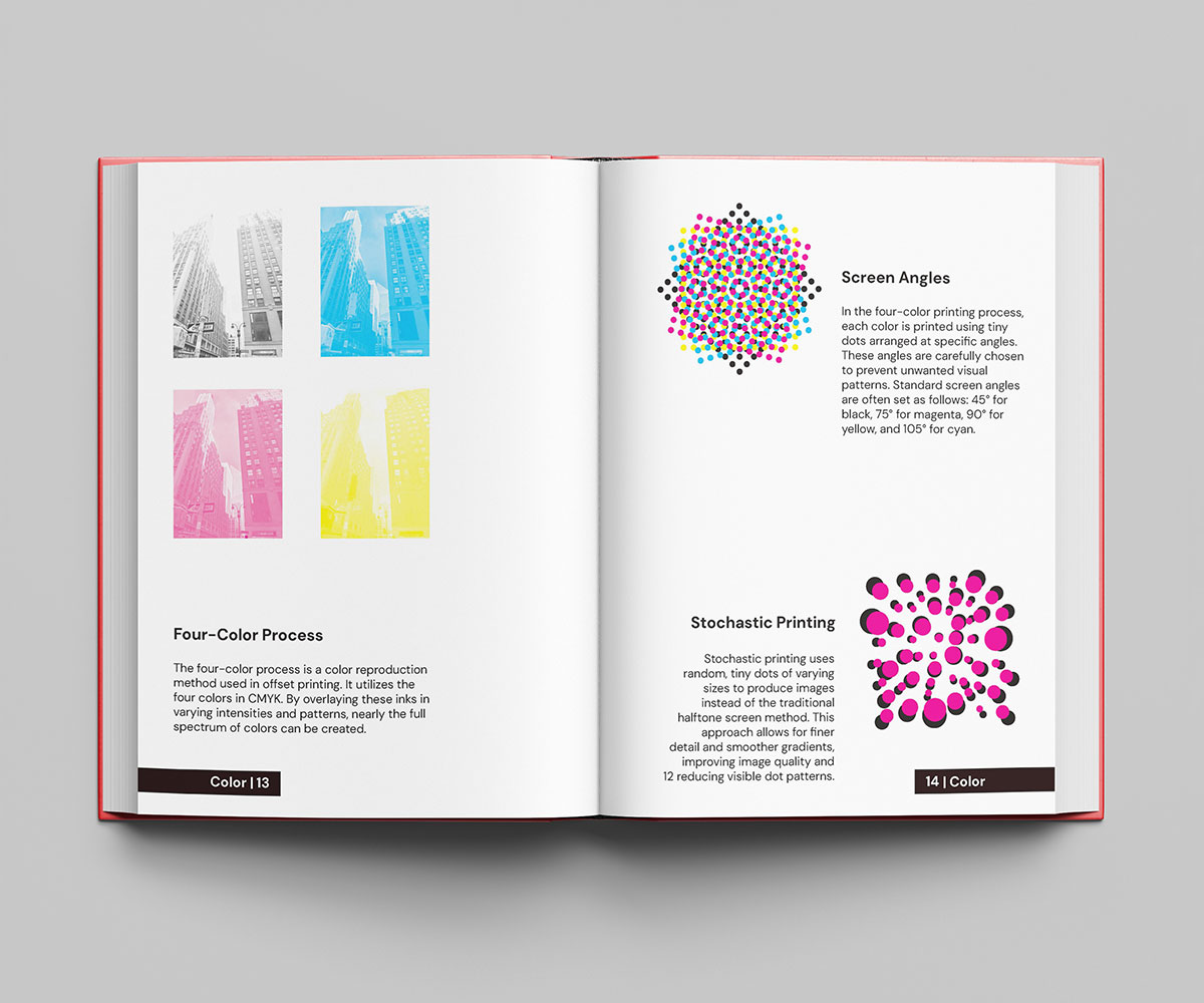
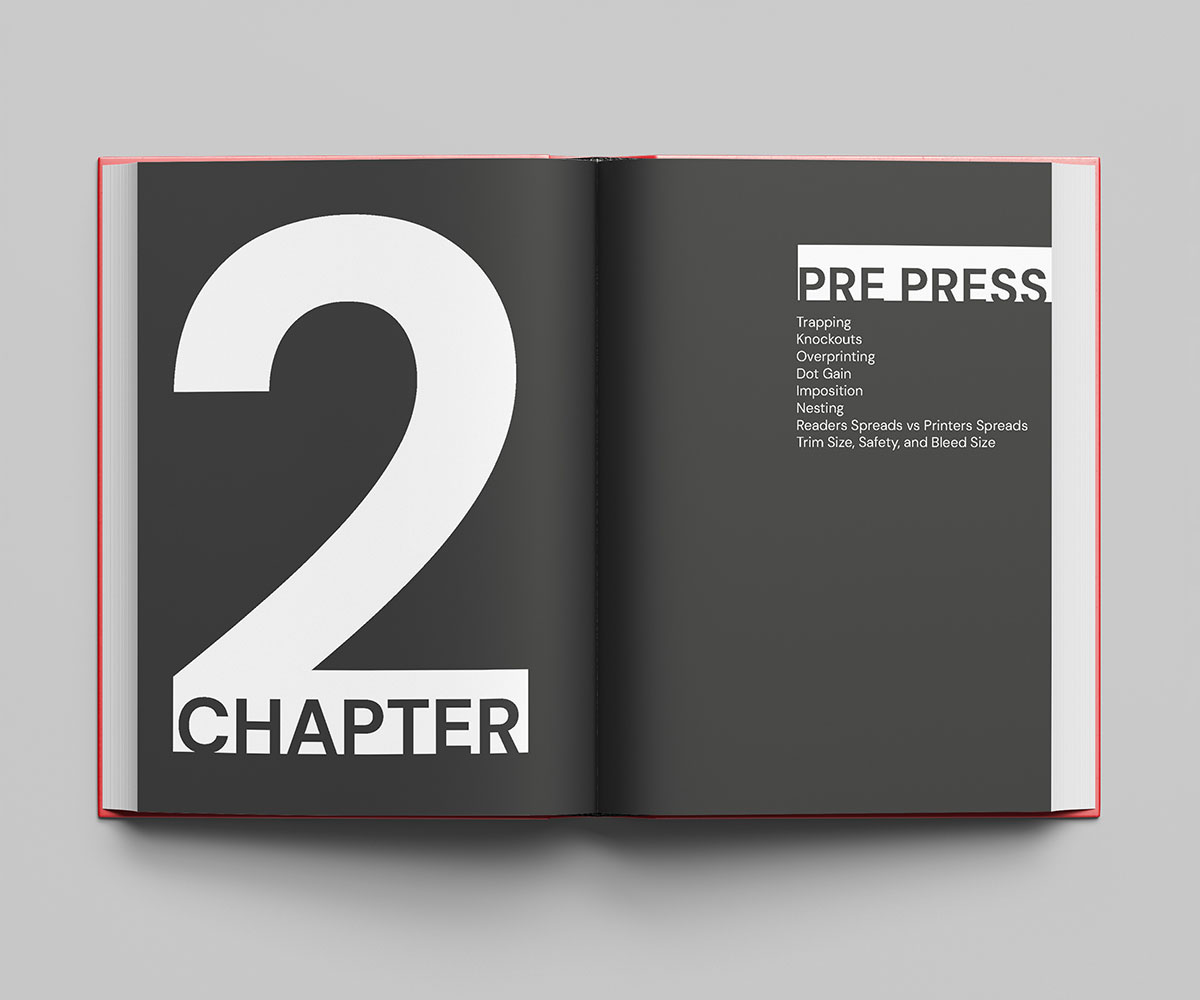
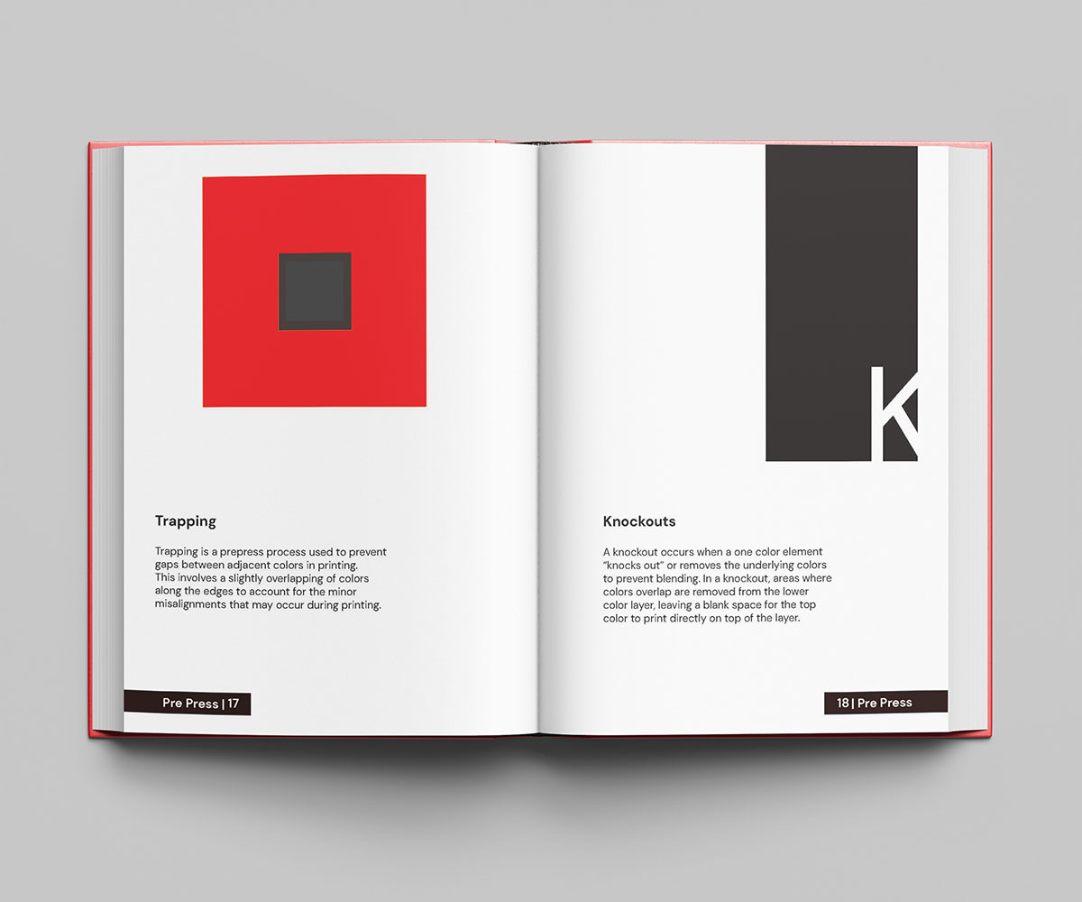
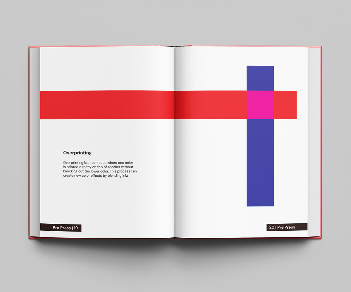
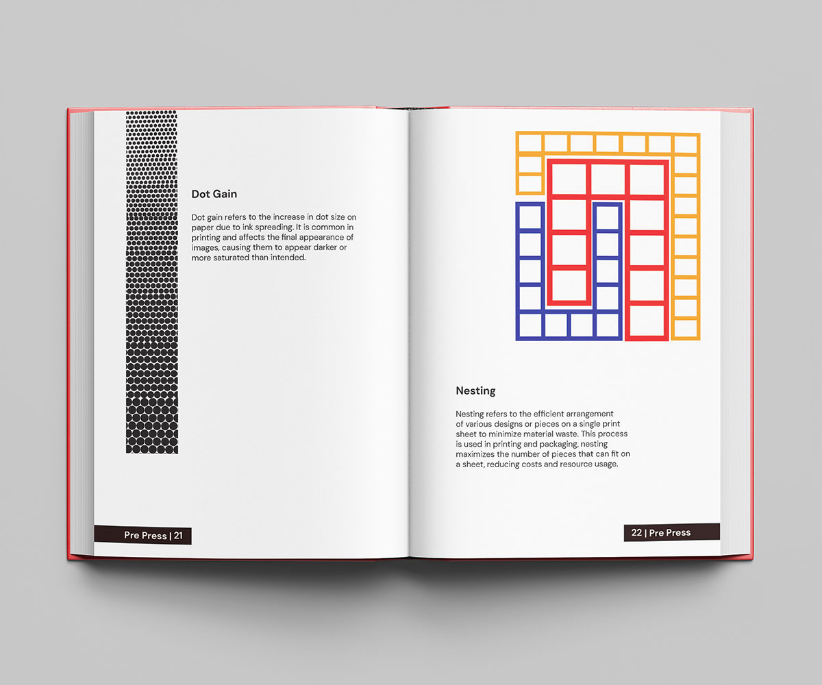
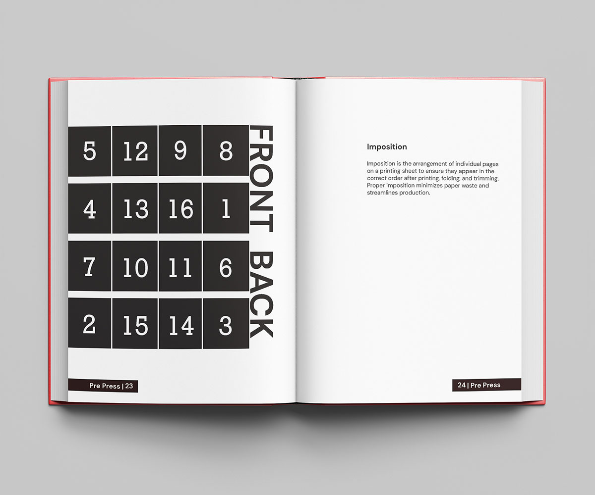
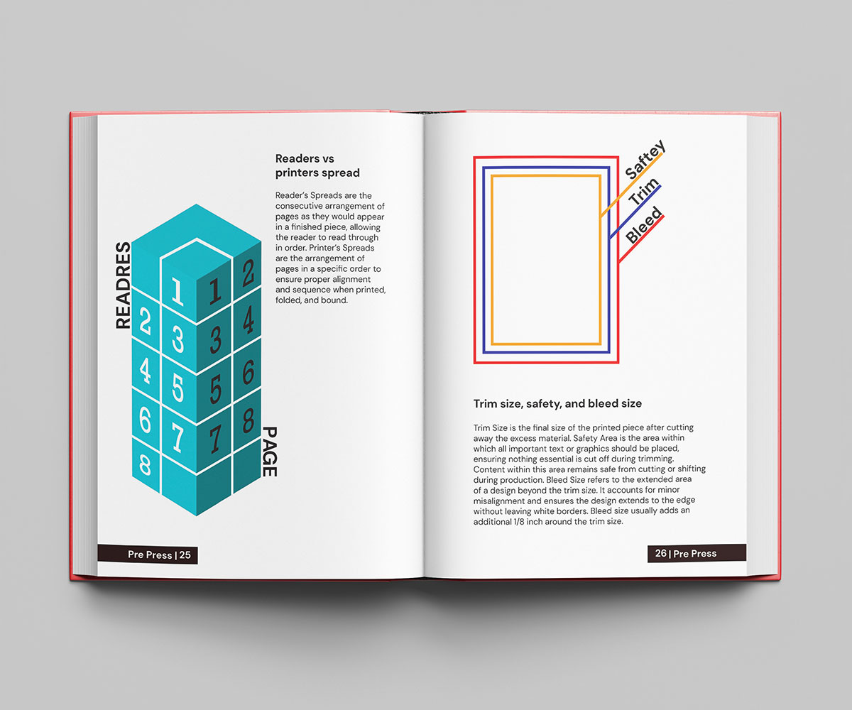
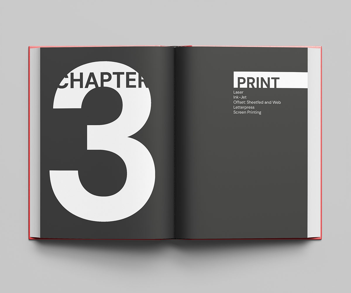
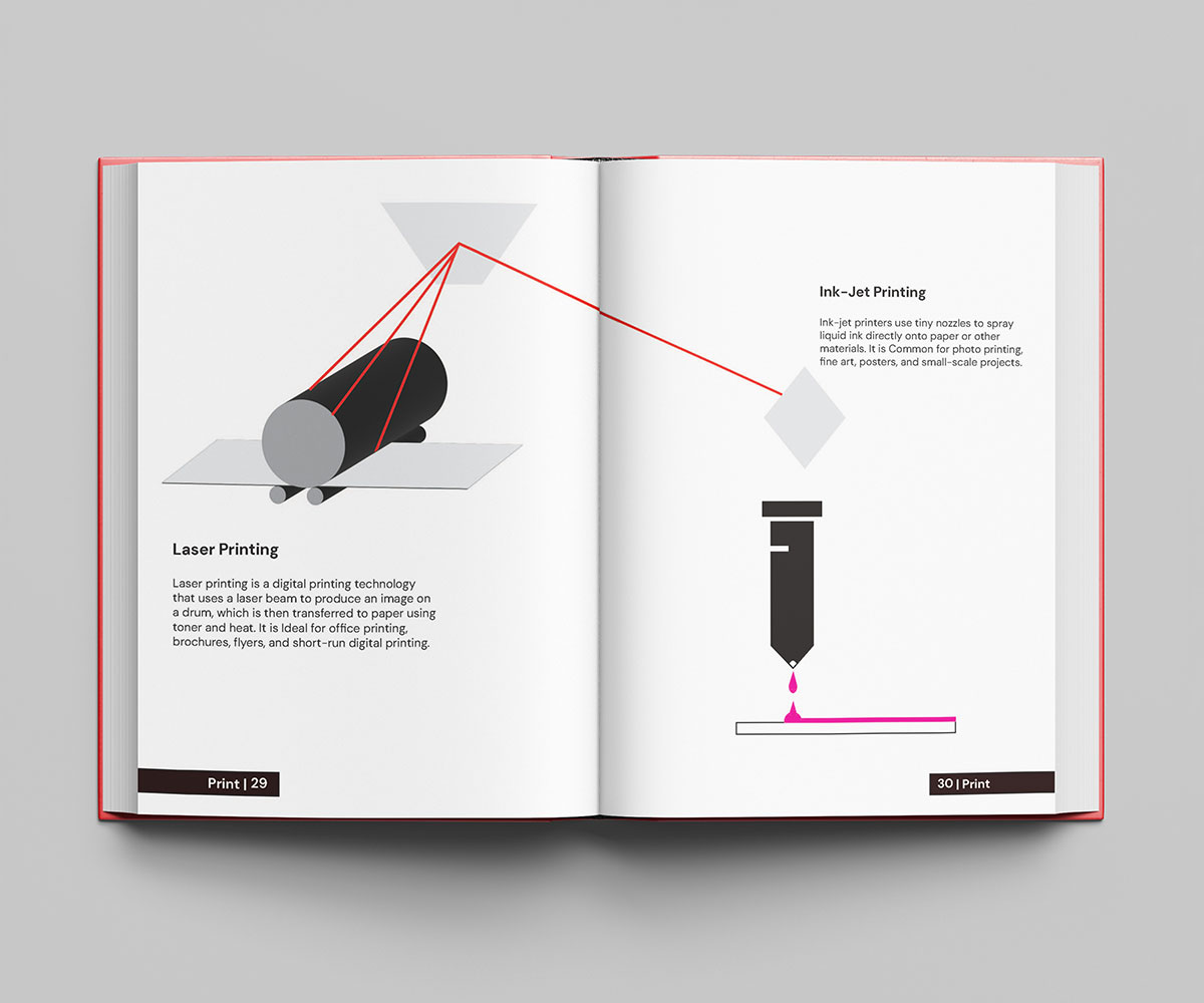
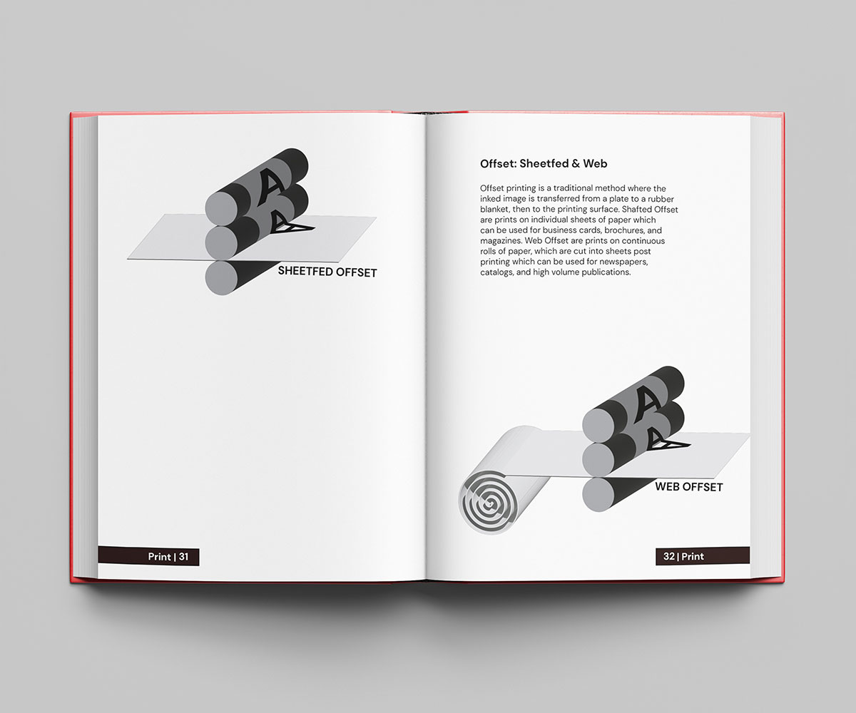
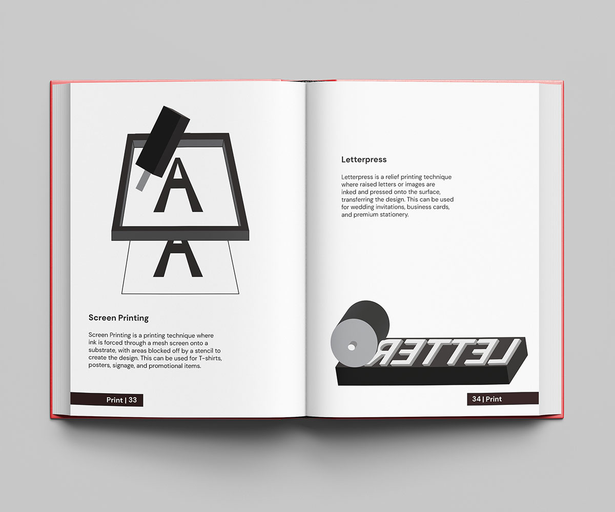
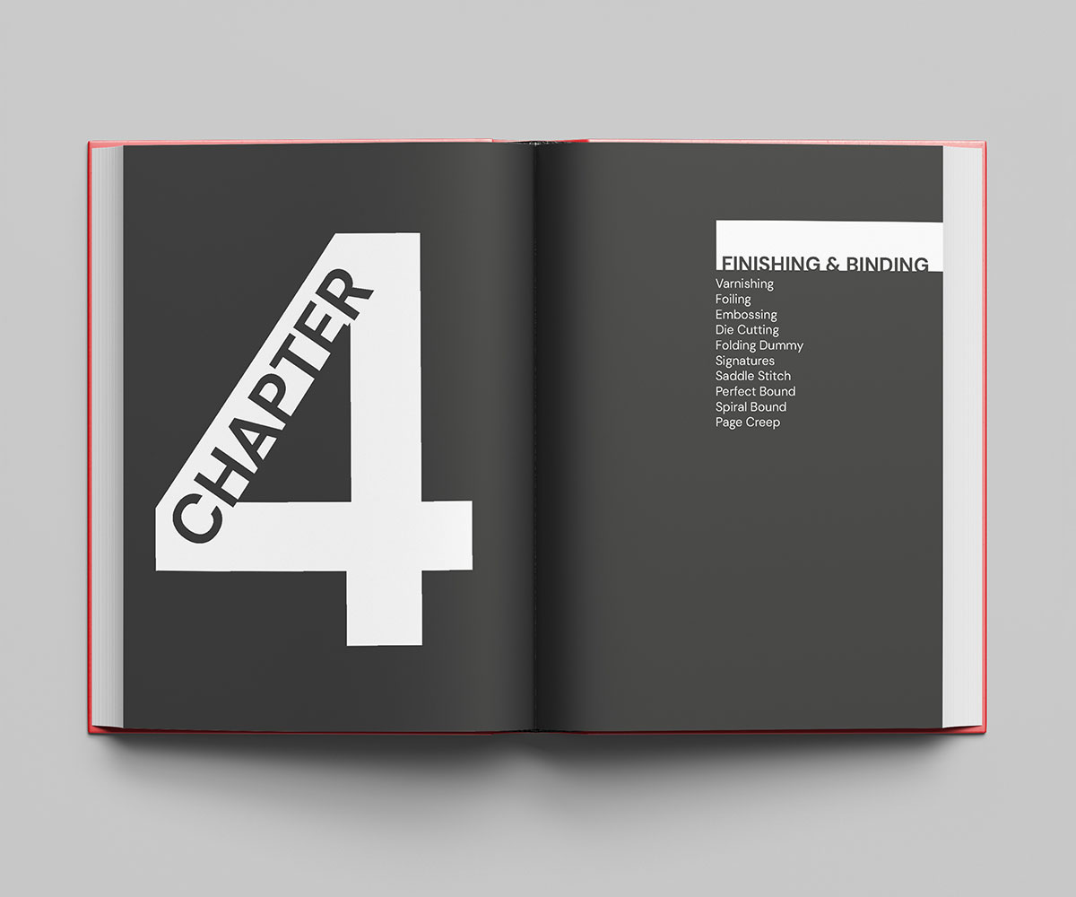
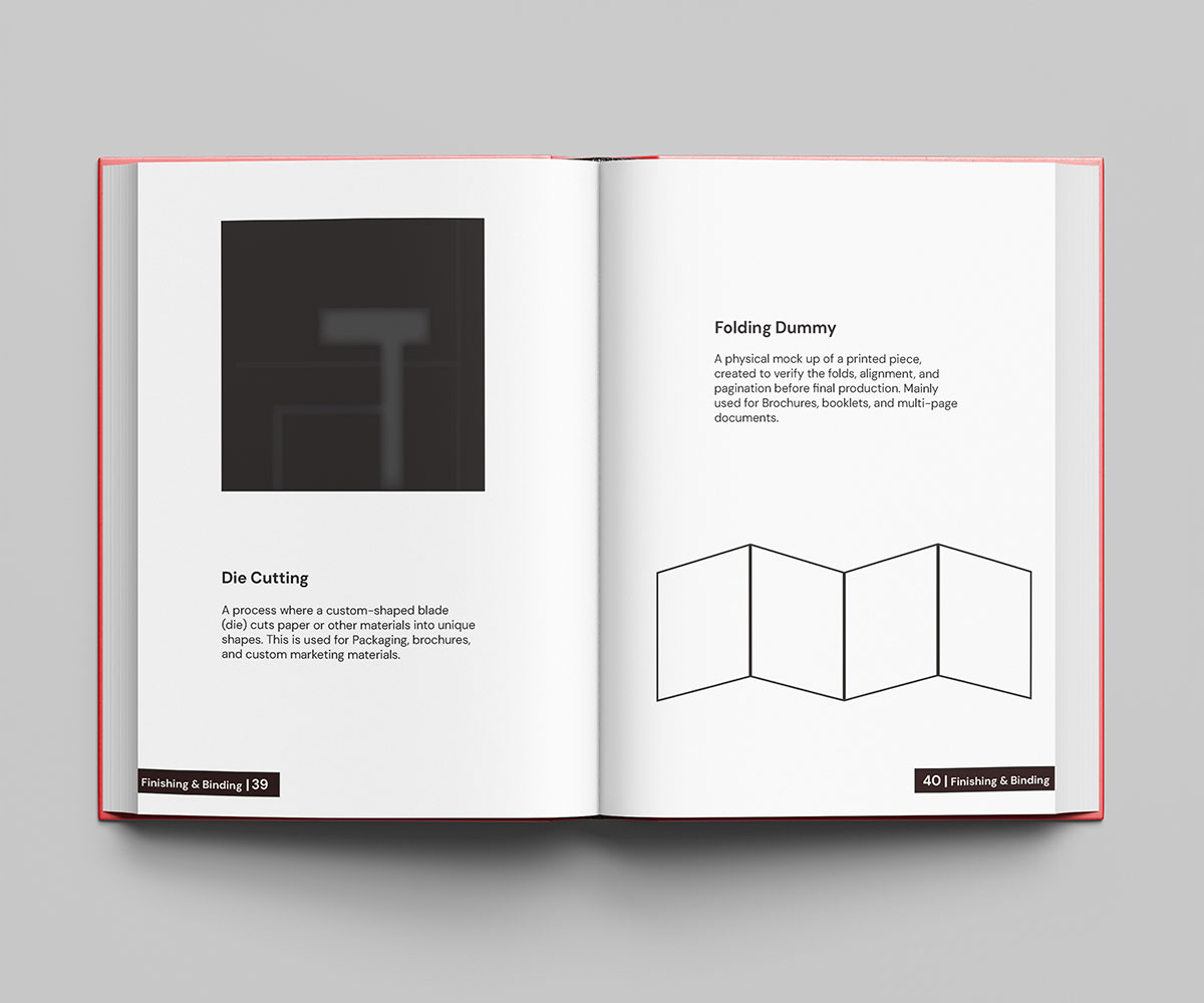
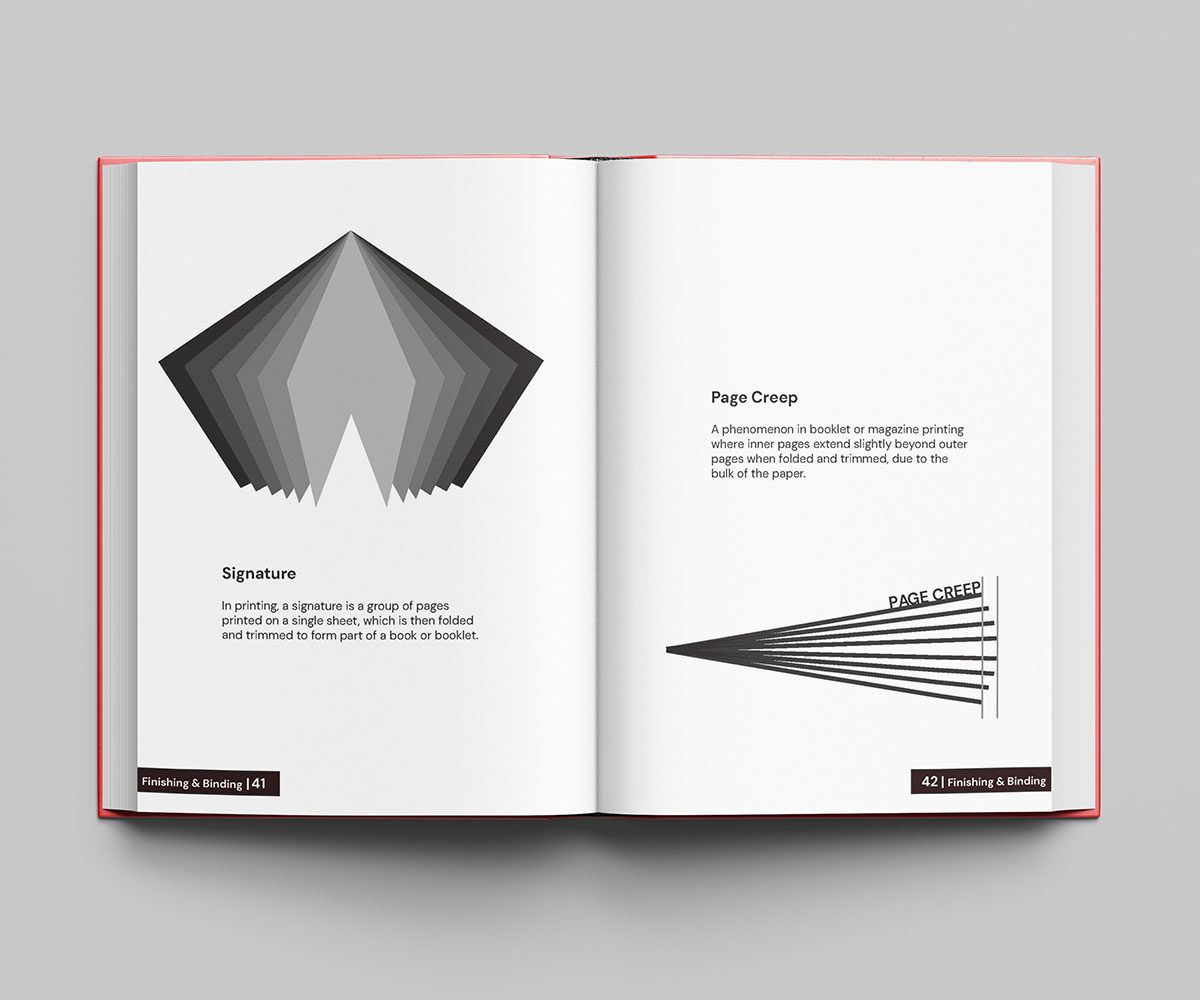
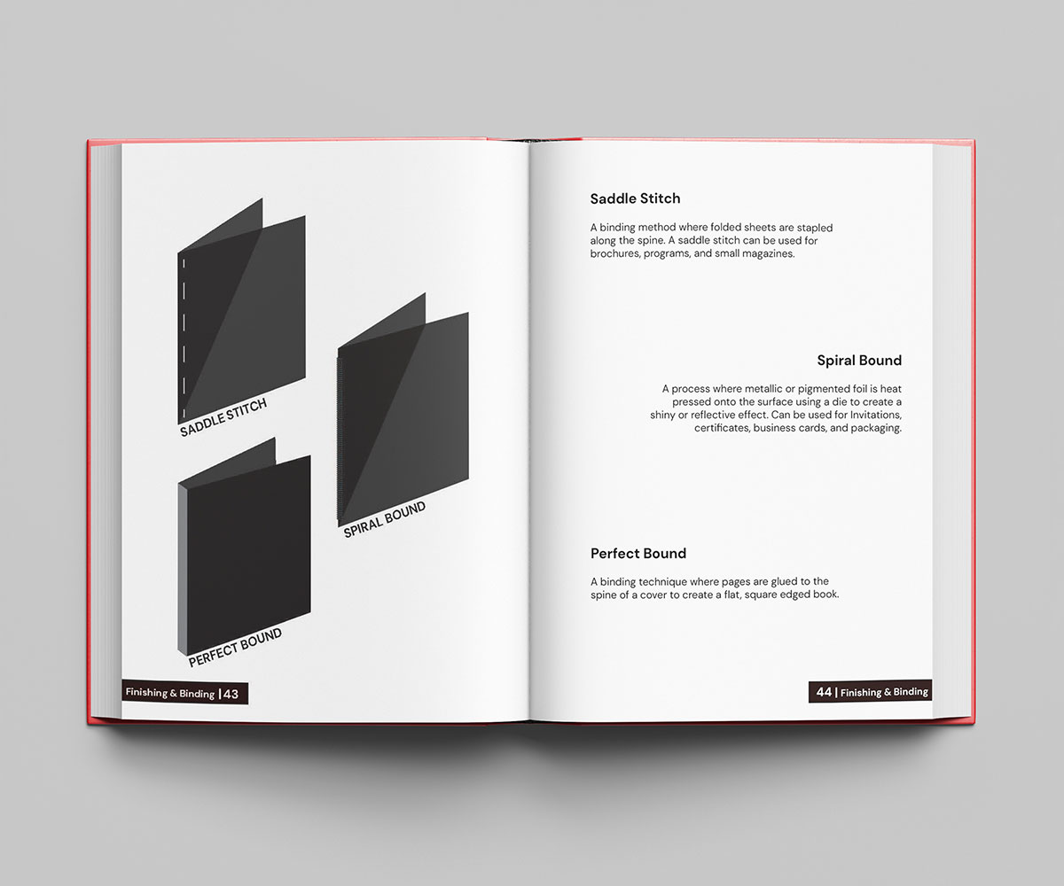
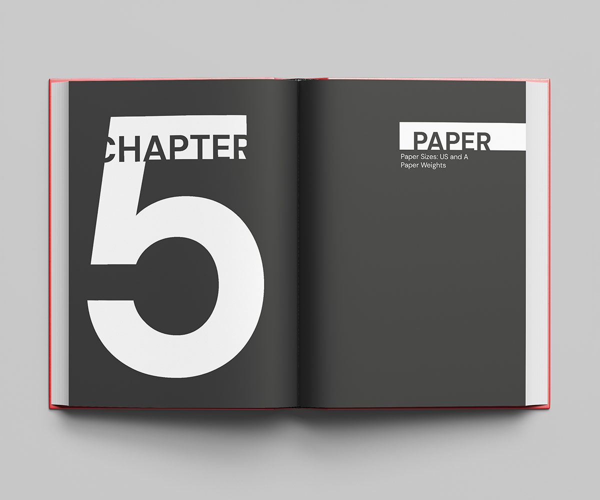
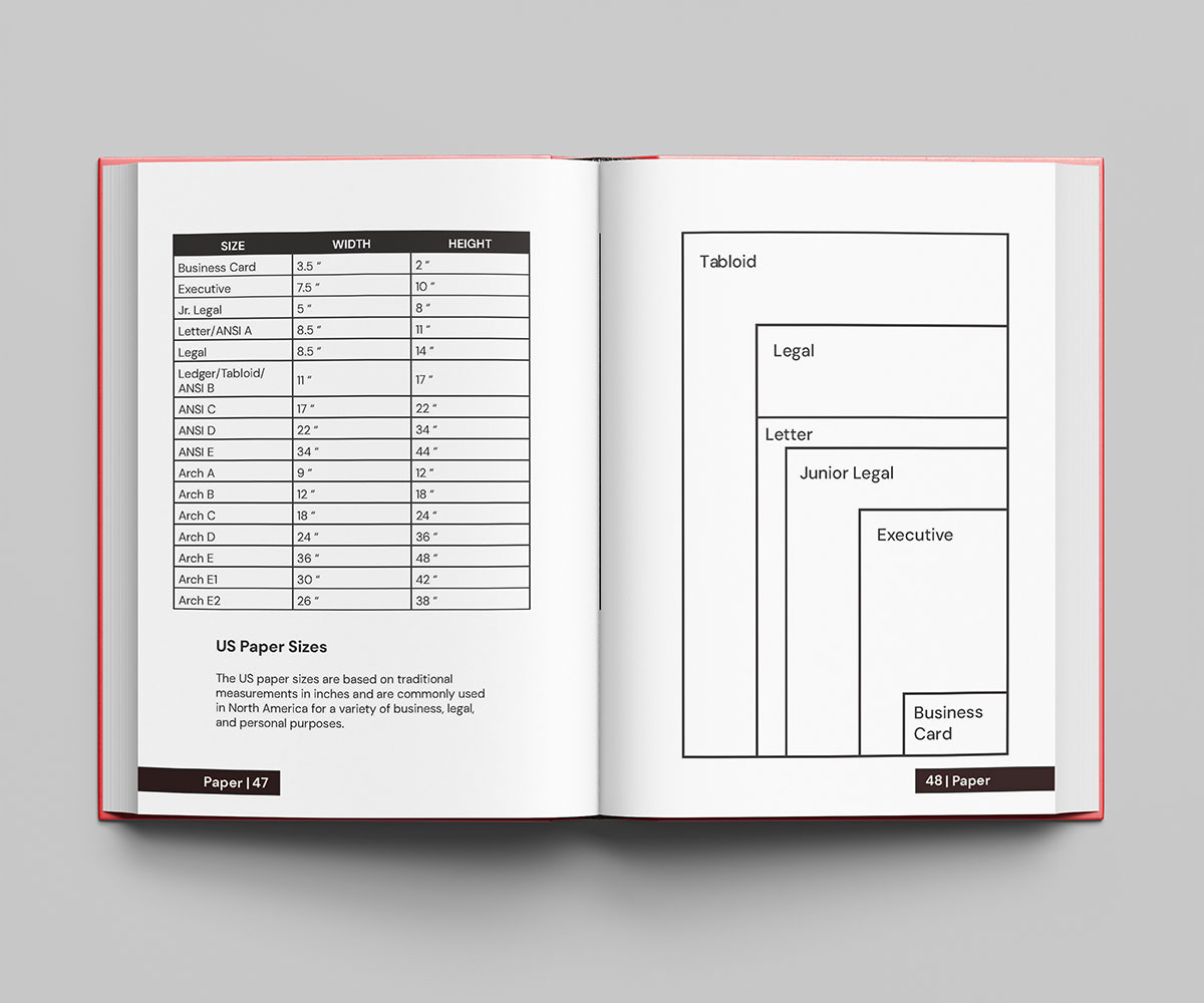
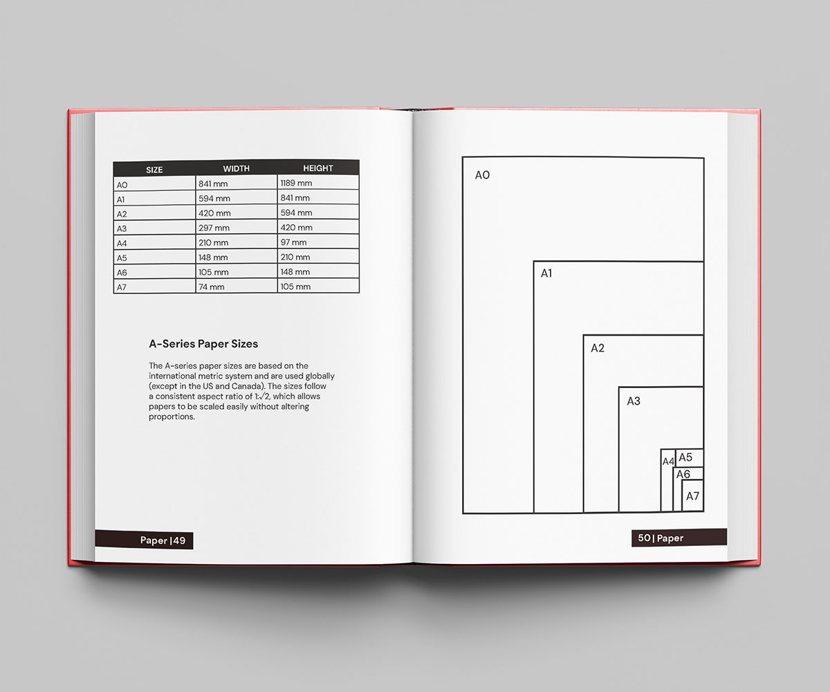
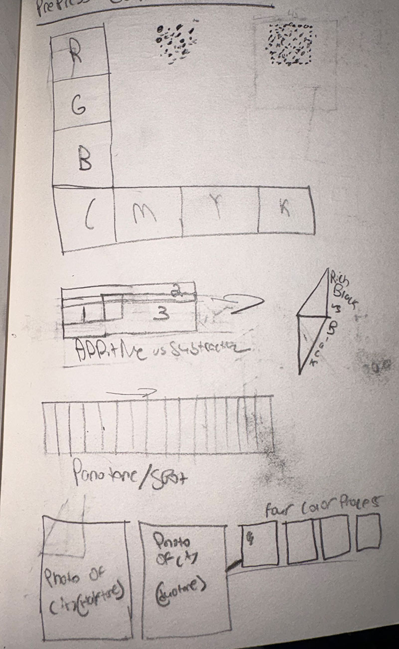
This class project focused on designing a pocket-sized book that demonstrated the fundamentals of pre-press production and print design. The assignment required a consistent visual theme based on a specific art movement, and I chose to develop the book in the style of De Stijl. Inspired by the movement’s use of structure, balance, and bold primary color, I created a layout system that felt both clean and visually engaging. This project allowed me to explore editorial design through a minimalist approach while also applying key principles of print production, consistency, and composition.


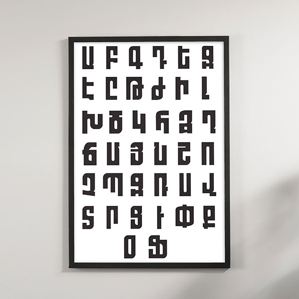
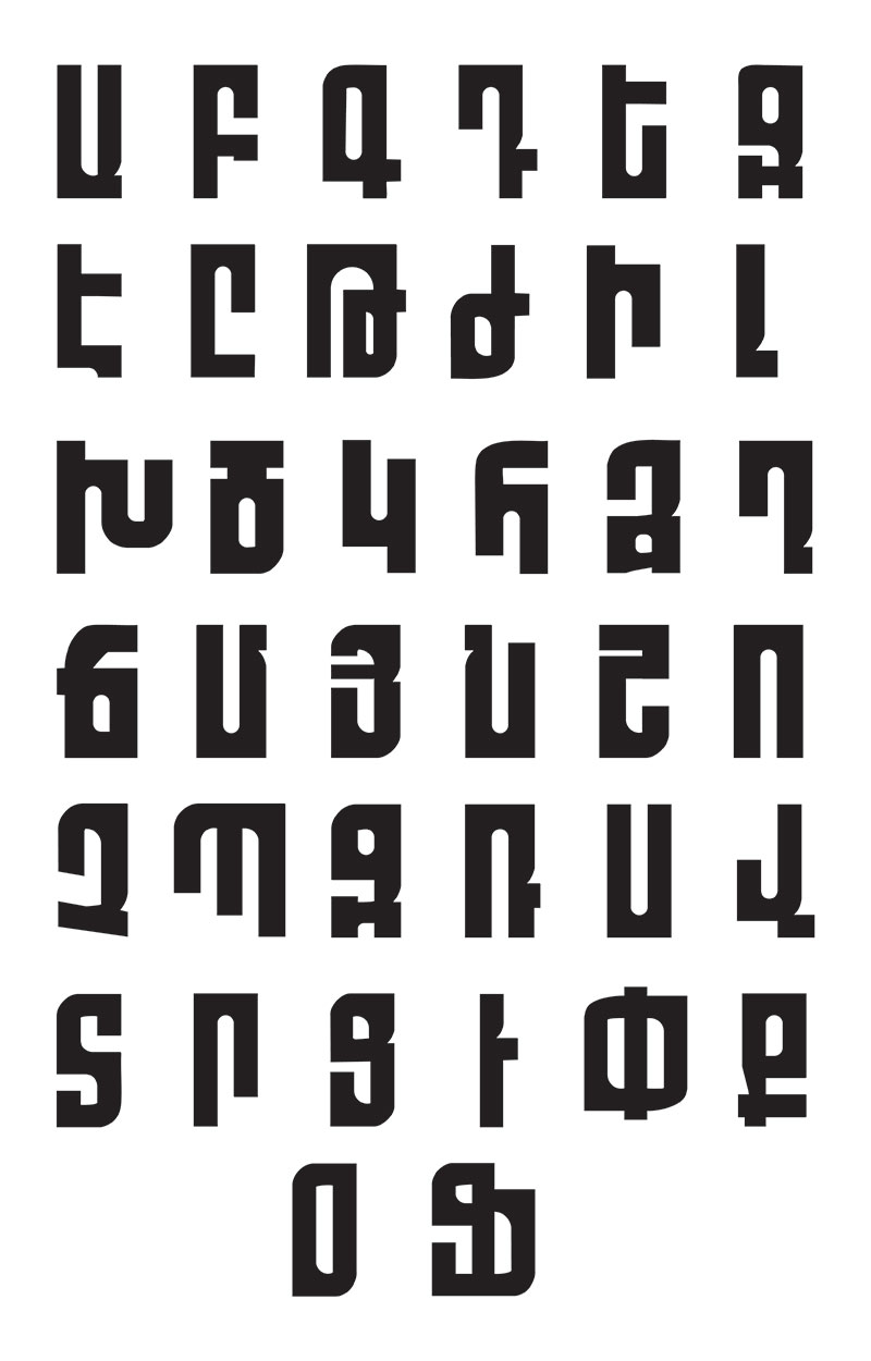
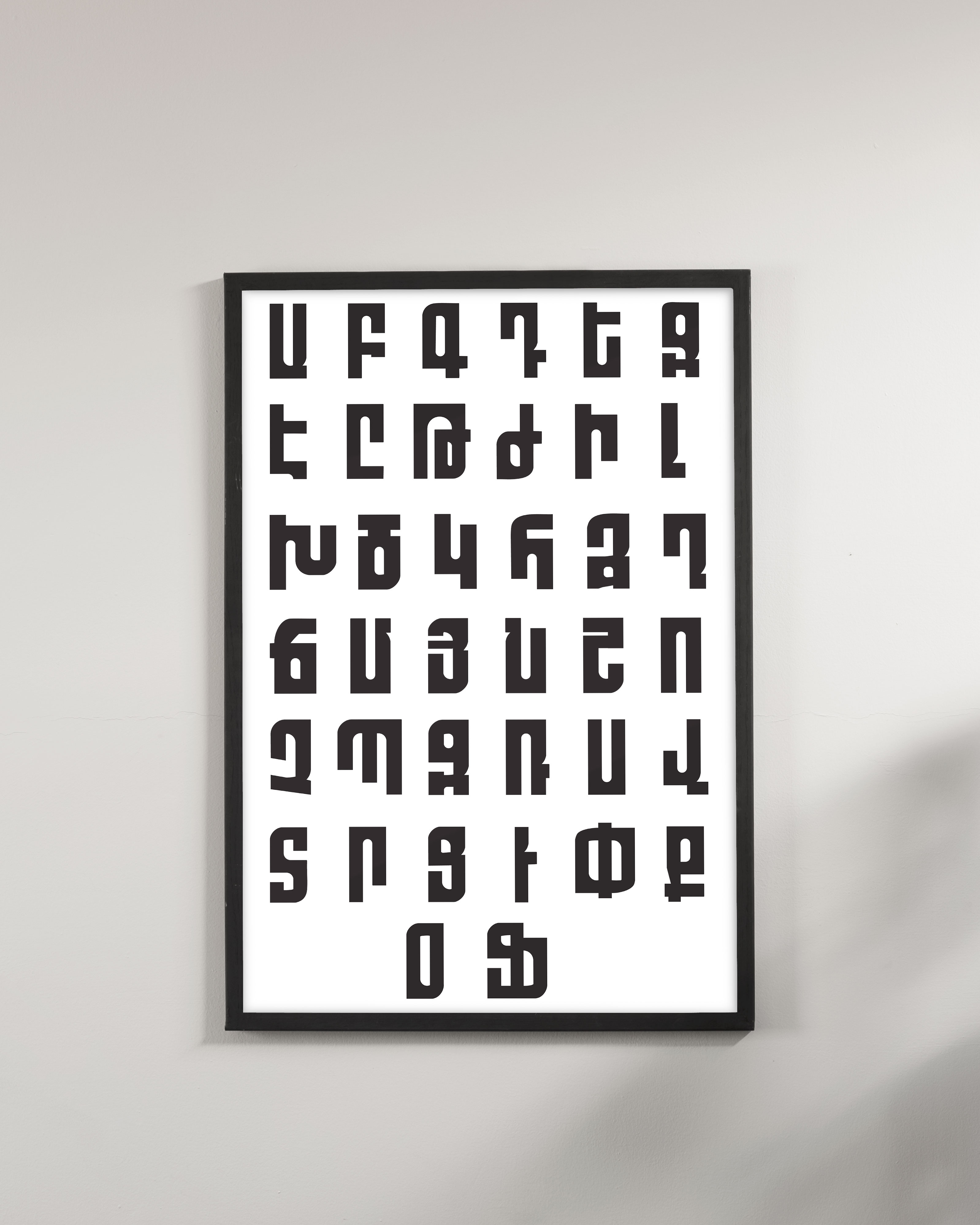
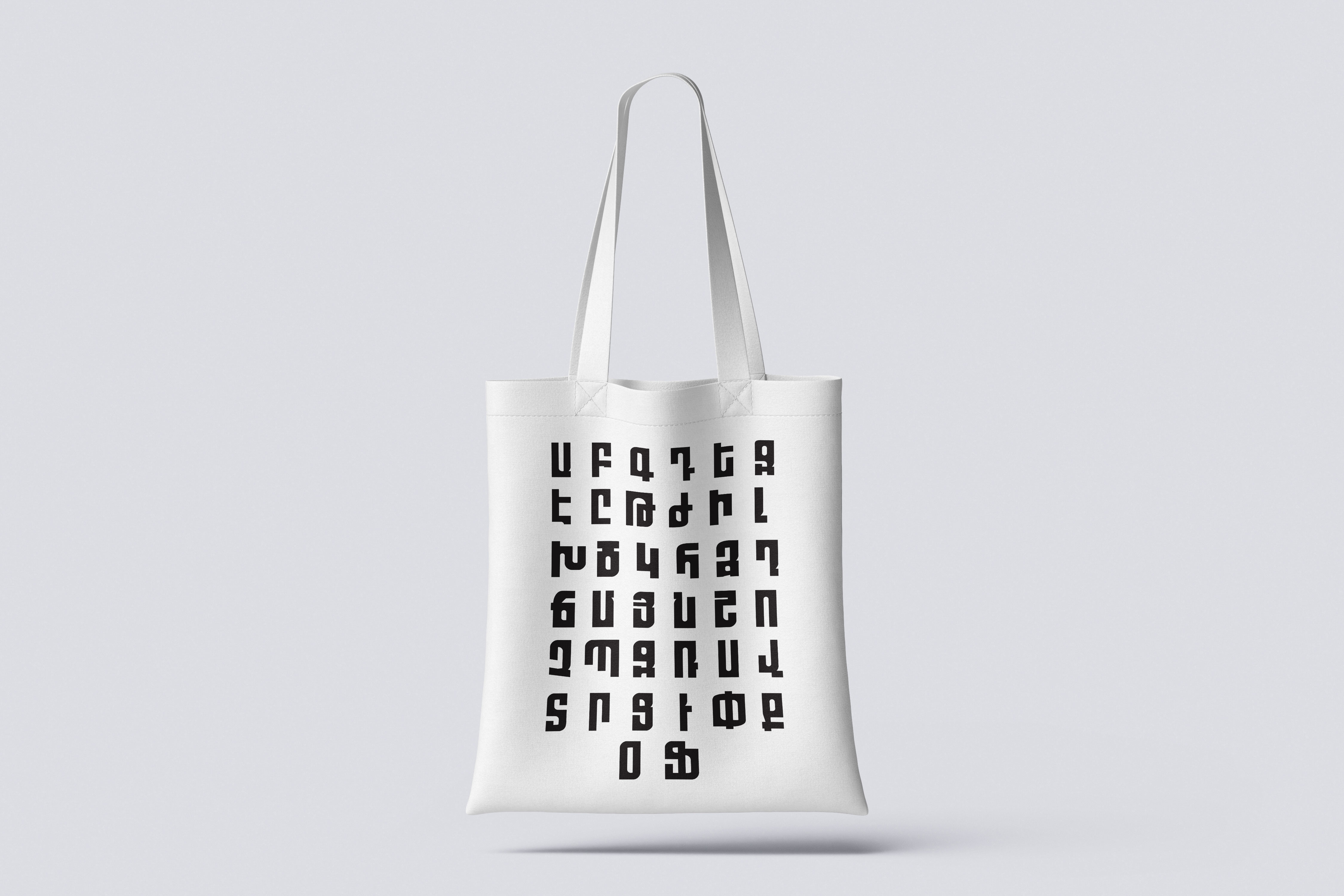
This type design project was created as part of a class assignment to develop an original typeface with complete creative freedom. Wanting to challenge myself both conceptually and technically, I chose to design a typeface in Armenian, connecting the project to my cultural background and heritage. The goal was to create a typeface that felt grotesque, clean, modern, and visually distinctive while still respecting the structure and rhythm of the Armenian alphabet. I named the typeface MARASH Type, after the town where my ancestral family lived prior to the Armenian Genocide. The final design merges contemporary typographic form with personal and historical significance, resulting in a typeface that is both visually unique and deeply meaningful.

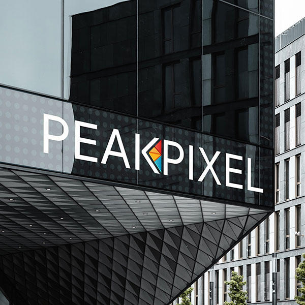
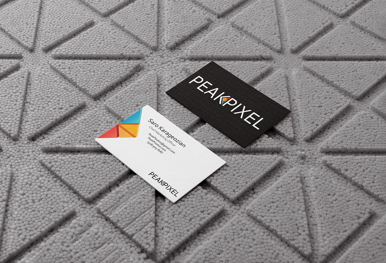
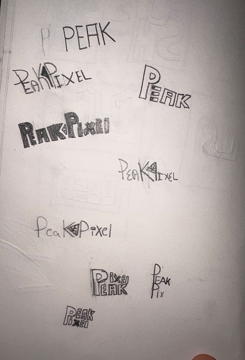
This logo was created for my marketing company, Peak Pixel, to build a visual identity that felt both simple and effective. I wanted the mark to be clean, memorable, and versatile enough to represent the brand across a range of digital and marketing applications. The concept was centered around precision and attention to detail, reflecting the idea of delivering work down to the “perfect pixel.” By combining a minimal brand mark with a strong, modern identity, the final logo was designed to communicate clarity, professionalism, and a polished creative standard.
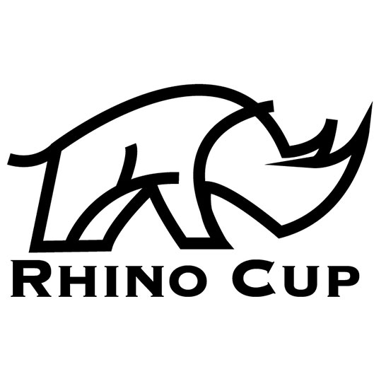
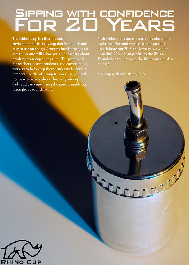
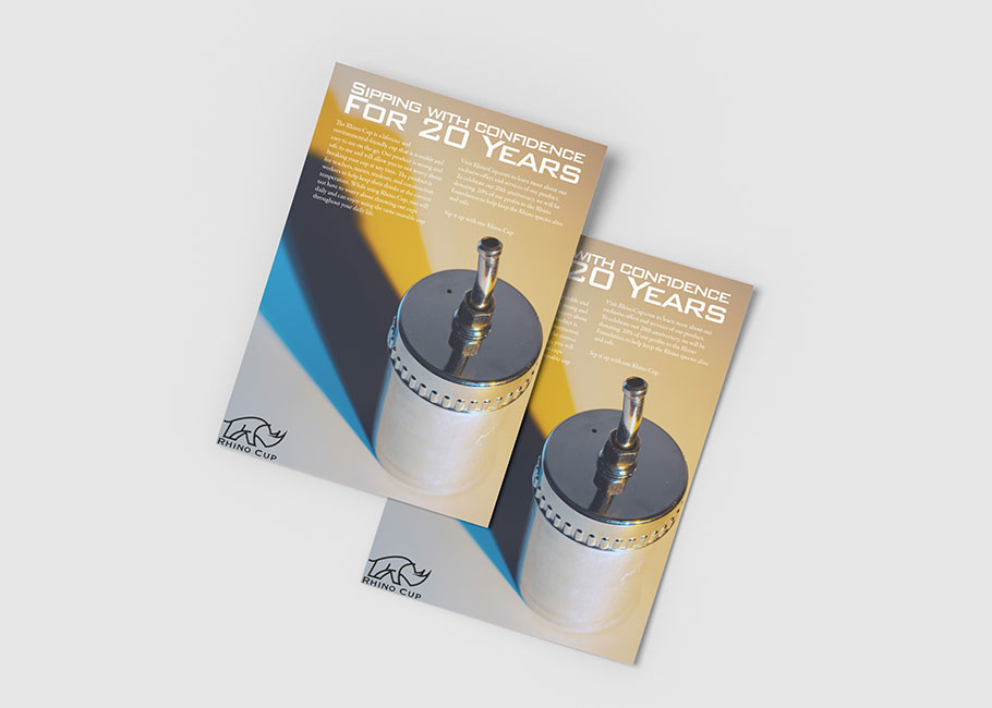
This collaborative class project focused on developing and executing a promotional ad flyer based on a randomly assigned object. Working as part of a team, we transformed the object into a branded product concept called Rhino Cup. My role in the project included designing the logo and creating the overall flyer layout, while also contributing to the visual direction of the final campaign. As a team, we planned and executed a product photo shoot to support the advertisement and bring the concept to life. The final piece combines branding, layout design, and photography to create a playful and cohesive product campaign.
I am a passionate Graphic Designer dedicated to achieving excellence in my field. I am always eager to learn new skills and grow as an inspiring designer. My objective with design is to create and manage design products that contribute to my professional growth. Graphic design allows me to display my creative process, design knowledge, and skills. I aspire to be able to produce and execute creative work with my main motivator, inspiration, being Jesus Christ. With faith, I can produce creative work, and have faith that the holy spirit will be able to guide me throughout all my creative pieces. I enjoy and have passion behind all my work, and hold real value. As an aspiring designer and arts enthusiast, I strive to produce final work to a high standard.
I chose graphic design in 8th grade. I knew ever since then that I would be a graphic designer. I knew at that age that I wanted to pursue a career somewhere in that creative field. I had a passion and enjoyed producing creative graphic work starting in my early teens. My skills naturally grew during this self-exploration in graphic design. When I started taking classes in college about various types of design, my skills began to grow and reach a professional standard. I'm confident in my work and can back it up with appropriate design reasoning. Till this day, I take on any project with the true intent to deliver and execute a real purpose behind every design.